 kage
kage
nimbleway.com
Design analysis
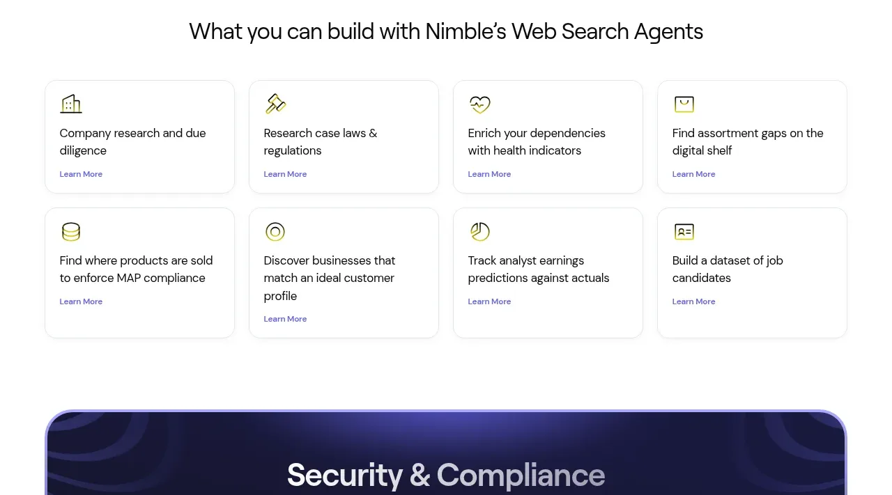
Eight compact cards are arranged in a clean four-column by two-row grid, making concrete applications scannable without heavy visual decoration.
Prompt preview
## Reference images

Study these alongside the description below: hierarchy, rhythm, spacing, colour. Build for the product you are asked about, using this design language.

- Component: https://kage-design-assets.t3.tigrisfiles.io/components/web-search-agents-by-nimble/b9f88c51-9261-49a4-af5a-25ccd481000c-1789452129-6.webp
- Full page it was cut from: https://kage-design-assets.t3.tigrisfiles.io/screenshots/web-search-agents-by-nimble/b9f88c51-9261-49a4-af5a-25ccd481000c-1789452077081-full.webp
- Component on Kage: https://kage.design/component/web-search-agents-by-nimble-feature-grid-3

## Before you start
Ask what the user's product, audience, and brand identity are, then apply the principles below to that product rather than reproducing the reference.

Create a use-case gallery on white with a centered section title and a responsive four-column grid that becomes two columns and then one. Each card should be a modest rounded rectangle, approximately 190–220px tall, with a small line icon or abstract glyph, a two-line use-case title, and a compact text link. Use white #FFFFFF, a 1px border around #E6E6EA, a very soft shadow, 14–18px radius, and 20–24px internal padding. Typography should use near-black #17181C for titles, #62636B for supporting/link text, and a restrained indigo or lime accent for icons and links. Keep all cards equal height, align titles consistently, and add a subtle lift/border-color change on hover.

Never use the reference product name, exact use-case titles, exact link labels, icons, illustrations, or imagery.







