kage
kage
nimbleway.com
Design analysis
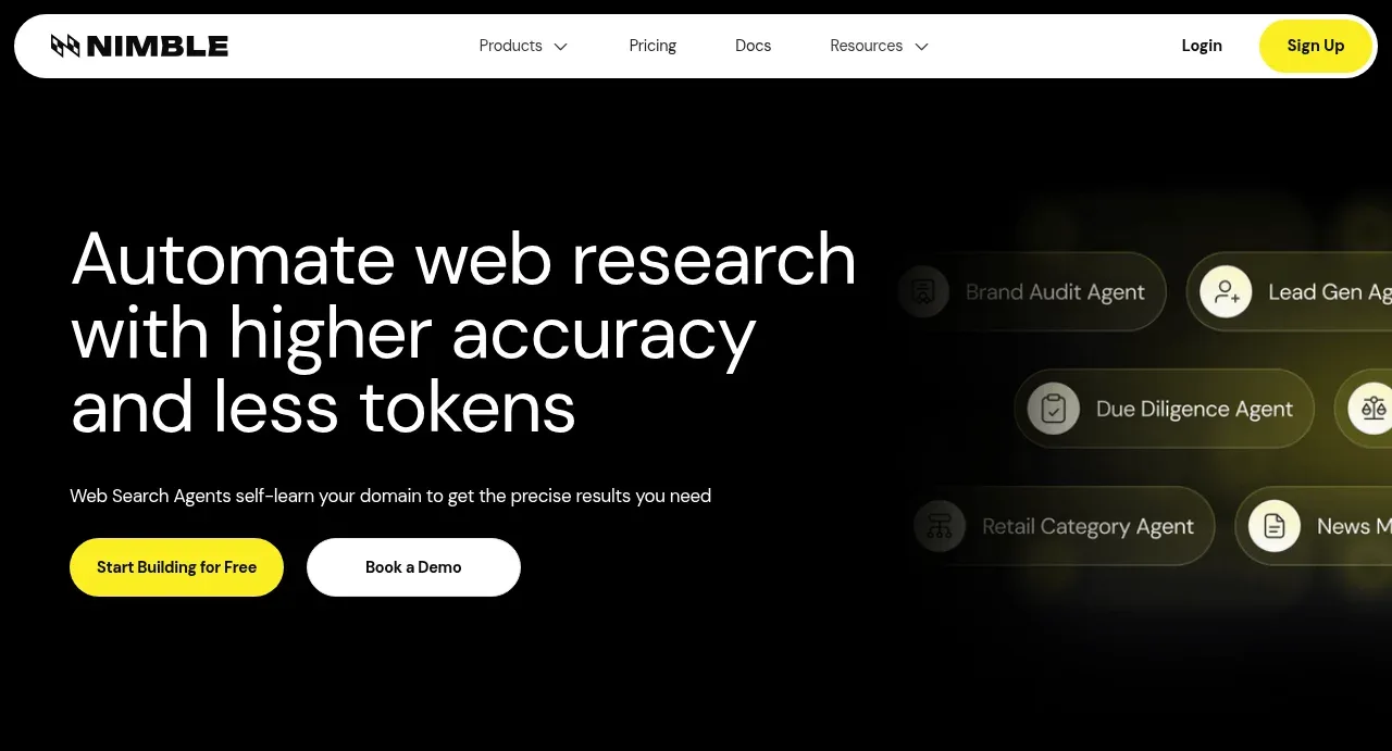
The hero uses an oversized left-aligned promise, concise supporting copy, two contrasting CTAs, and a softly blurred agent interface motif on the right.
Prompt preview
## Reference images

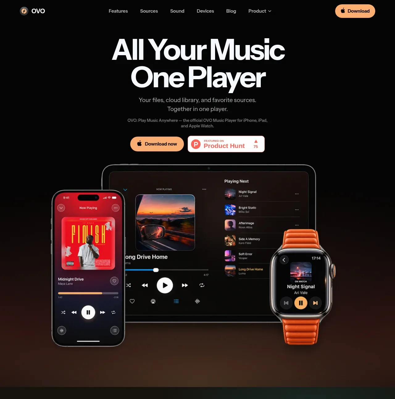
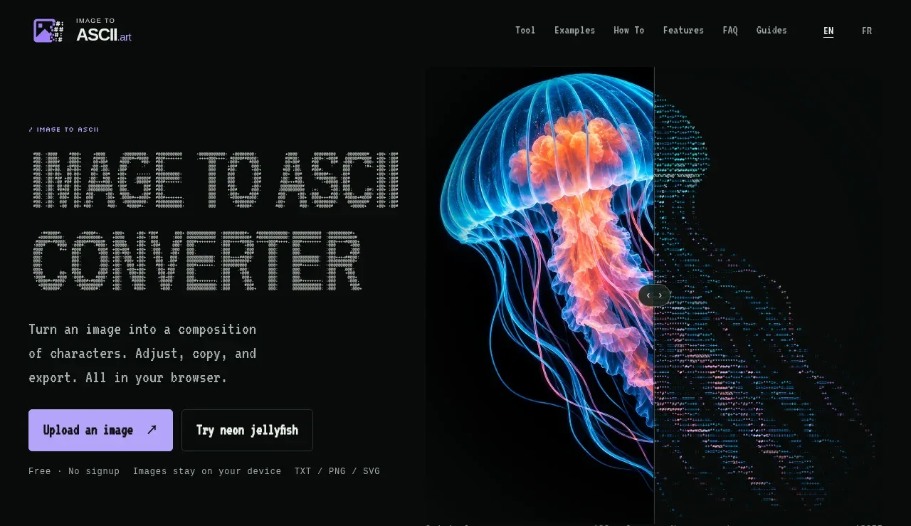
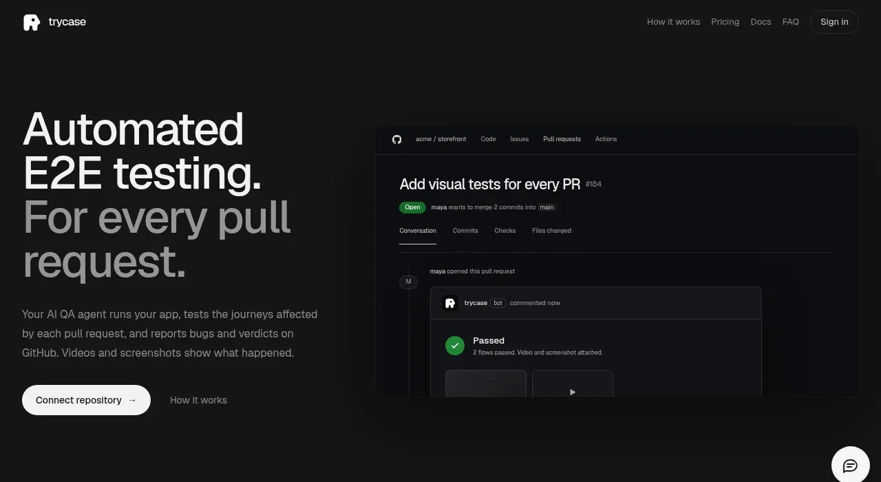
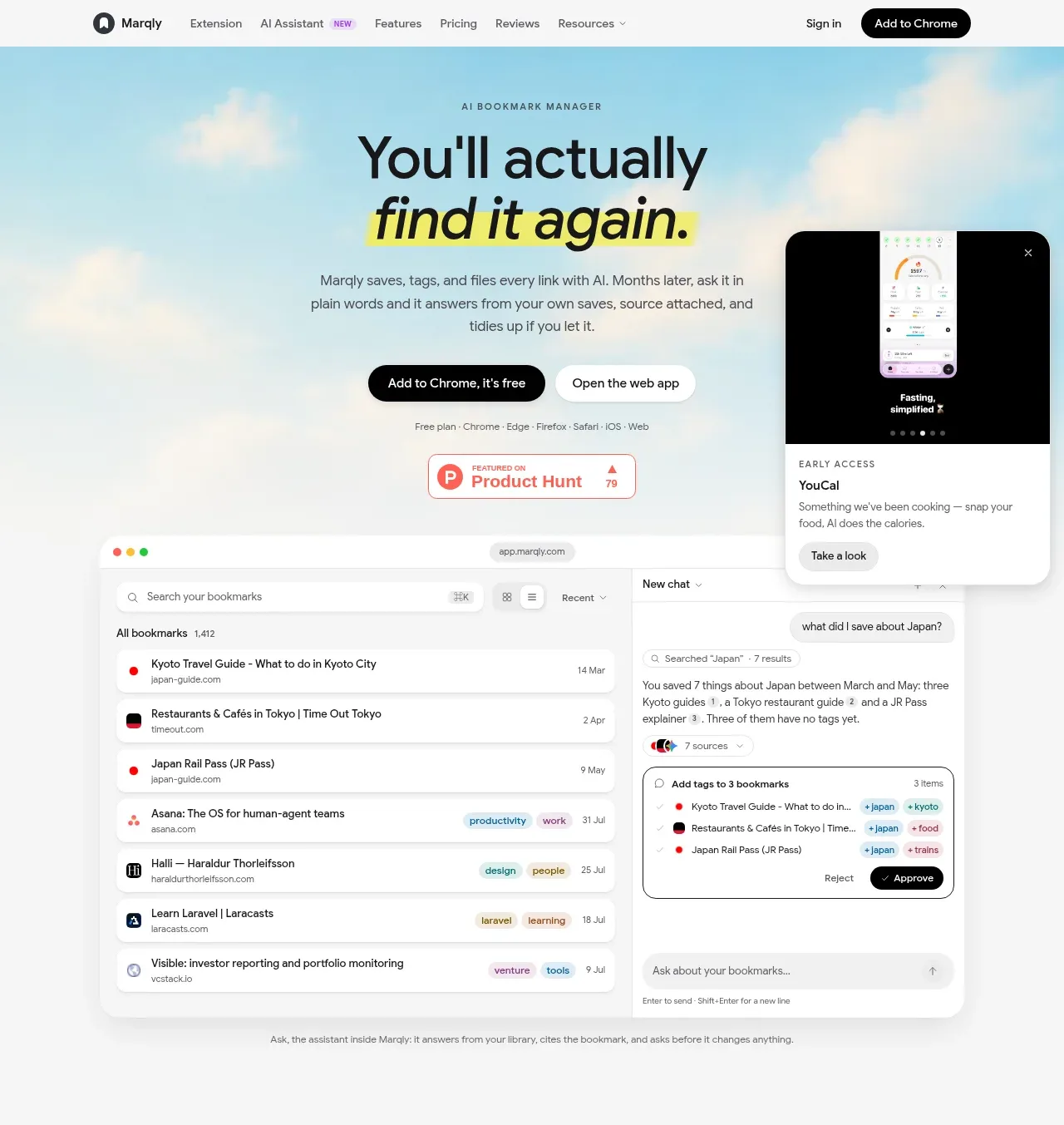
Study these alongside the description below: hierarchy, rhythm, spacing, colour. Build for the product you are asked about, using this design language.

- Component: https://kage-design-assets.t3.tigrisfiles.io/components/web-search-agents-by-nimble/b9f88c51-9261-49a4-af5a-25ccd481000c-1789452127-1.webp
- Full page it was cut from: https://kage-design-assets.t3.tigrisfiles.io/screenshots/web-search-agents-by-nimble/b9f88c51-9261-49a4-af5a-25ccd481000c-1789452077081-full.webp
- Component on Kage: https://kage.design/component/web-search-agents-by-nimble-hero

## Before you start
Ask what the user's product, audience, and brand identity are, then apply the principles below to that product rather than reproducing the reference.

Create a full-width dark hero directly below the navigation, with a two-column layout and a generous max-width inner container. Put a large multi-line headline on the left, approximately 48–64px on desktop with tight line-height, followed by one short explanatory sentence and two horizontally arranged buttons. Make the primary button a vivid warm accent such as #FFF500 with dark text, and the secondary button white with dark text; use 14–16px type, pill radii around 999px, and comfortable 14–18px vertical padding. On the right, add an abstract, low-contrast product/workflow visual made from softly glowing rounded chips or panels; keep it subordinate so the headline remains the focal point. Use #050505 or #080808 as the background, #F7F7F7 for headline text, muted gray #A4A4A4 for body text, and faint gray/olive glows. Add responsive stacking, ample top and bottom spacing, and visible hover/focus states.

Never use the reference logo, product name, exact headline, exact copy, agent labels, UI screenshots, or imagery.