 kage
kage
xem.email
Design analysis
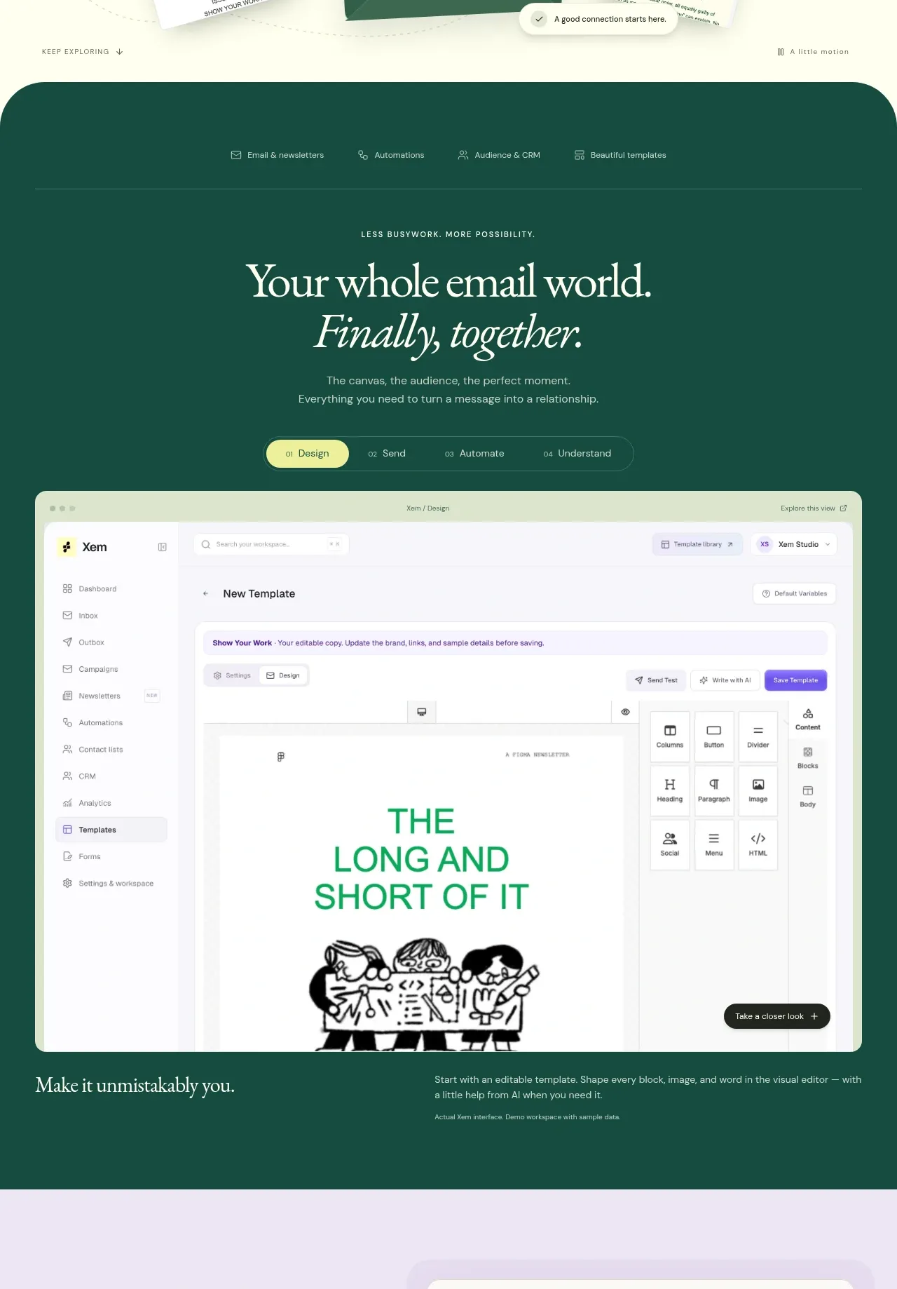
A deep green feature band introduces a unified email world, then uses a tab-like sequence and a large product screenshot to show how the core workflow fits together.
Prompt preview
## Reference images

Study these alongside the description below: hierarchy, rhythm, spacing, colour. Build for the product you are asked about, using this design language.

- Component: https://kage-design-assets.t3.tigrisfiles.io/components/xem/cfdda217-53f8-4a81-998a-9d07a076ba78-1790143671-2.webp
- Full page it was cut from: https://kage-design-assets.t3.tigrisfiles.io/screenshots/xem/cfdda217-53f8-4a81-998a-9d07a076ba78-1790143376275-full.webp
- Component on Kage: https://kage.design/component/xem-feature-grid

## Before you start
Ask what product workflow should be demonstrated, which capabilities matter most, and what visual brand palette to use. Build an original version for that product.

Create a full-width dark feature section with a rounded top edge and deep forest background around #145747. Begin with a small capability navigation row, then a centered serif heading and italic emphasis line, a short explanation, and a compact four-step tab or segmented control. Below it, place one large rounded product UI screenshot inside the section, followed by a short explanatory caption and a small contextual link. Use cream text, muted sage secondary text, and a pale lime active tab around #dfeea2. Use 20–24px outer padding, 24px card radius, thin translucent borders, and a clear visual hierarchy from promise to workflow to proof. Tabs should visibly change the screenshot/caption when implemented.

Never use the reference's logo, product name, copy, illustrations, or imagery.
More components

 Spend visibility and daily-cost breakdown
Subscrr · Feature grid
Spend visibility and daily-cost breakdown
Subscrr · Feature grid
 Reminders and simple setup flow
Subscrr · Feature grid
Reminders and simple setup flow
Subscrr · Feature grid

 Security and permissions cards
NotchPop · Feature grid
Security and permissions cards
NotchPop · Feature grid
 Focused feature cards
NotchPop · Feature grid
Focused feature cards
NotchPop · Feature grid
 Interactive product demonstration
NotchPop · Feature grid
Interactive product demonstration
NotchPop · Feature grid
 Quiet information cards
NotchPop · Feature grid
Quiet information cards
NotchPop · Feature grid