 kage
kage
xem.email
Design analysis
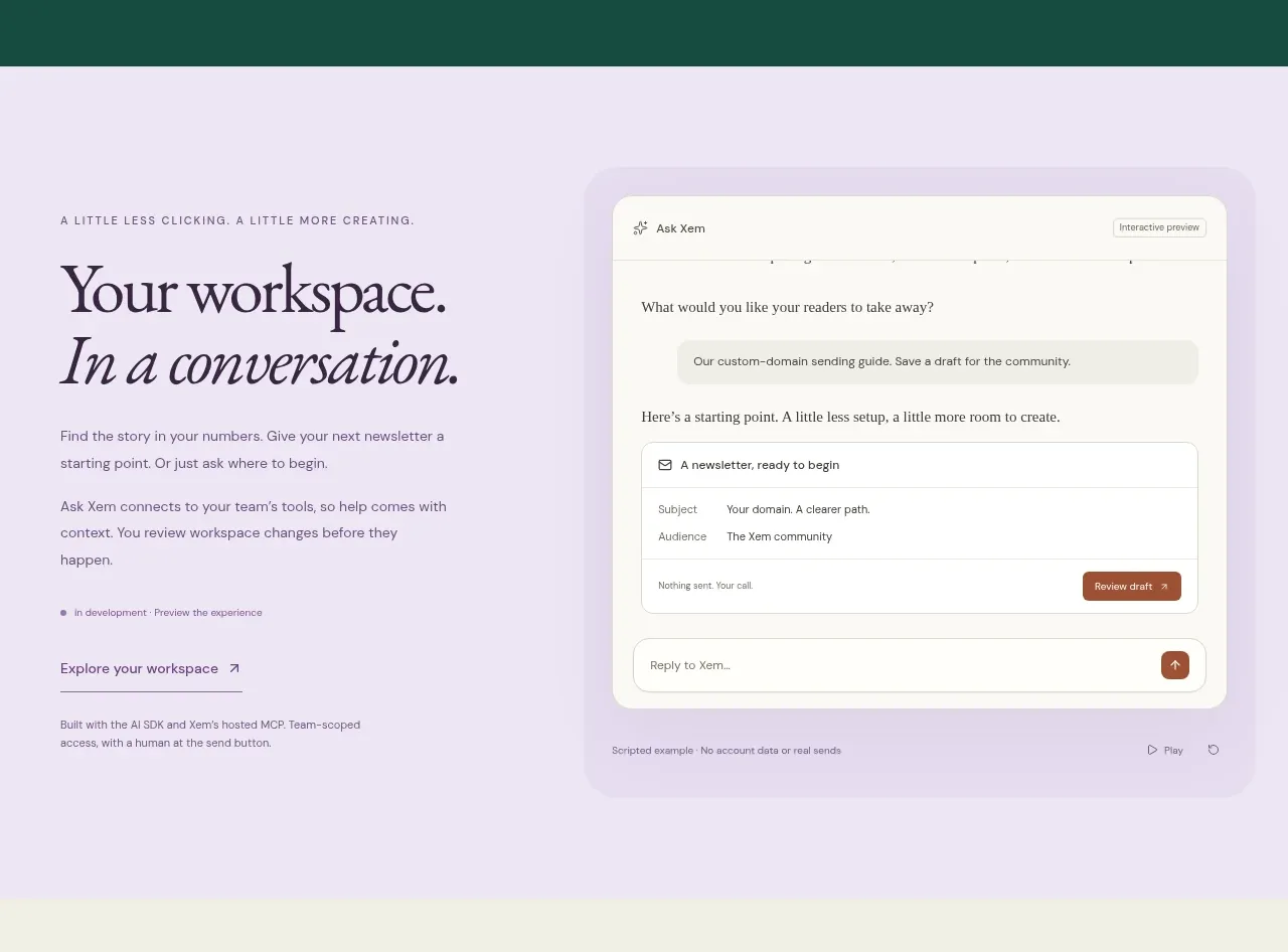
A soft lavender split section pairs an expressive serif statement with a realistic conversation UI, making a collaborative feature feel human and approachable.
Prompt preview
## Reference images

Study these alongside the description below: hierarchy, rhythm, spacing, colour. Build for the product you are asked about, using this design language.

- Component: https://kage-design-assets.t3.tigrisfiles.io/components/xem/cfdda217-53f8-4a81-998a-9d07a076ba78-1790143671-3.webp
- Full page it was cut from: https://kage-design-assets.t3.tigrisfiles.io/screenshots/xem/cfdda217-53f8-4a81-998a-9d07a076ba78-1790143376275-full.webp
- Component on Kage: https://kage.design/component/xem-feature-grid-2

## Before you start
Ask what collaborative or conversational capability the user's product has and what emotional response the brand should create. Apply the layout logic to that product.

Build a two-column feature band on a pale lavender background around #eeeafa. Put a small eyebrow, large serif heading with an italic phrase, body copy, and understated link on the left; put a rounded, lightly elevated application panel or conversation mockup on the right. Keep both columns vertically centered and align them to a shared max-width. Use dark charcoal-green text #1d2c27, muted gray-green supporting copy, 16–24px gaps, 20px card radius, and a very soft border/shadow. On mobile, stack the text above the visual. Make the UI mockup feel functional with message rows, fields, and a clear send affordance, but use original content.

Never use the reference's logo, product name, copy, illustrations, or imagery.
More components

 Spend visibility and daily-cost breakdown
Subscrr · Feature grid
Spend visibility and daily-cost breakdown
Subscrr · Feature grid
 Reminders and simple setup flow
Subscrr · Feature grid
Reminders and simple setup flow
Subscrr · Feature grid

 Security and permissions cards
NotchPop · Feature grid
Security and permissions cards
NotchPop · Feature grid
 Focused feature cards
NotchPop · Feature grid
Focused feature cards
NotchPop · Feature grid
 Interactive product demonstration
NotchPop · Feature grid
Interactive product demonstration
NotchPop · Feature grid
 Quiet information cards
NotchPop · Feature grid
Quiet information cards
NotchPop · Feature grid