 kage
kage
xem.email
Design analysis
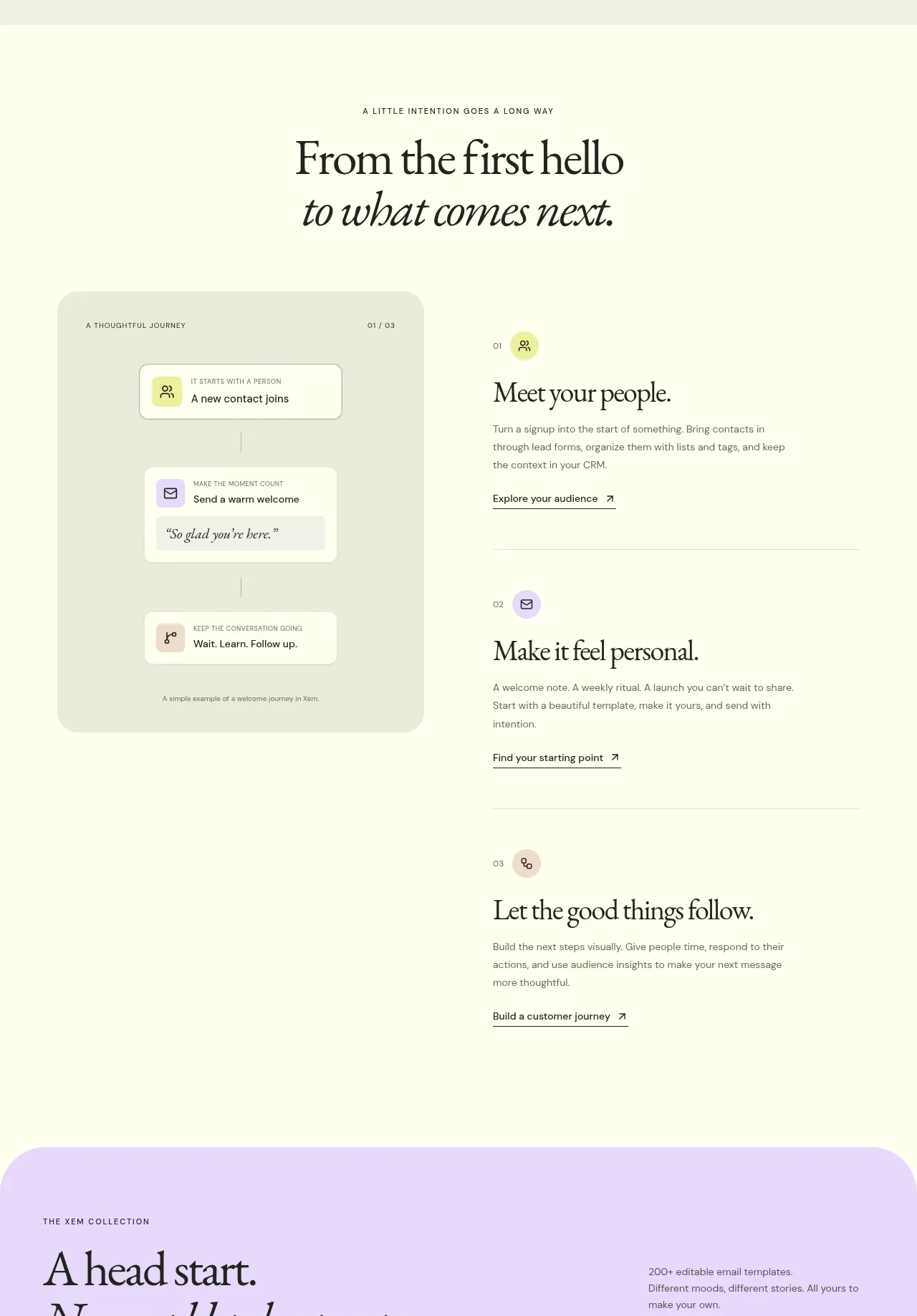
This section reframes the product as a sequence of human moments, pairing a simple journey visual with three vertically ordered content steps and ample whitespace.
Prompt preview
## Reference images

Study these alongside the description below: hierarchy, rhythm, spacing, colour. Build for the product you are asked about, using this design language.

- Component: https://kage-design-assets.t3.tigrisfiles.io/components/xem/cfdda217-53f8-4a81-998a-9d07a076ba78-1790143672-5.webp
- Full page it was cut from: https://kage-design-assets.t3.tigrisfiles.io/screenshots/xem/cfdda217-53f8-4a81-998a-9d07a076ba78-1790143376275-full.webp
- Component on Kage: https://kage.design/component/xem-feature-grid-4

## Before you start
Ask what lifecycle or customer journey your product enables and which three moments should be highlighted. Adapt the pattern to the user's own story and brand.

Build a spacious ivory section with a centered serif heading and italic subline. Under it, use a split layout: a soft tinted journey illustration or abstract process card on the left, and three numbered content blocks stacked on the right. Each block should have a small circular icon, a serif title, concise copy, and a text link separated by thin horizontal rules. Use #fffef0 as the base, pale sage #e9edda for the visual card, dark #1c2d26 text, and restrained peach/lavender icon accents. Maintain 48–72px section padding, 24px gaps, and a responsive one-column mobile layout. The visual should explain progression without relying on decorative complexity.

Never use the reference's logo, product name, copy, illustrations, or imagery.
More components

 Spend visibility and daily-cost breakdown
Subscrr · Feature grid
Spend visibility and daily-cost breakdown
Subscrr · Feature grid
 Reminders and simple setup flow
Subscrr · Feature grid
Reminders and simple setup flow
Subscrr · Feature grid

 Security and permissions cards
NotchPop · Feature grid
Security and permissions cards
NotchPop · Feature grid
 Focused feature cards
NotchPop · Feature grid
Focused feature cards
NotchPop · Feature grid
 Interactive product demonstration
NotchPop · Feature grid
Interactive product demonstration
NotchPop · Feature grid
 Quiet information cards
NotchPop · Feature grid
Quiet information cards
NotchPop · Feature grid