 kage
kage
xem.email
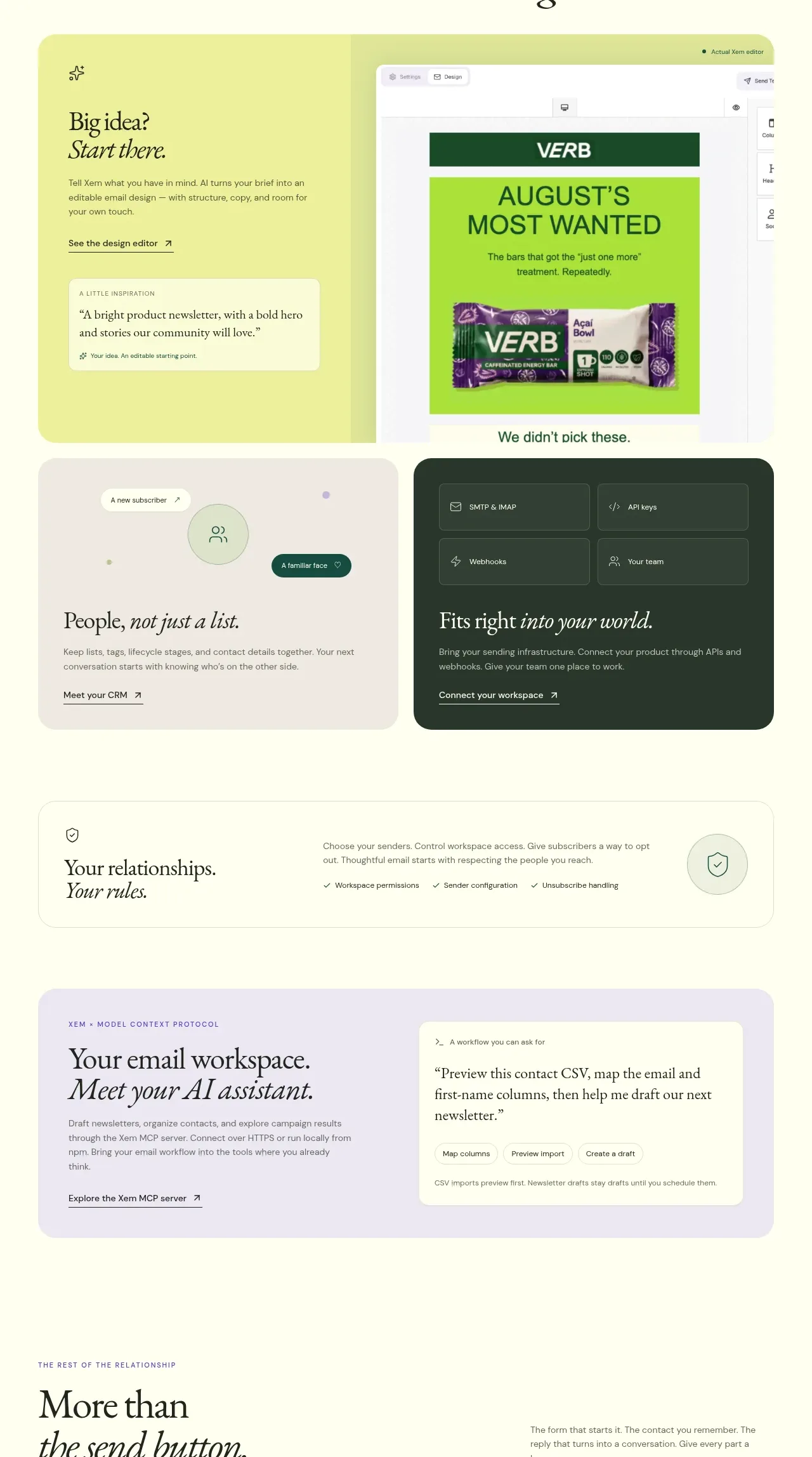
Design analysis
A modular card grid shifts from analytics to creation, showing a bright design workspace, audience context, integration infrastructure, and a compact policy row.
Prompt preview
## Reference images

Study these alongside the description below: hierarchy, rhythm, spacing, colour. Build for the product you are asked about, using this design language.

- Component: https://kage-design-assets.t3.tigrisfiles.io/components/xem/cfdda217-53f8-4a81-998a-9d07a076ba78-1790143674-8.webp
- Full page it was cut from: https://kage-design-assets.t3.tigrisfiles.io/screenshots/xem/cfdda217-53f8-4a81-998a-9d07a076ba78-1790143376275-full.webp
- Component on Kage: https://kage.design/component/xem-feature-grid-5

## Before you start
Ask which creative and operational tools belong in the user's product ecosystem and what should be primary versus supporting. Use the following composition as a flexible pattern, not a copy.

Create a pale yellow-green section with a centered serif heading and italic line. Below, build a 2x2 responsive card grid: a larger bright lime design/editor card with a product preview, a light relationship or audience card, a dark green infrastructure/integrations card, and a slim full-width trust or rules card. Use #f4f79b, #f3eee5, #183b31, and #fffef0 as surfaces; use 20–24px radii, 1px low-contrast borders, and 24px internal padding. Each card needs a small eyebrow, concise serif title, short sans-serif description, and one understated link. Use screenshots or abstract UI belonging to the user's product, and make cards stack cleanly on mobile.

Never use the reference's logo, product name, copy, illustrations, or imagery.
More components

 Spend visibility and daily-cost breakdown
Subscrr · Feature grid
Spend visibility and daily-cost breakdown
Subscrr · Feature grid
 Reminders and simple setup flow
Subscrr · Feature grid
Reminders and simple setup flow
Subscrr · Feature grid

 Security and permissions cards
NotchPop · Feature grid
Security and permissions cards
NotchPop · Feature grid
 Focused feature cards
NotchPop · Feature grid
Focused feature cards
NotchPop · Feature grid
 Interactive product demonstration
NotchPop · Feature grid
Interactive product demonstration
NotchPop · Feature grid
 Quiet information cards
NotchPop · Feature grid
Quiet information cards
NotchPop · Feature grid