 kage
kage
xem.email
Design analysis
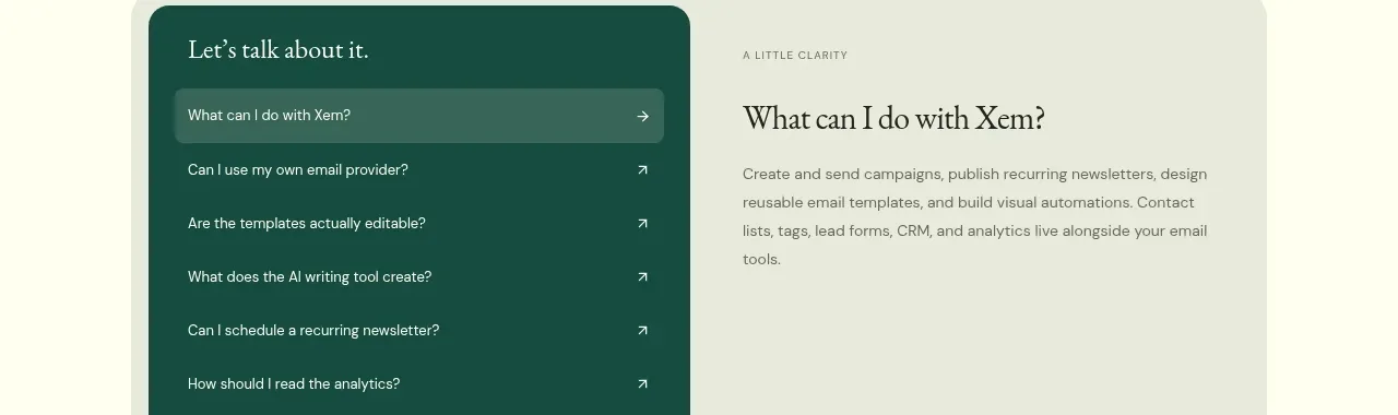
The closing area begins with editorial resource cards and transitions toward an open-source invitation and the start of a question-led FAQ, giving visitors multiple low-friction next steps.
Prompt preview
## Reference images

Study these alongside the description below: hierarchy, rhythm, spacing, colour. Build for the product you are asked about, using this design language.

- Component: https://kage-design-assets.t3.tigrisfiles.io/components/xem/cfdda217-53f8-4a81-998a-9d07a076ba78-1790143675-11.webp
- Full page it was cut from: https://kage-design-assets.t3.tigrisfiles.io/screenshots/xem/cfdda217-53f8-4a81-998a-9d07a076ba78-1790143376275-full.webp
- Component on Kage: https://kage.design/component/xem-feature-grid-6

## Before you start
Ask what educational resources, community materials, or open-source commitments the user's product has, and which final action should be emphasized. Apply the pattern with original content.

Create a warm editorial closing region with a serif heading and italic emphasis, followed by three compact article/resource cards in a row. Each card should have a small category label, a preview surface or simple UI thumbnail, a serif title, short metadata, and an arrow link. Below or alongside, add a lightly tinted open-source/community invitation with a short checklist and a purple CTA; begin a FAQ area with a centered heading and an accordion panel if space permits. Use #fffef0, pale blush #faf3f1, and dark green text #1e2b25, with 16–24px gaps, 16–20px card radii, and thin borders. Keep the resource cards responsive and make accordion rows keyboard accessible.

Never use the reference's logo, product name, copy, illustrations, or imagery.
More components

 Spend visibility and daily-cost breakdown
Subscrr · Feature grid
Spend visibility and daily-cost breakdown
Subscrr · Feature grid
 Reminders and simple setup flow
Subscrr · Feature grid
Reminders and simple setup flow
Subscrr · Feature grid

 Security and permissions cards
NotchPop · Feature grid
Security and permissions cards
NotchPop · Feature grid
 Focused feature cards
NotchPop · Feature grid
Focused feature cards
NotchPop · Feature grid
 Interactive product demonstration
NotchPop · Feature grid
Interactive product demonstration
NotchPop · Feature grid
 Quiet information cards
NotchPop · Feature grid
Quiet information cards
NotchPop · Feature grid