kage
kage
xem.email
Design analysis
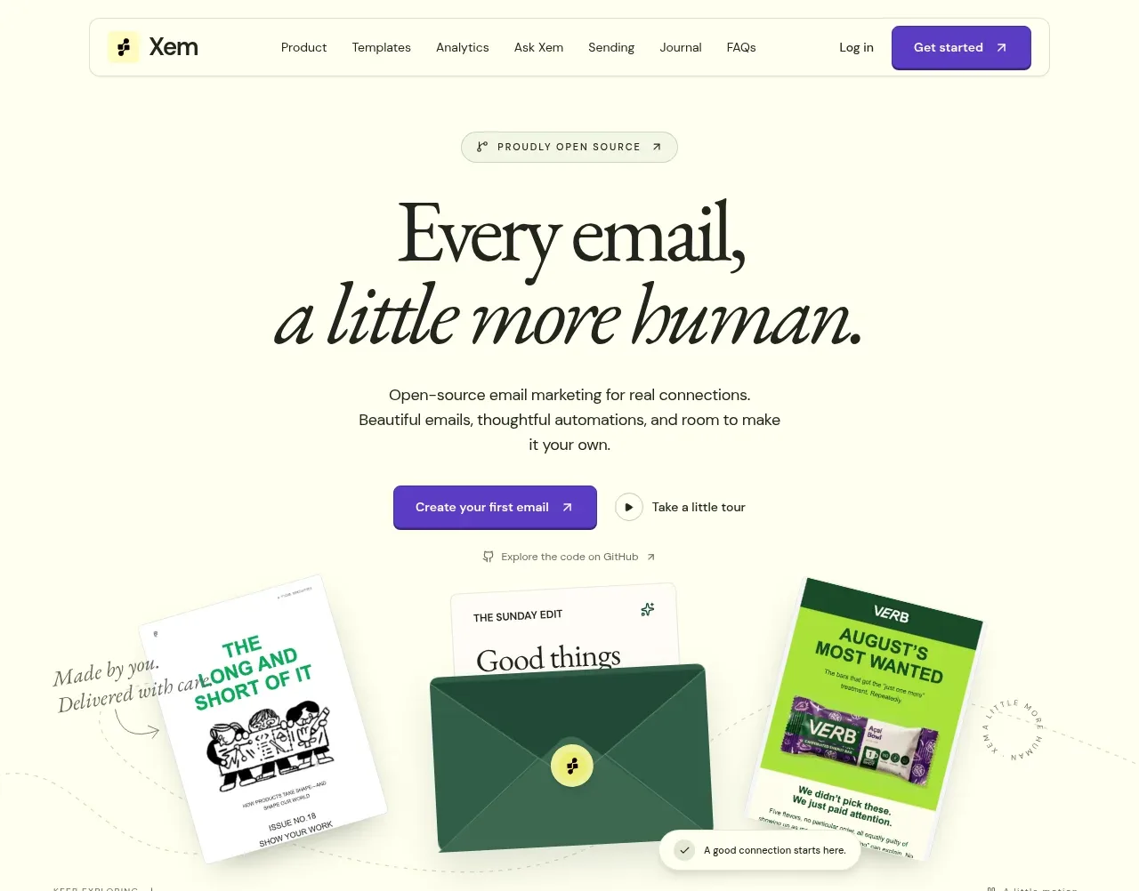
The hero uses a small credibility eyebrow, oversized serif headline with an italic second line, concise supporting copy, paired calls to action, and a tilted collage of email examples to make the promise tangible.
Prompt preview
## Reference images

Study these alongside the description below: hierarchy, rhythm, spacing, colour. Build for the product you are asked about, using this design language.

- Component: https://kage-design-assets.t3.tigrisfiles.io/components/xem/cfdda217-53f8-4a81-998a-9d07a076ba78-1790143670-1.webp
- Full page it was cut from: https://kage-design-assets.t3.tigrisfiles.io/screenshots/xem/cfdda217-53f8-4a81-998a-9d07a076ba78-1790143376275-full.webp
- Component on Kage: https://kage.design/component/xem-hero

## Before you start
Ask what the user's product does, who its audience is, and what brand voice and action the hero should drive. Apply these principles to that product instead of reproducing the reference.

Create a centered editorial SaaS hero on a warm ivory canvas (#fffef0). Start with a tiny uppercase eyebrow, then a large high-contrast serif headline with a distinct italic phrase on the second line. Follow it with a short, low-contrast explanation, a filled purple primary CTA, a small secondary tour/demo action, and a subtle text link. Below the copy, place a broad visual proof area: use the user's own product screenshots or abstract cards, slightly rotated and layered with soft shadows, while preserving plenty of negative space. Keep the content max-width around 520px, use responsive type from 48–76px for the headline, 14–16px sans-serif body text, 24–32px vertical gaps, and avoid letting the visual overpower the message. Buttons should use #5b35c9 with 6–8px radius; supporting accents may use pale green and lime.

Never use the reference's logo, product name, copy, illustrations, or imagery.