kage
kage
xem.email
Design analysis
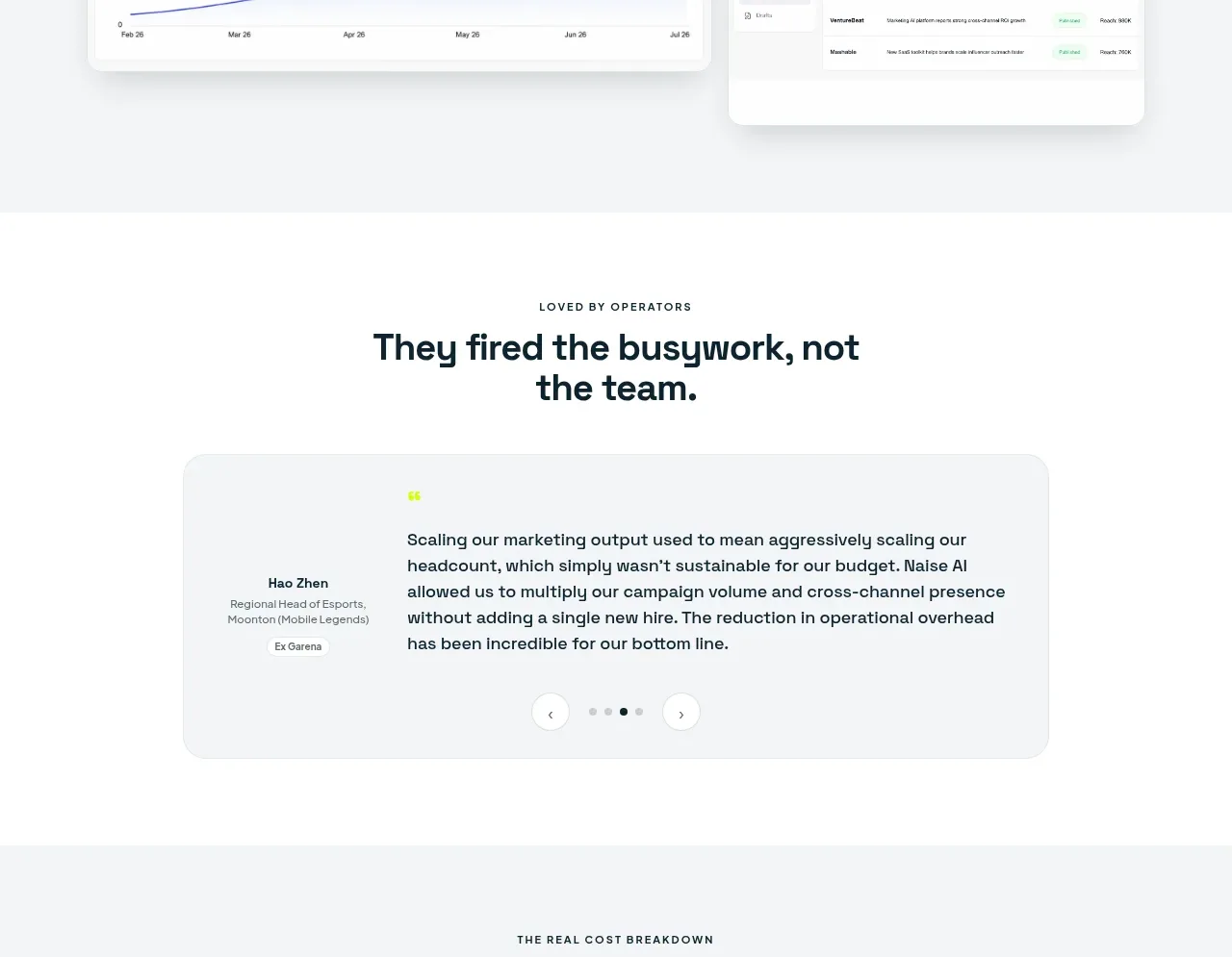
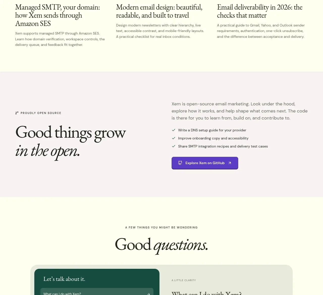
A dark editorial testimonial band combines a strong proof headline, a long quote, attribution controls, and understated carousel navigation to add credibility late in the page.
Prompt preview
## Reference images

Study these alongside the description below: hierarchy, rhythm, spacing, colour. Build for the product you are asked about, using this design language.

- Component: https://kage-design-assets.t3.tigrisfiles.io/components/xem/cfdda217-53f8-4a81-998a-9d07a076ba78-1790143675-10.webp
- Full page it was cut from: https://kage-design-assets.t3.tigrisfiles.io/screenshots/xem/cfdda217-53f8-4a81-998a-9d07a076ba78-1790143376275-full.webp
- Component on Kage: https://kage.design/component/xem-testimonials

## Before you start
Ask who the user's most credible customer or audience segment is, what proof point matters, and what tone the testimonial should have. Build a version for that product.

Create a full-width deep plum testimonial section around #252137. Use a two-column layout: a small eyebrow, large serif heading, and short context paragraph on the left; a large quote in an elegant serif style on the right. Add an attribution row with name, role, organization, and compact previous/next controls beneath the quote. Keep the design quiet and premium: cream text #fffbe9, lavender-muted metadata, thin #514a67 dividers, 24px spacing, and no giant logos. If multiple testimonials exist, implement an accessible carousel with pause and keyboard controls. Stack the columns on mobile.

Never use the reference's logo, product name, copy, illustrations, or imagery.