 kage
kage
zellahq.com
Design analysis
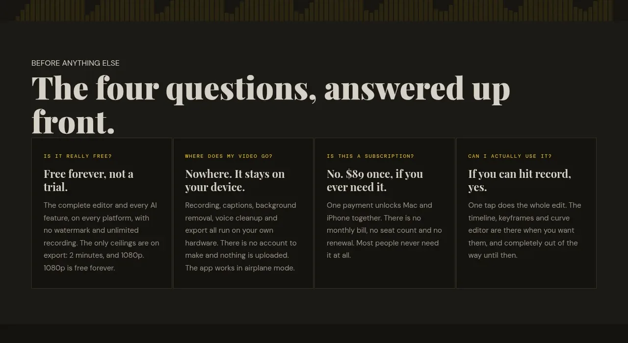
A direct section heading introduces four evenly weighted cards that resolve objections around price, privacy, subscription, and ease of use before deeper product detail.
Prompt preview
## Reference images

Study these alongside the description below: hierarchy, rhythm, spacing, colour. Build for the product you are asked about, using this design language.

- Component: https://kage-design-assets.t3.tigrisfiles.io/components/zella/1ad8c25d-9254-4564-a81b-c4a3a0594691-1789711355-2.webp
- Full page it was cut from: https://kage-design-assets.t3.tigrisfiles.io/screenshots/zella/1ad8c25d-9254-4564-a81b-c4a3a0594691-1789711295290-full.webp
- Component on Kage: https://kage.design/component/zella-feature-grid

## Before you start
Ask what the user's product and brand are, then apply the principles below to that product rather than copying the reference.

Build an objection-handling feature section on a dark surface. Start with a small uppercase lead-in and a large editorial serif heading, then lay out four equal cards in one row on desktop. Each card should have a tiny accent eyebrow, a short bold serif or display title, and compact explanatory copy. Use hairline borders (#2a2b26), nearly-black card fills (#151613), warm ivory headings, muted gray body text, and a restrained yellow-green accent for labels. Keep cards aligned to a shared baseline and make the section breathe with generous top and bottom padding. On mobile, switch to a single-column or two-column grid while retaining equal visual weight.

Never: use logos, product names, copy, illustrations, or imagery from the reference.
More components

 AI-powered helpdesk feature section
intercom.com · Feature grid
AI-powered helpdesk feature section
intercom.com · Feature grid
 Integrations and ecosystem section
intercom.com · Feature grid
Integrations and ecosystem section
intercom.com · Feature grid
 AI agent capabilities section
intercom.com · Feature grid
AI agent capabilities section
intercom.com · Feature grid
 Unified support experience overview
intercom.com · Feature grid
Unified support experience overview
intercom.com · Feature grid

 Core invoicing capabilities
sendinvo.com · Feature grid
Core invoicing capabilities
sendinvo.com · Feature grid
 Audience and trade types
sendinvo.com · Feature grid
Audience and trade types
sendinvo.com · Feature grid