 kage
kage
zellahq.com
Design analysis
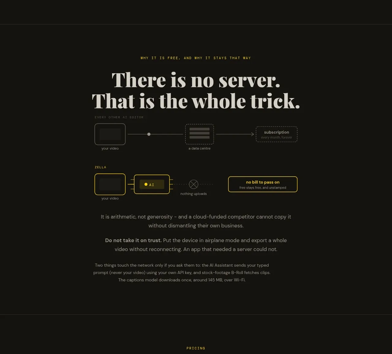
A focused trust section contrasts a remote-server workflow with an on-device workflow, using simple diagrams and clear explanatory copy to turn privacy into a concrete product advantage.
Prompt preview
## Reference images

Study these alongside the description below: hierarchy, rhythm, spacing, colour. Build for the product you are asked about, using this design language.

- Component: https://kage-design-assets.t3.tigrisfiles.io/components/zella/1ad8c25d-9254-4564-a81b-c4a3a0594691-1789711356-4.webp
- Full page it was cut from: https://kage-design-assets.t3.tigrisfiles.io/screenshots/zella/1ad8c25d-9254-4564-a81b-c4a3a0594691-1789711295290-full.webp
- Component on Kage: https://kage.design/component/zella-feature-grid-3

## Before you start
Ask what the user's product and brand are, then apply the principles below to that product rather than copying the reference.

Build a centered privacy/value section with a small eyebrow and a two-line editorial headline. Show two compact side-by-side flow diagrams: a muted problematic path involving an external service and a brighter preferred path that keeps data local. Use boxes, arrows, crossed-out transfer cues, and a concise paragraph beneath explaining the tradeoff. Add a short bold reassurance statement and supporting footnote. Maintain a near-black background, warm ivory typography, low-contrast gray diagram elements, yellow highlight for the preferred path, and subtle green success cues. Keep the diagrams legible without decorative illustration and stack them vertically on mobile.

Never: use logos, product names, copy, illustrations, or imagery from the reference.
More components

 AI-powered helpdesk feature section
intercom.com · Feature grid
AI-powered helpdesk feature section
intercom.com · Feature grid
 Integrations and ecosystem section
intercom.com · Feature grid
Integrations and ecosystem section
intercom.com · Feature grid
 AI agent capabilities section
intercom.com · Feature grid
AI agent capabilities section
intercom.com · Feature grid
 Unified support experience overview
intercom.com · Feature grid
Unified support experience overview
intercom.com · Feature grid

 Core invoicing capabilities
sendinvo.com · Feature grid
Core invoicing capabilities
sendinvo.com · Feature grid
 Audience and trade types
sendinvo.com · Feature grid
Audience and trade types
sendinvo.com · Feature grid