 kage
kage
zellahq.com
Design analysis
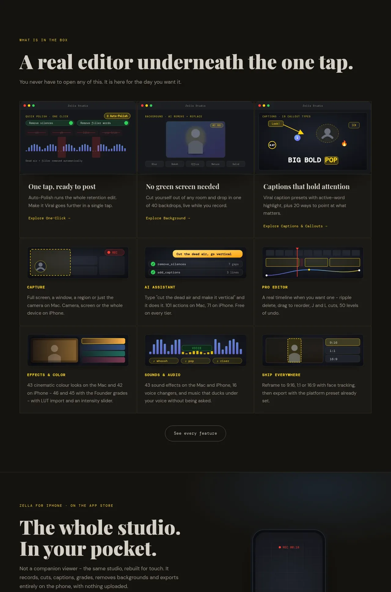
A broad feature section introduces the product surface, then presents nine visual cards in a consistent three-column grid with concise labels and exploration links.
Prompt preview
## Reference images

Study these alongside the description below: hierarchy, rhythm, spacing, colour. Build for the product you are asked about, using this design language.

- Component: https://kage-design-assets.t3.tigrisfiles.io/components/zella/1ad8c25d-9254-4564-a81b-c4a3a0594691-1789711357-6.webp
- Full page it was cut from: https://kage-design-assets.t3.tigrisfiles.io/screenshots/zella/1ad8c25d-9254-4564-a81b-c4a3a0594691-1789711295290-full.webp
- Component on Kage: https://kage.design/component/zella-feature-grid-4

## Before you start
Ask what the user's product and brand are, then apply the principles below to that product rather than copying the reference.

Build a feature gallery section with a small uppercase eyebrow, a large left-aligned serif heading, and one supporting sentence. Follow with a 3-column by 3-row grid of product feature cards. Every card should have a dark framed visual placeholder at the top, a compact title, two or three lines of explanation, and an optional small text link. Keep image areas consistent in height, use thin dividers between cards, and make the grid feel like one editorial system rather than unrelated tiles. Palette: #151613 cards, #111210 page, #e6e1d6 headings, #96968d body copy, and small yellow/green/blue accents. Add a centered secondary button below the grid. Make cards stack responsively and support keyboard focus.

Never: use logos, product names, copy, illustrations, or imagery from the reference.
More components

 AI-powered helpdesk feature section
intercom.com · Feature grid
AI-powered helpdesk feature section
intercom.com · Feature grid
 Integrations and ecosystem section
intercom.com · Feature grid
Integrations and ecosystem section
intercom.com · Feature grid
 AI agent capabilities section
intercom.com · Feature grid
AI agent capabilities section
intercom.com · Feature grid
 Unified support experience overview
intercom.com · Feature grid
Unified support experience overview
intercom.com · Feature grid

 Core invoicing capabilities
sendinvo.com · Feature grid
Core invoicing capabilities
sendinvo.com · Feature grid
 Audience and trade types
sendinvo.com · Feature grid
Audience and trade types
sendinvo.com · Feature grid