 kage
kage
zellahq.com
Design analysis
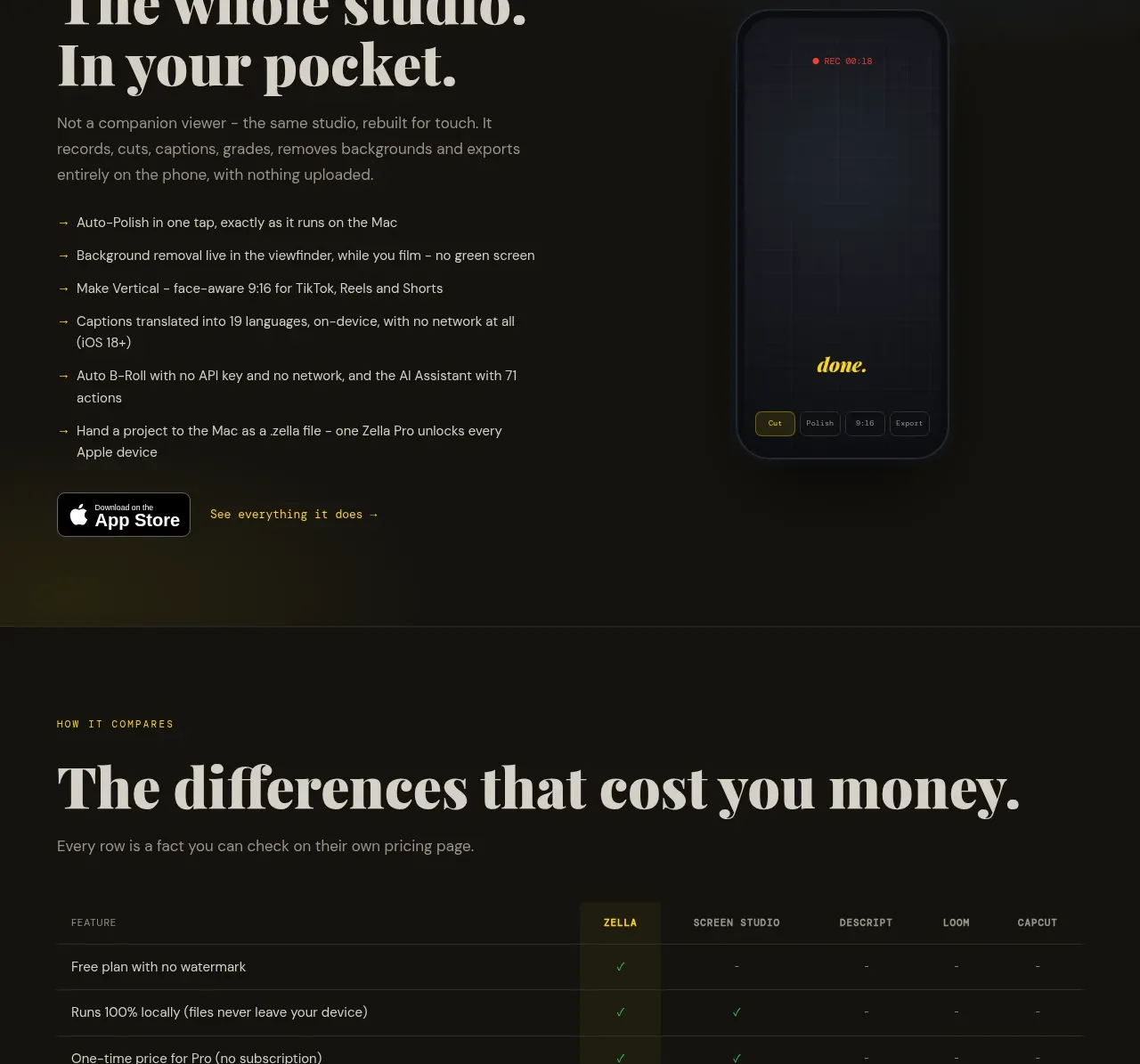
A split section makes the companion mobile experience tangible with a feature list, app-store-style action, and a tall device preview against a subtle atmospheric background.
Prompt preview
## Reference images

Study these alongside the description below: hierarchy, rhythm, spacing, colour. Build for the product you are asked about, using this design language.

- Component: https://kage-design-assets.t3.tigrisfiles.io/components/zella/1ad8c25d-9254-4564-a81b-c4a3a0594691-1789711357-7.webp
- Full page it was cut from: https://kage-design-assets.t3.tigrisfiles.io/screenshots/zella/1ad8c25d-9254-4564-a81b-c4a3a0594691-1789711295290-full.webp
- Component on Kage: https://kage.design/component/zella-feature-grid-5

## Before you start
Ask what the user's product and brand are, then apply the principles below to that product rather than copying the reference.

Create a split promotional section for a mobile companion experience. Place an eyebrow, large serif headline, supporting paragraph, and six short arrow-led benefits on the left; finish with a compact store/download badge and text link. On the right, show a tall rounded device frame containing a minimal abstract interface, with a soft blue-black glow behind it. Use a near-black background with a slightly cooler gradient in the visual half, warm ivory type, muted gray bullets, and yellow highlights. The device should be decorative but clearly subordinate to the copy. Stack the columns on mobile and move the device below the CTA.

Never: use logos, product names, copy, illustrations, or imagery from the reference.
More components

 AI-powered helpdesk feature section
intercom.com · Feature grid
AI-powered helpdesk feature section
intercom.com · Feature grid
 Integrations and ecosystem section
intercom.com · Feature grid
Integrations and ecosystem section
intercom.com · Feature grid
 AI agent capabilities section
intercom.com · Feature grid
AI agent capabilities section
intercom.com · Feature grid
 Unified support experience overview
intercom.com · Feature grid
Unified support experience overview
intercom.com · Feature grid

 Core invoicing capabilities
sendinvo.com · Feature grid
Core invoicing capabilities
sendinvo.com · Feature grid
 Audience and trade types
sendinvo.com · Feature grid
Audience and trade types
sendinvo.com · Feature grid