 kage
kage
zellahq.com
Design analysis
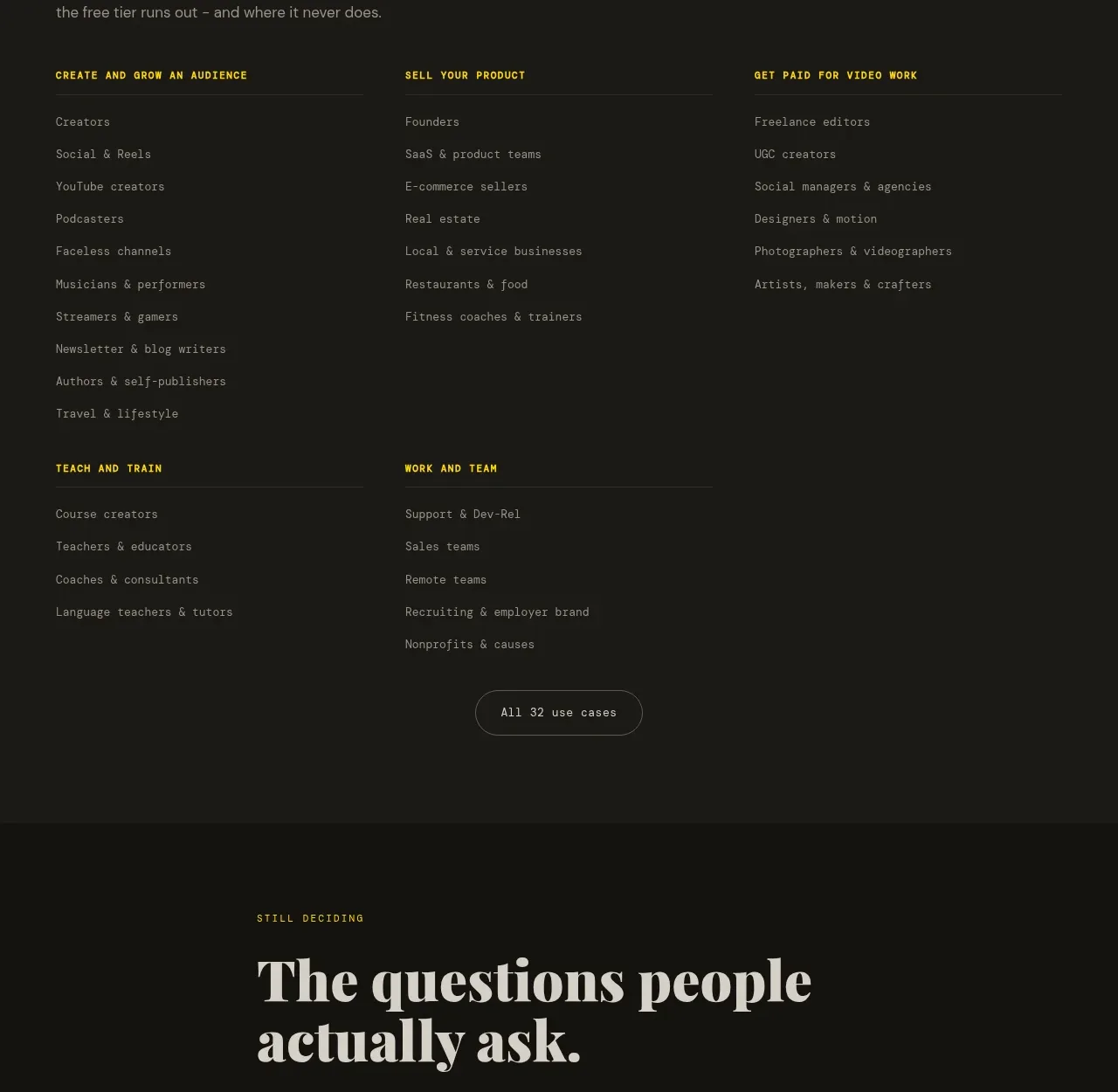
An audience-oriented directory organizes many use cases into labeled columns, helping visitors quickly recognize themselves and navigate deeper content.
Prompt preview
## Reference images

Study these alongside the description below: hierarchy, rhythm, spacing, colour. Build for the product you are asked about, using this design language.

- Component: https://kage-design-assets.t3.tigrisfiles.io/components/zella/1ad8c25d-9254-4564-a81b-c4a3a0594691-1789711358-9.webp
- Full page it was cut from: https://kage-design-assets.t3.tigrisfiles.io/screenshots/zella/1ad8c25d-9254-4564-a81b-c4a3a0594691-1789711295290-full.webp
- Component on Kage: https://kage.design/component/zella-feature-grid-6

## Before you start
Ask what the user's product and brand are, then apply the principles below to that product rather than copying the reference.

Create an audience/use-case section with a muted dark panel, a small eyebrow, a large two-line serif heading, and a short explanatory sentence. Under it, arrange several labeled category columns, each with a yellow uppercase category title and a vertical list of muted text links separated from the heading by a subtle rule. Keep column widths balanced and vertical rhythm consistent even when lists vary slightly. Finish with a centered outlined button to reveal more categories. Use #171815 panel background, #e5e0d5 headings, #92938b links, #e9cf16 accents, and thin #2b2c26 rules. Make the columns collapse to two and then one on narrow screens.

Never: use logos, product names, copy, illustrations, or imagery from the reference.
More components

 AI-powered helpdesk feature section
intercom.com · Feature grid
AI-powered helpdesk feature section
intercom.com · Feature grid
 Integrations and ecosystem section
intercom.com · Feature grid
Integrations and ecosystem section
intercom.com · Feature grid
 AI agent capabilities section
intercom.com · Feature grid
AI agent capabilities section
intercom.com · Feature grid
 Unified support experience overview
intercom.com · Feature grid
Unified support experience overview
intercom.com · Feature grid

 Core invoicing capabilities
sendinvo.com · Feature grid
Core invoicing capabilities
sendinvo.com · Feature grid
 Audience and trade types
sendinvo.com · Feature grid
Audience and trade types
sendinvo.com · Feature grid