kage
kage
zellahq.com
Design analysis
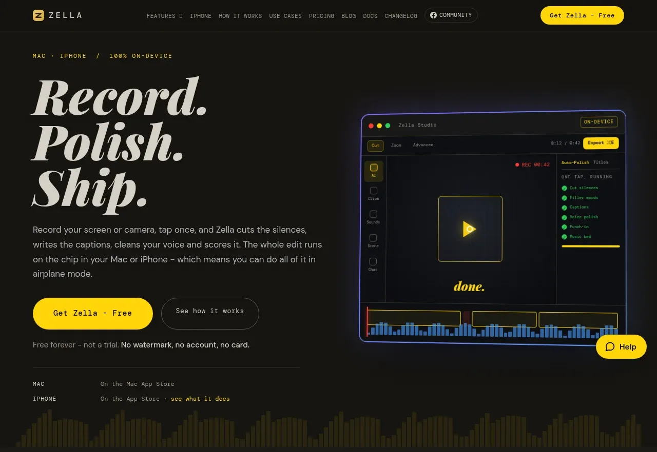
The hero pairs an oversized editorial headline and concise promise with two CTAs, trust microcopy, and a large editor preview that makes the workflow immediately tangible.
Prompt preview
## Reference images

Study these alongside the description below: hierarchy, rhythm, spacing, colour. Build for the product you are asked about, using this design language.

- Component: https://kage-design-assets.t3.tigrisfiles.io/components/zella/1ad8c25d-9254-4564-a81b-c4a3a0594691-1789711355-1.webp
- Full page it was cut from: https://kage-design-assets.t3.tigrisfiles.io/screenshots/zella/1ad8c25d-9254-4564-a81b-c4a3a0594691-1789711295290-full.webp
- Component on Kage: https://kage.design/component/zella-hero

## Before you start
Ask what the user's product and brand are, then apply the principles below to that product rather than copying the reference.

Create a dark two-column hero directly beneath the navigation. On the left, place a tiny uppercase eyebrow, a very large high-contrast serif headline with tight line-height, a short supporting paragraph, a filled yellow pill CTA and a quiet outlined secondary CTA. On the right, show an abstract product interface preview with subtle glow, thin borders, and enough detail to communicate the workflow without relying on a literal screenshot. Use a near-black canvas (#121310), warm ivory type (#e6e1d5), muted gray copy (#96968d), yellow accent (#f5d313), and faint olive/blue interface highlights. Keep the hero vertically generous, with trust or availability microcopy beneath the actions and a restrained visual divider before the next section. On mobile, stack text above the visual and preserve the headline hierarchy.

Never: use logos, product names, copy, illustrations, or imagery from the reference.