kage
kage
reasonmachines.com
Design analysis
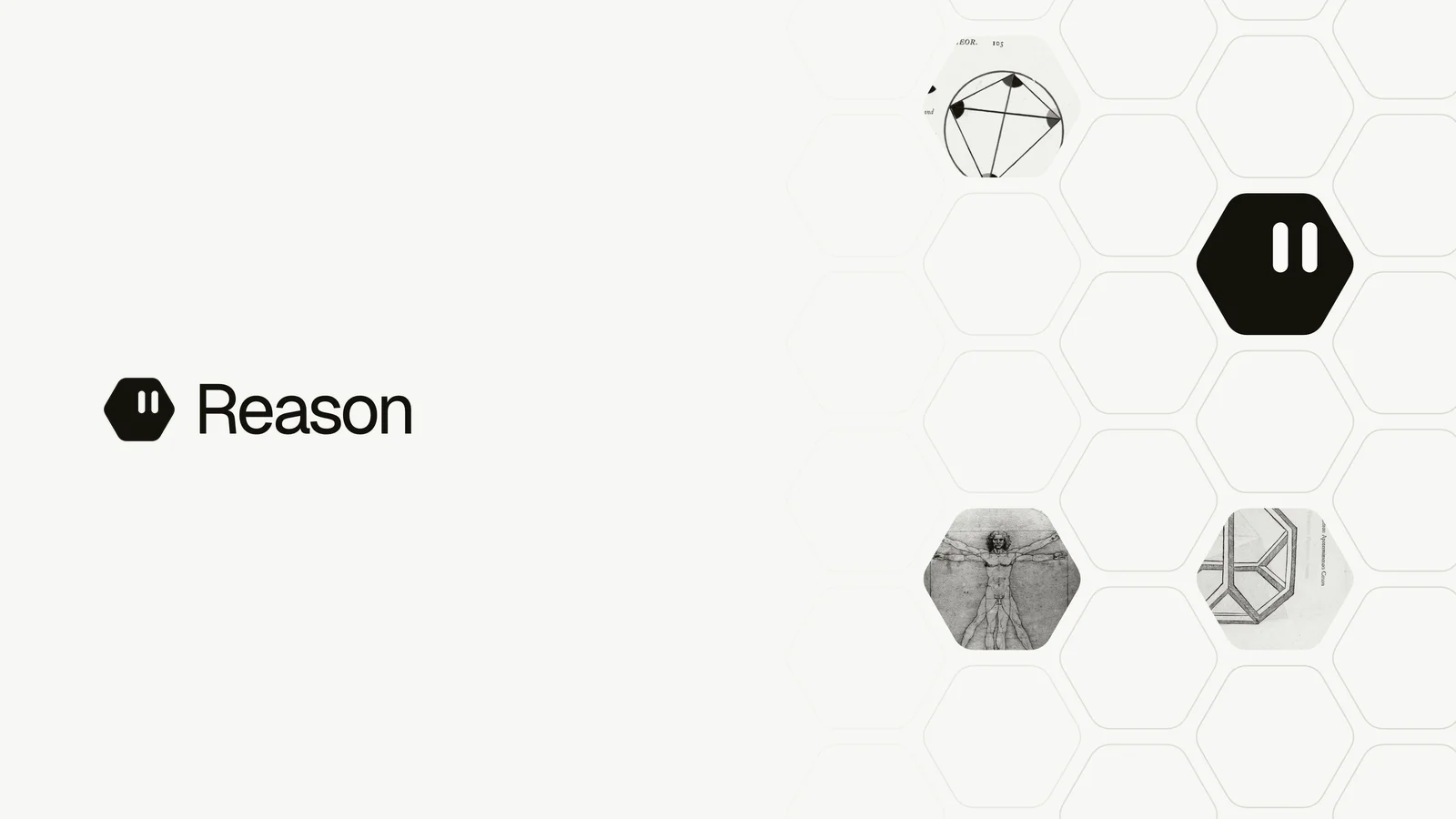
A 1200×630 social card uses a quiet off-white canvas with a strong left-side wordmark and a dense, cropped hexagonal field occupying the right third. The black geometric mark is the main focal point within the pattern, while tiny monochrome diagrammatic images add texture; thin gray outlines, generous negative space, and restrained sans-serif typography keep the composition editorial and high-contrast.
Prompt preview
## Reference images

Study these alongside the description below: hierarchy, rhythm, spacing, colour. Build for the product you are asked about, using this design language.

- Screenshot: https://kage-design-assets.t3.tigrisfiles.io/screenshots/reason/7a3c1ab7-cbfe-4d23-8e5b-63a4fbf4fe9d-1792044194662.webp
- Design on Kage: https://kage.design/designs/reason-og-image

## Before you start
Ask the user what they are building, who it is for, and what brand assets they already have, including the brand name, colours, typefaces, logo or symbol, and the copy to feature. Wait for their answers before proceeding. Apply everything below to their product, not to the reference brand.

## Page structure
- **1200×630 social-card canvas:** Create a fixed 1200 by 630 pixel composition intended for Open Graph sharing, with an off-white background and no scrolling page chrome.
- **Primary brand lockup:** Place a compact placeholder symbol and placeholder wordmark on the left half, around the vertical center, with generous surrounding negative space.
- **Right-side geometric field:** Build a cropped honeycomb/hexagonal grid concentrated on the right third and extending slightly toward the center, using many thin outlined cells.
- **Focal geometric tile:** Set one prominent dark hexagonal tile in the upper-right/mid-right area, containing a simple placeholder symbol or abstract mark in a contrasting light colour.
- **Secondary image tiles:** Add two or three smaller hexagonal cells within the right-side grid containing subtle monochrome abstract diagrams or placeholder textures; keep them subordinate to the brand lockup and focal tile.
- **Optional headline treatment:** If the product needs a headline, place a short placeholder headline in the open left area near the lockup, preserving the same sparse hierarchy rather than filling the canvas.

## Design language
- **Compose asymmetrically:** Keep approximately two-thirds of the canvas quiet and open on the left, while the right side carries the visual complexity; do not center the composition.
- **Use restrained contrast:** Set the background to a warm off-white near `#F7F7F5`, primary text and the focal tile near `#11110D`, and grid strokes in a very light gray near `#D9D9D5`.
- **Build hierarchy through scale and space:** Make the wordmark the clearest textual element, use a simple modern sans-serif at a large readable size, and let whitespace separate it from the patterned field.
- **Keep typography neutral:** Use a clean grotesk or humanist sans-serif, with regular-to-medium weight, tight but not compressed tracking, and no decorative effects or gradients.
- **Use geometry as imagery:** Construct repeated flat-topped or pointy-topped hexagons with consistent thin outlines; crop the grid at the canvas edges so it feels like an excerpt from a larger system.
- **Limit colour:** Use only off-white, black, and pale gray by default, with light content inside the dark tile; avoid colourful accents unless the user’s brand requires them.
- **Treat detail as texture:** Make secondary diagrams tiny, grayscale, and low contrast—technical line drawings, abstract nodes, or archival-style marks—so they enrich the card without competing with the wordmark.
- **Avoid effects:** Use no drop shadows, glossy surfaces, heavy borders, rounded rectangular cards, or gradients. The visual language should feel precise, quiet, and editorial.
- **Render as an image:** Implement the card as SVG or HTML/CSS rendered to PNG, ensuring text and geometric edges remain crisp at exactly 1200×630. Provide a deterministic export path and keep all placeholder assets local or procedurally generated.

## Never
- Do not use the reference brand’s logo, wordmark, product name, tagline, copy, exact symbol, or source imagery.
- Do not reproduce the reference card pixel-for-pixel; create an original card using the same sparse left/right composition and geometric-grid principles.
- Do not add logos, wordmarks, product names, copy, illustrations, photography, or icon sets from the reference.
- Never present the result as Reason or imply affiliation with it.