kage
kage

Design analysis
A two-person software studio site built on a warm cream canvas with hairline rules and an alternating band rhythm: cream hero, cream studio intro, near-black craft section, cream project list, lilac contact band. Hierarchy is carried almost entirely by an enormous tight-tracking grotesque display face against small grey body text, with colour used only as punctuation — a gradient underline, a lilac word, a purple question mark. The playful layer (eyed mascot, pixel sprites, tilted letter stickers, hand-drawn arrow) sits against a rigorously ordered grid, and the dark band proves the studio's 'software that feels good' claim with three genuinely interactive widgets: a London clock, a weather card with hourly forecast, and a playable audio tile.
Prompt preview
## Reference images

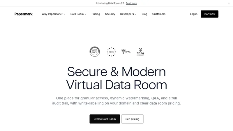
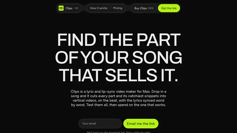
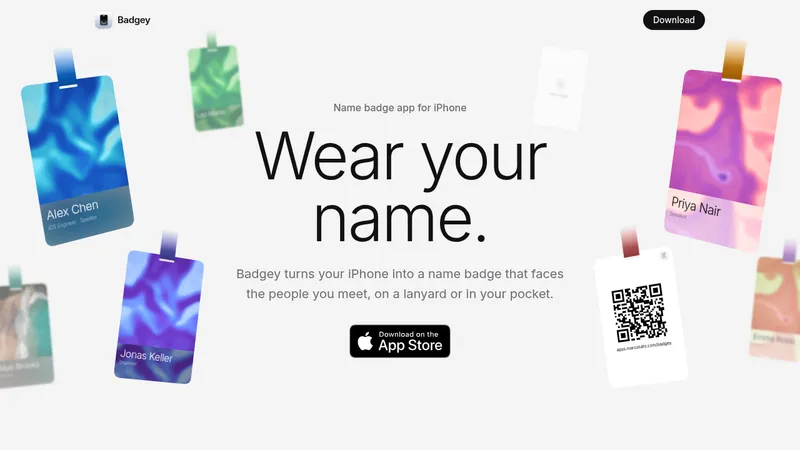
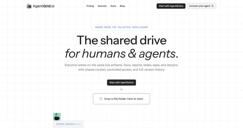
Study these alongside the description below: hierarchy, rhythm, spacing, colour. Build for the product you are asked about, using this design language.

- Full page: https://kage-design-assets.t3.tigrisfiles.io/screenshots/madebydaedalus-com/ae0cc407-2597-43fd-9c0f-0722227b2dcc-1789060515-full.webp
- Above the fold: https://kage-design-assets.t3.tigrisfiles.io/screenshots/madebydaedalus-com/ae0cc407-2597-43fd-9c0f-0722227b2dcc-1789060052747.webp
- Design on Kage: https://kage.design/designs/madebydaedalus-landing-page

## Before you start
Ask the user what they are building, who it is for, and what brand assets they already have (name, colours, type, any mascot or mark). Wait for the answers before writing any code — everything below is applied to their product, not to the reference site.

## Page structure
1. **Top nav** — slim bar on cream: small geometric logo mark + wordmark left; three plain text links plus a dark fully-rounded pill CTA with an arrow glyph right; 1px hairline underneath.
2. **Hero** — left column: eyebrow line with a leading em dash, a three-line display headline where one line gets a soft gradient underline, a two-line grey subtext, a dark pill CTA with a small aside note beside it. Right column: a large playful gradient mascot shape with two eyes, floating pixel-sprite crosses in accent colours, a thin orbit ellipse, and a hand-drawn arrow with a cheeky caption. Close the hero with a hairline row: a short motto left, a scroll-down link right.
3. **Studio intro** — two columns. Left: eyebrow with dash, two small tilted sticker tiles (one letterform, one code glyph) and a two-line caption. Right: a two-line headline and a two-column body paragraph explaining who the team is.
4. **Dark craft band** — full-width near-black section. Top row: eyebrow with dash left, a small 'replay' control right. Huge headline with one word in a lilac gradient; right-aligned column of short paragraphs ending in a 'have a play' nudge. Below: three interactive widget cards side by side, each self-contained: (a) a cream clock card with location header, tick-ring dial, live time and date, and a 24h toggle; (b) a warm weather card with an illustrated sun-and-cloud, big temperature, condition line, a four-slot hourly forecast row and a data-source link; (c) a lilac audio card with petal illustration, track title, scrub slider, play button, elapsed/total time and a speed control. A single-line caption sits under the trio.
5. **Projects list** — cream again. Left: eyebrow, two-line headline, two-line subtext. Right: three rows separated by hairlines, each with product name + small domain, one-line description, and an up-right arrow that should nudge on hover.
6. **Contact band** — soft lilac full-width section: eyebrow, a huge two-line question headline with the final punctuation in accent purple, two short invitation lines, a dark pill CTA pushed right, then email address with a copy-to-clipboard pill and a closing one-liner.
7. **Footer** — hairline-topped cream row: logo + wordmark left, tagline centred, a reduced-motion toggle and copyright right.

## Design language
- **Rhythm by colour block, not decoration.** Alternate full-width bands — cream → cream → near-black → cream → lilac → cream — so the page has chapters. Keep every band on one flat background colour; no images-as-backgrounds.
- **Palette.** Warm cream base `#FAF6EE`; ink `#1B1A17` for dark sections and text; lilac band `#EDE8F6`; accent purple `#8B72E9`; a soft multi-stop gradient (`#F2C94C → #F08BC0 → #7FB0EE → #9B7BEA`) reserved for one hero shape and one underline. Grey `#8A867E` for body text.
- **Type.** One geometric grotesque family throughout. Display scale is extreme: ~clamp(64px, 9vw, 120px), line-height ~0.95, letter-spacing -0.02em, sentence case with full stops. Body 15–16px/1.6 in grey. Eyebrows ~13px with a leading em dash — this dash-plus-small-caps-free pattern marks every section start.
- **Hierarchy from scale contrast.** Big headline vs tiny grey body does the work; avoid bold-weight stacking, avoid decorative dividers beyond 1px hairlines.
- **Borders and radius.** 1px hairlines (`#E6E0D5`) structure the page: nav underline, hero footer strip, project rows, footer top. Buttons are fully-rounded dark pills with white 14px text and an arrow glyph. Cards use 20–28px radius, flat fills, no visible shadow or use a very soft one.
- **Colour as punctuation.** Gradients and accent colour appear on exactly one element per section (mascot, one gradient word, one purple question mark, one accent widget card). Everything else stays neutral.
- **Playful layer over strict grid.** Tilted sticker tiles, floating pixel sprites, hand-drawn arrow annotations and an eyed mascot are allowed, but they orbit the layout, never break it.
- **Widgets as proof of craft.** Where the page makes a claim about quality, show it: small self-contained interactive cards (clock, weather, audio player) each with a header row, a focal visual, and real data/controls. Build these as genuine working components, not screenshots.
- **Motion.** Small and purposeful: arrows nudge on hover, copy button confirms, the dark band's demo can be replayed, and a reduced-motion toggle in the footer actually disables animation.
- **Density curve.** Airy and typographic at top and bottom, denser only in the widget band; generous section padding (~120px) everywhere.

## Never
- Do not reuse the Daedalus name, wing metaphor copy, logo, eyed-star mascot, pixel sprite set, or their products (FPLXI, Uini, Stowdrop) or their descriptions.
- Do not copy any headline, tagline, email, or caption text from the reference.
- Never present the output as Daedalus or imply it is their site; apply the design language to the user's own brand and content.
Components from this page
All components
 Minimal studio navigation bar
madebydaedalus.com · Navigation
Minimal studio navigation bar
madebydaedalus.com · Navigation
 Playful split-screen studio hero
madebydaedalus.com · Hero
Playful split-screen studio hero
madebydaedalus.com · Hero
 Two-sided feature statement
madebydaedalus.com · Feature grid
Two-sided feature statement
madebydaedalus.com · Feature grid
 Playful product card gallery
madebydaedalus.com · Gallery
Playful product card gallery
madebydaedalus.com · Gallery
 Editorial project list feature grid
madebydaedalus.com · Feature grid
Editorial project list feature grid
madebydaedalus.com · Feature grid
 Playful split-layout contact CTA
madebydaedalus.com · Call to action
Playful split-layout contact CTA
madebydaedalus.com · Call to action
 Minimal brand footer
madebydaedalus.com · Footer
Minimal brand footer
madebydaedalus.com · Footer