 kage
kage
upstash.com

Design analysis
A serverless-data-platform landing page built on a mint-to-green gradient canvas with oversized display typography that shifts from gradient-filled hero text to a full-bleed 'Fast Anywhere' band over a dotted globe. The page alternates airy white rounded cards and dark terminal blocks, using a bento grid for the platform section, numbered feature columns inside the product panel, big green stat numerals, a script-type testimonial with a lozenge logo wall, and a minimal centered footer. Density rises in the middle (code, pricing boxes, diagrams) and relaxes again toward community and footer, giving the long page a clear light–dense–social rhythm.
Prompt preview
## Reference images

Study these alongside the description below: hierarchy, rhythm, spacing, colour. Build for the product you are asked about, using this design language.

- Full page: https://kage-design-assets.t3.tigrisfiles.io/screenshots/upstash-com/210669b2-56ab-47a0-9be6-e94255ecbd31-1789073722-full.webp
- Above the fold: https://kage-design-assets.t3.tigrisfiles.io/screenshots/upstash-com/210669b2-56ab-47a0-9be6-e94255ecbd31-1789073644436.webp
- Design on Kage: https://kage.design/designs/upstash-landing-page

## Before you start
Ask the user: what product or service are you building this landing page for, who is the primary audience, and what brand assets already exist (name, logo, brand colours, typeface)? Wait for the answers. Every rule below is applied to *their* product, not to the reference site.

## Page structure
1. **Announcement bar** — a slim full-width pill in pale mint with one line of news text and a trailing arrow; links to the newest feature.
2. **Top navigation** — logo left, 5–6 short text links centre, a single solid-colour pill button right; sits on the page's light background with no border.
3. **Hero** — two-line display headline at very large size with a colour-gradient fill, one short subtitle, then two CTAs: a solid pill button and an outlined dropdown-style button with small inline icons.
4. **Product tab strip** — 4 tab cards (product names) directly under the hero; the active tab is a white card, inactive tabs are flat and ghosted.
5. **Active product panel** — one large white rounded card containing: a centred product heading, a row of three action pills (one filled, two outlined), then three equal columns each with a bold two-line title and a numbered list (① ② ③ circled digits). Below, a dark code explorer: left sidebar listing use-case examples, top tabs for languages, and a syntax-highlighted snippet with line numbers.
6. **Immersion band** — a full-width section with giant display text running edge-to-edge over a dotted point-cloud globe illustration, followed by a floating white stats strip: four columns of large coloured numerals with tiny grey labels, plus a one-line footnote.
7. **Platform bento grid** — centred section heading + subtitle on a deeper tint of the background colour, then white rounded cards in an asymmetric grid: a latency visualisation card, a pricing card with three small stat boxes, a wide card pairing a product-tab row with a dark code block, and a narrower card with an orbit/radial diagram.
8. **AI-agents section** — heading + subtitle, then one wide card (description on the left, a dark terminal command chip with a copy button on the right, plus small "works with" pills) and two half-width cards below, each with title, body text, a terminal chip or link, and an arrow link.
9. **Social proof** — heading + subtitle, a large white card with the customer name set in a script/serif face above a single quote, carousel dots beneath, then a grid of ~15 customer logos each inside its own rounded lozenge, closed by a single underlined text link.
10. **Community row** — heading + subtitle, four equal white cards each with a line icon, one-line description, and a small pill button with an external-link arrow.
11. **Footer** — centred and minimal: logo, one copyright line, four small legal links, two status pills with coloured dots, and a paragraph of fine-print legal text in small grey type.

## Design language
- **Canvas over cards:** the page background is a vertical gradient (approx `#eaf6ee` → `#cfe9d6` → `#b7e0c4`) and all content lives on white (`#ffffff`) rounded cards (radius 16–24px) with hairline borders (`rgba(0,0,0,0.06)`) and very soft shadows. Sections never hard-edge; the gradient deepens mid-page and lightens again toward the footer.
- **One brand colour carries everything:** a single saturated green (approx `#10a35a`) for CTAs, numerals, icons, links and active states, with a lime shift (approx `#9ccc3c`) reserved for gradient fills on display type. Accent neutrals: text `#111418`, secondary text `#5b6660`.
- **Dark blocks as punctuation:** code explorers and terminal chips are near-black (`#0d1117`) with light syntax colours and green accents; they break the white rhythm and signal "real product". Use them sparingly — two or three per page.
- **Type scale by contrast, not weight:** one geometric sans throughout. Display headlines at 90–140px with tight tracking; the hero fills the viewport width. Section headings 36–48px, card titles 20–24px bold, body 14–16px in the secondary grey. Monospace only for code, terminal chips and stats labels. A script or serif face may appear exactly once (testimonial signature) as a human accent.
- **Numbered micro-arguments:** feature lists use circled digits (①②③) instead of bullets — each card makes exactly three short claims.
- **Stats as typography:** large numerals in the brand colour at 32–40px with 11px grey labels underneath, arranged in a floating 4-column strip; always include a small footnote line.
- **Bento rhythm:** alternate wide + narrow cards (2:1) and pair every abstract claim with a concrete artifact — a chart, a pricing box trio, a code snippet, or a diagram — so each card is self-evident without reading the body copy.
- **Density curve:** open and airy in hero and immersion band, densest in the platform and agent sections, airy again for community and footer. Keep generous vertical padding (80–120px) between sections.
- **Interaction:** pill-shaped buttons everywhere; hover = slight darkening/border emphasis; tabs swap panel content; carousels use small round dots with the active one elongated or coloured; links end with a small ↗ or → glyph.

## Never
- Never use Upstash's name, logo, wordmark, headline copy, or its customers' logos (Meta, Vercel, Coinbase, etc.) in the output.
- Never copy the reference's product names (Redis, QStash, Vector, Workflow), code snippets, or testimonial text.
- Never reproduce the dotted-globe artwork or the edge-orbit diagram as-is; build an equivalent visualisation from the user's own product concepts.
- Never present the result as Upstash or imply any affiliation; it is a new product wearing this design language.
Components from this page
All components
 Announcement Bar + Minimal SaaS Navigation
upstash.com · Navigation
Announcement Bar + Minimal SaaS Navigation
upstash.com · Navigation
 Gradient SaaS product hero
upstash.com · Hero
Gradient SaaS product hero
upstash.com · Hero
 Tabbed product feature grid
upstash.com · Feature grid
Tabbed product feature grid
upstash.com · Feature grid
 Floating metrics spotlight
upstash.com · Stats
Floating metrics spotlight
upstash.com · Stats
 Serverless feature grid
upstash.com · Feature grid
Serverless feature grid
upstash.com · Feature grid
 Agent-ready feature card grid
upstash.com · Feature grid
Agent-ready feature card grid
upstash.com · Feature grid
 Testimonial carousel with customer proof grid
upstash.com · Testimonials
Testimonial carousel with customer proof grid
upstash.com · Testimonials
 Community and resources feature grid
upstash.com · Feature grid
Community and resources feature grid
upstash.com · Feature grid
 Legal and developer resources footer
upstash.com · Footer
Legal and developer resources footer
upstash.com · Footer
Related designs
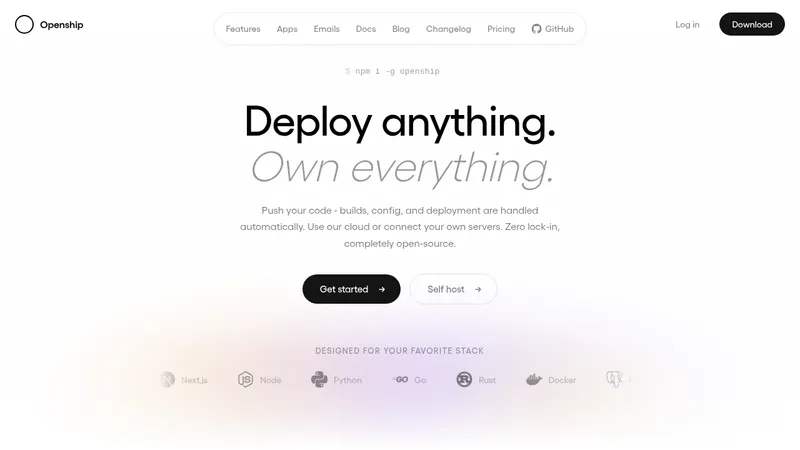

 OpenShip Cloud
Landing page · Cloud & infrastructure
OpenShip Cloud
Landing page · Cloud & infrastructure
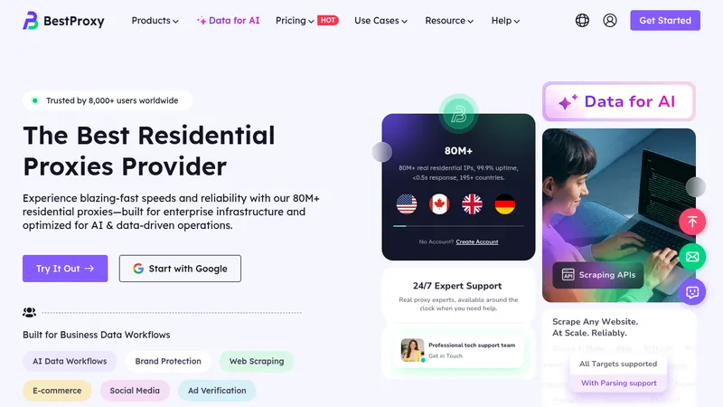

 bestproxy.com
Landing page · Cloud & infrastructure
bestproxy.com
Landing page · Cloud & infrastructure
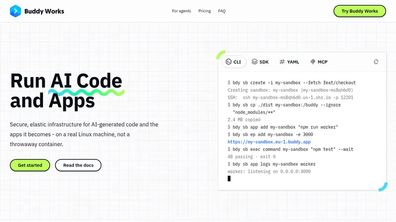

 AI Sandboxes by Buddy
Landing page · Cloud & infrastructure
AI Sandboxes by Buddy
Landing page · Cloud & infrastructure
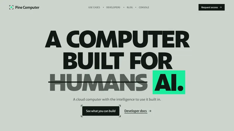

 Pine Computer
Landing page · Cloud & infrastructure
Pine Computer
Landing page · Cloud & infrastructure
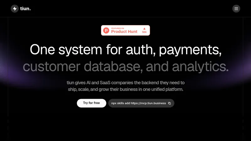

 tiun.
Landing page · Cloud & infrastructure
tiun.
Landing page · Cloud & infrastructure
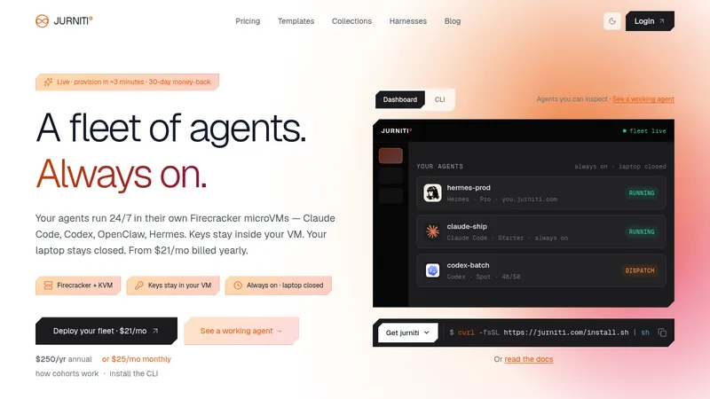

 jurniti
Landing page · Cloud & infrastructure
jurniti
Landing page · Cloud & infrastructure