kage
kage
adant.ai
Design analysis
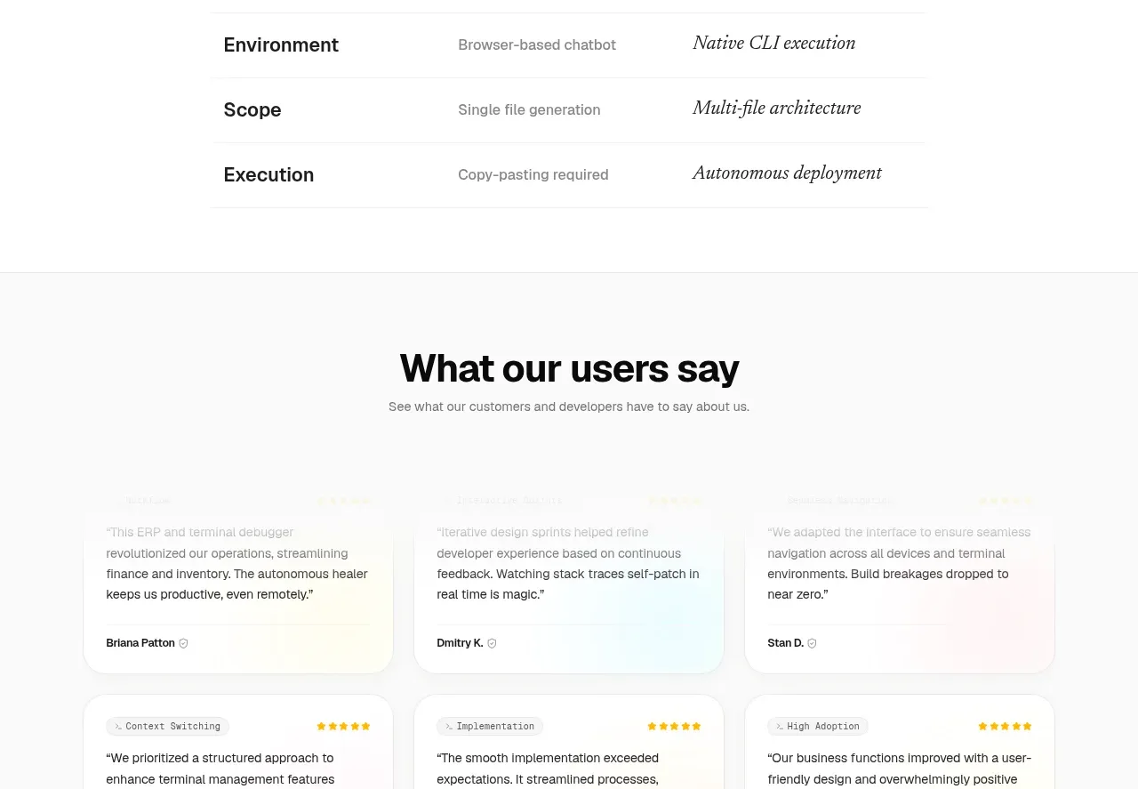
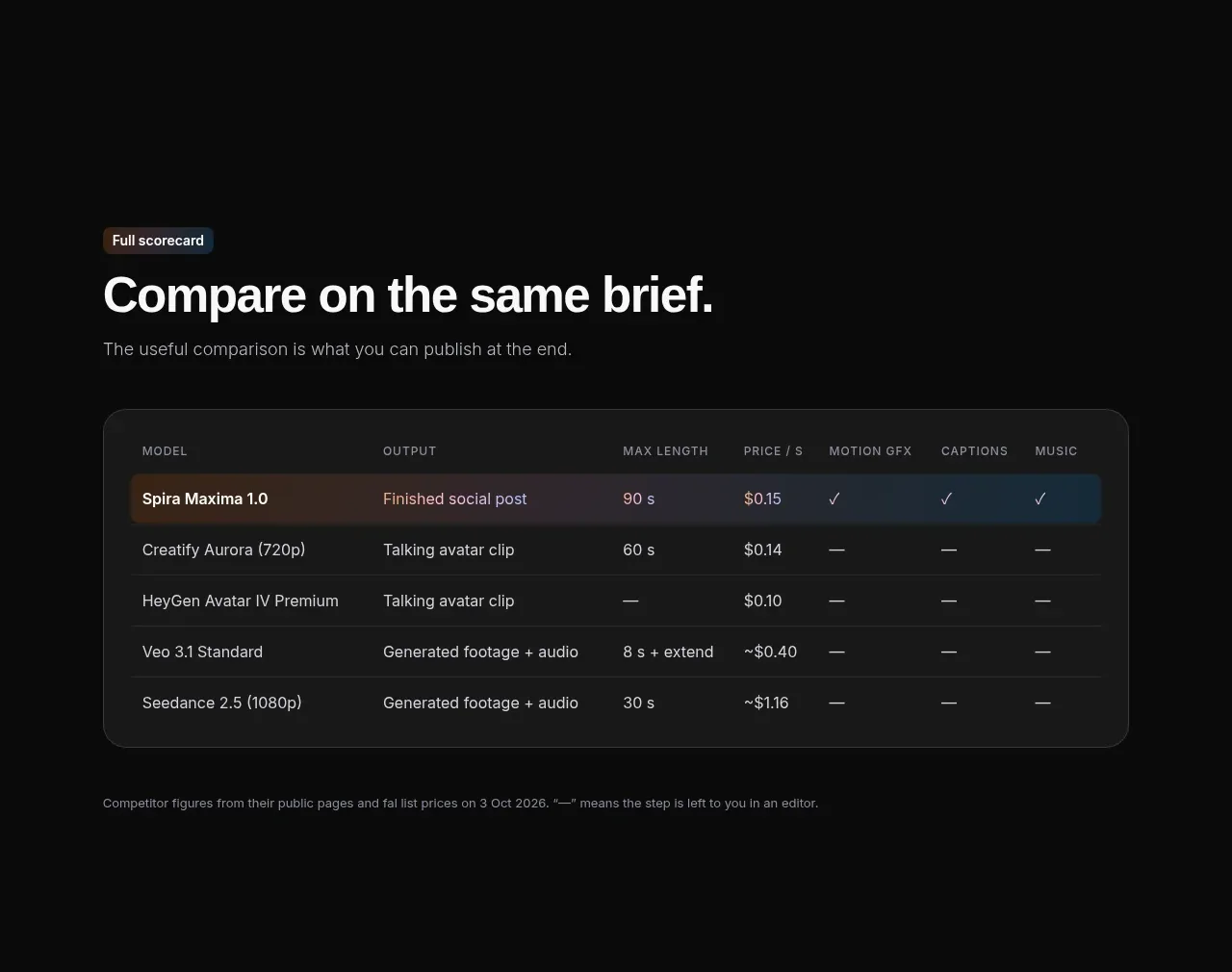
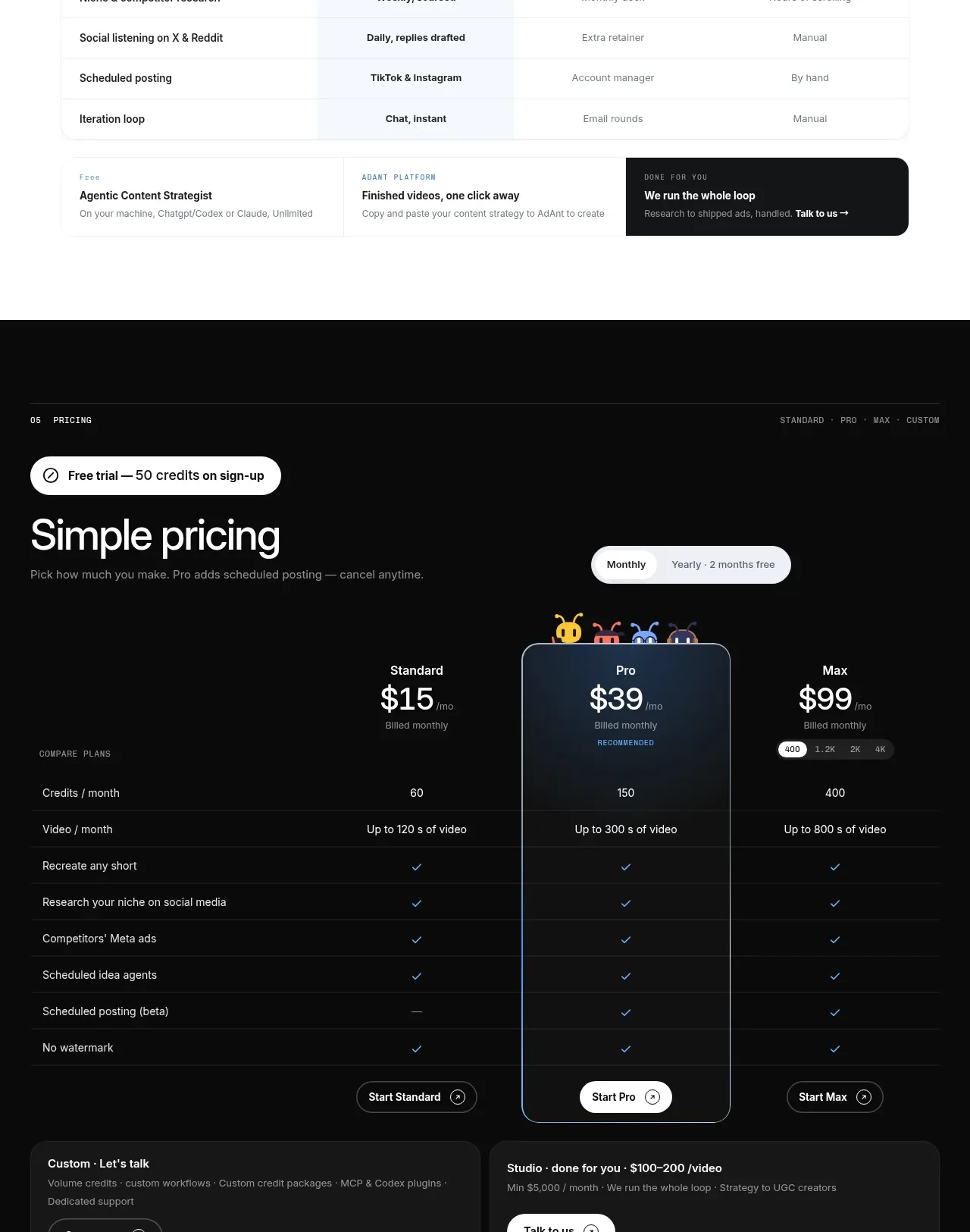
A light comparison section contrasts the product with slower alternatives across practical marketing workflow criteria, supported by a concise positioning headline.
Prompt preview
## Reference images

Study these alongside the description below: hierarchy, rhythm, spacing, colour. Build for the product you are asked about, using this design language.

- Component: https://kage-design-assets.t3.tigrisfiles.io/components/adant-2-0/1b13b0a2-e64e-418d-a933-0f40a66c40ee-1792044359-6.webp
- Full page it was cut from: https://kage-design-assets.t3.tigrisfiles.io/screenshots/adant-2-0/1b13b0a2-e64e-418d-a933-0f40a66c40ee-1792044250464-full.webp
- Component on Kage: https://kage.design/component/adant-2-0-table

## Before you start
Ask what alternatives customers compare against and which measurable criteria prove the user's product is better. Use those answers to define an original comparison.

Create a light comparison section with a small overline and a large headline that frames speed or another meaningful differentiator. Use a responsive table with a frozen first column of criteria and three or four alternatives across the top. Give the user's product column a very pale blue background and stronger typography; keep competitor columns neutral. Use thin #E6EAF0 horizontal rules, no heavy vertical grid, 14px row labels, 12–13px cell values, and simple check/neutral symbols. Add compact product markers above the highlighted column only if the brand system supports them. Keep the table max-width constrained, align numeric/short values centrally, and allow horizontal scrolling on small screens.

### Never
- Never use logos, product names, copy, illustrations, or imagery from the reference.
- Never make unsupported superiority claims or fabricate competitor data.
- Never allow the table to become unreadable on mobile.