kage
kage
blenny.fi5h.xyz
Design analysis
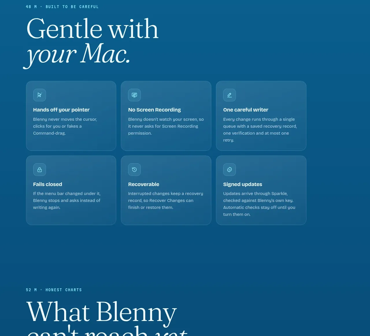
A focused limitations section uses a strong heading and five separated rows to clarify what the product cannot yet do.
Prompt preview
## Reference images

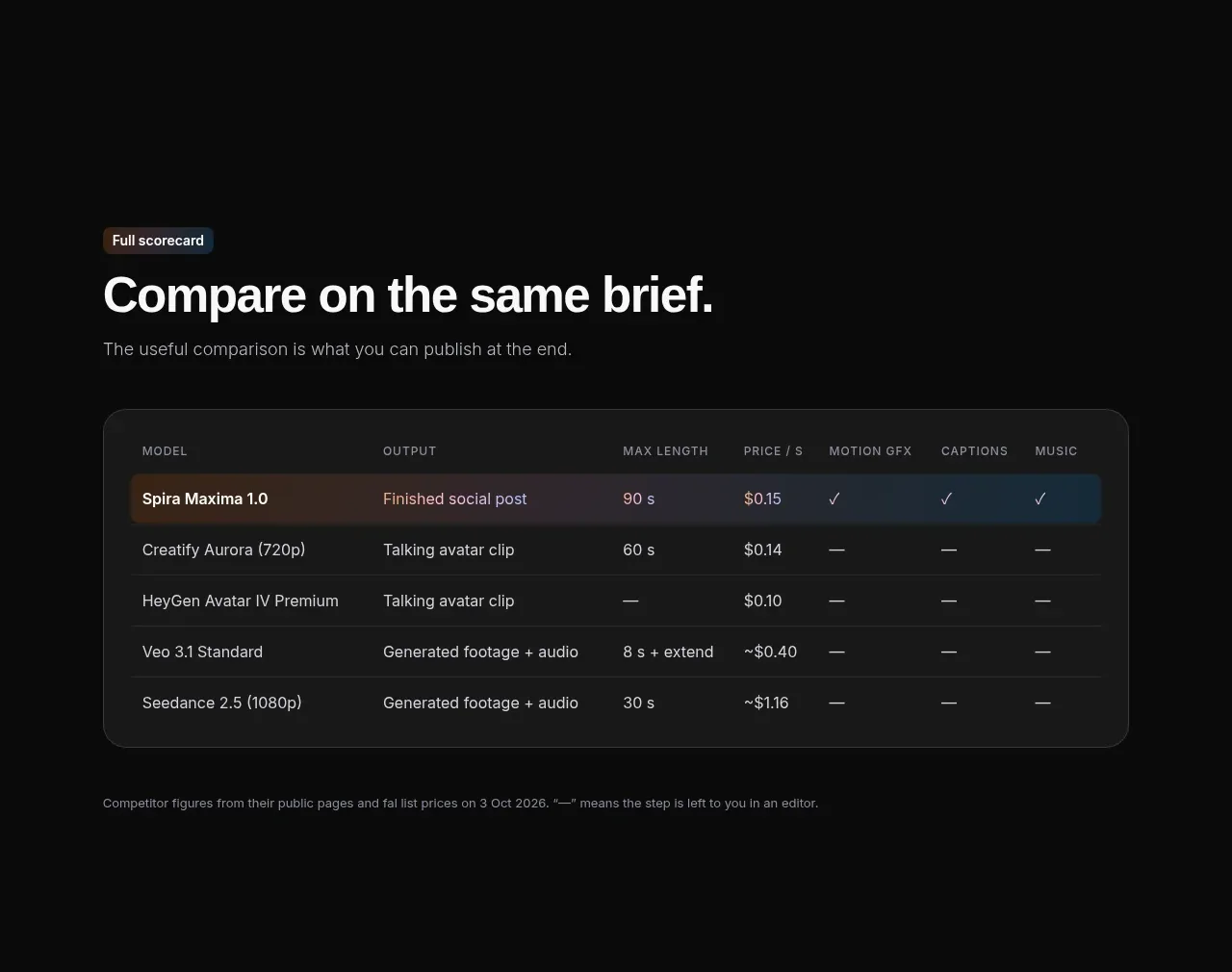
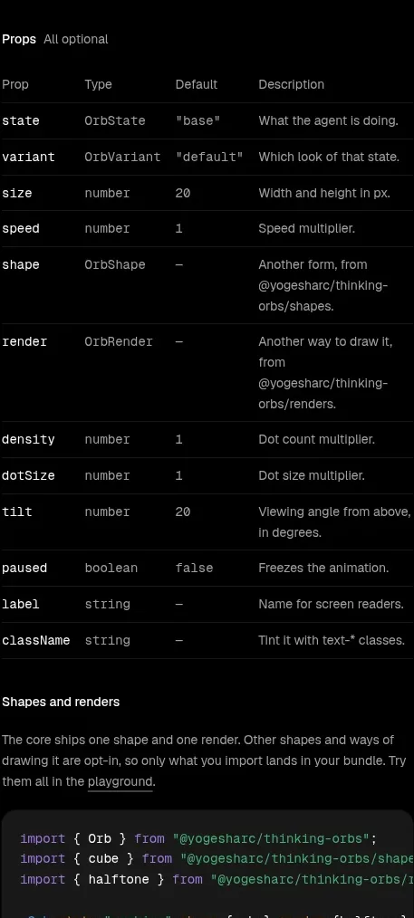
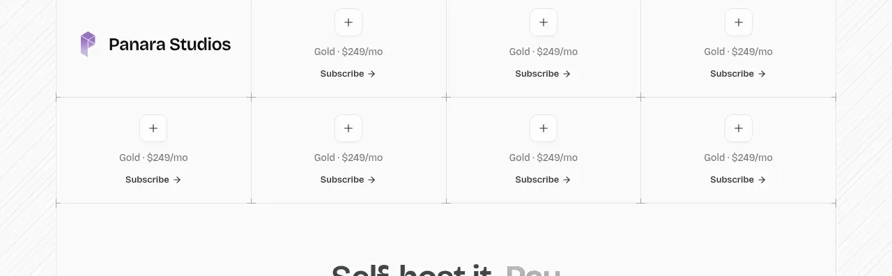
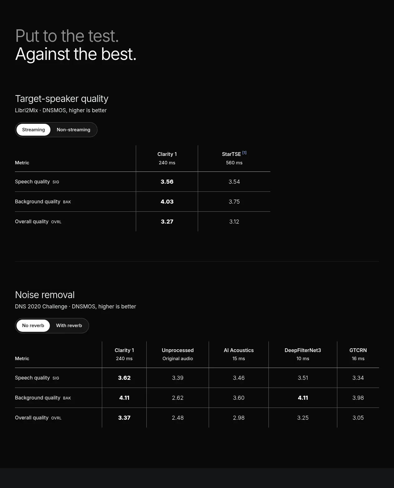
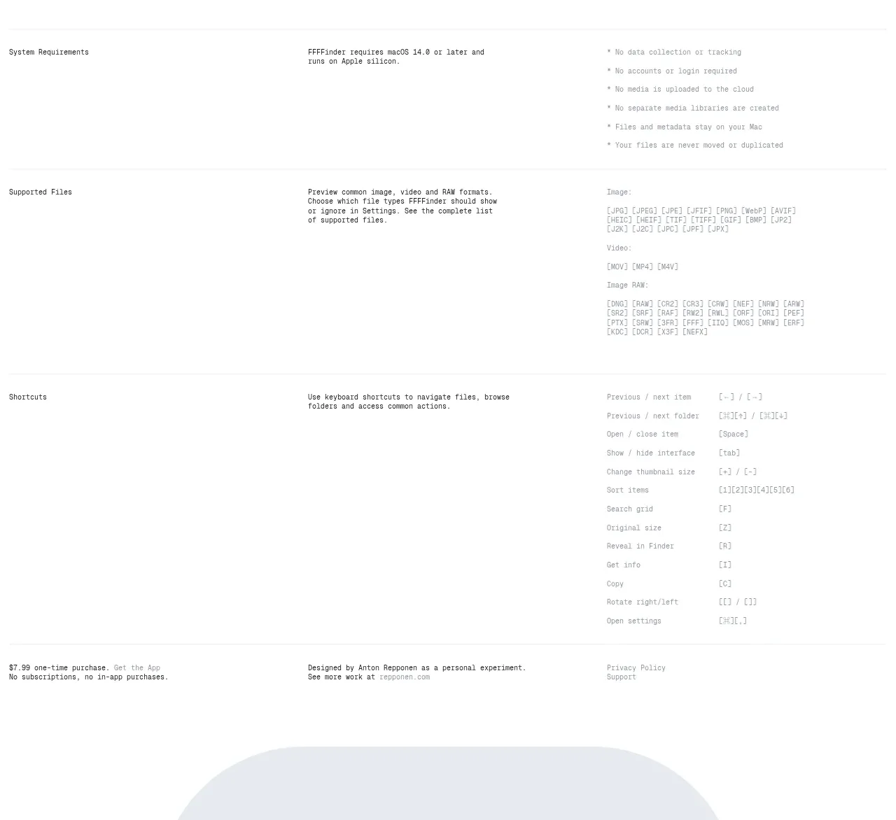
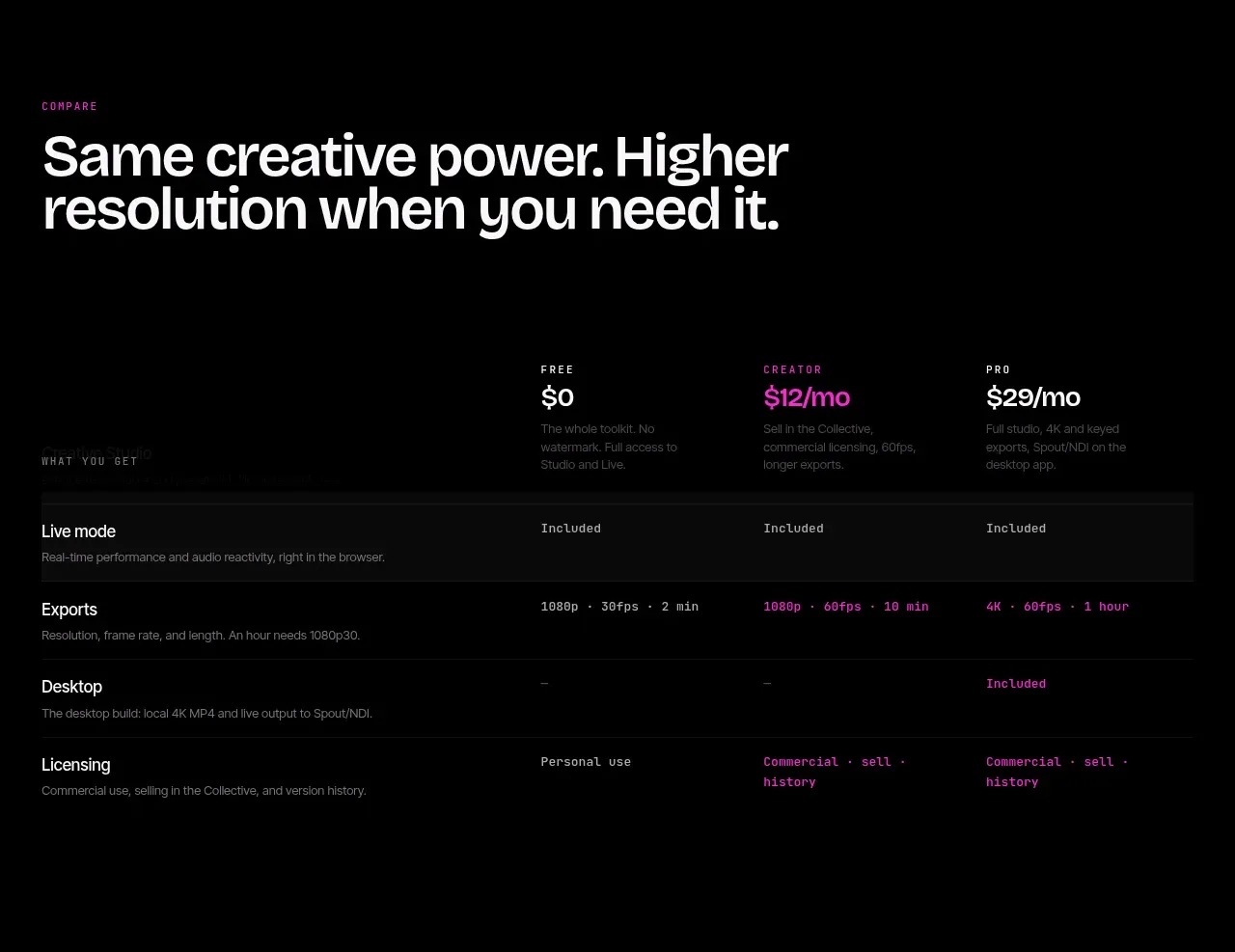
Study these alongside the description below: hierarchy, rhythm, spacing, colour. Build for the product you are asked about, using this design language.

- Component: https://kage-design-assets.t3.tigrisfiles.io/components/blenny/33d02076-57e4-4143-93c3-5008f6d9015f-1791180361-5.webp
- Full page it was cut from: https://kage-design-assets.t3.tigrisfiles.io/screenshots/blenny/33d02076-57e4-4143-93c3-5008f6d9015f-1791180160992-full.webp
- Component on Kage: https://kage.design/component/blenny-table

## Before you start
Ask the user what their product is, who it is for, and what their brand voice and visual identity are. Apply the principles below to that product rather than reproducing this reference.

Build a capability/limitations section with a large editorial title and a five-row list beneath it. Each row should have a small marker, a bold statement, and a supporting explanation; separate rows with thin horizontal rules and keep the text width readable. Use the same deep blue background around #0b5b85, light text, and a low-contrast rule around rgba(255,255,255,.14). Align the heading and list to the same left edge, with a max width around 640–760px. Keep row spacing generous and make the list scannable. On mobile, preserve the hierarchy by stacking the description below each bold label. If rows expand, use semantic disclosure controls and visible focus states.

Never use logos, product names, copy, illustrations, or imagery from the reference.