kage
kage
luneresearch.com
Design analysis
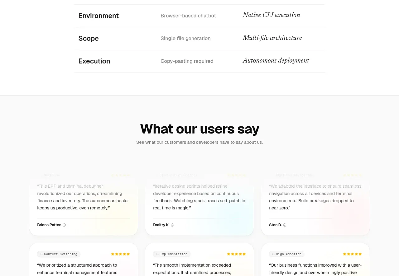
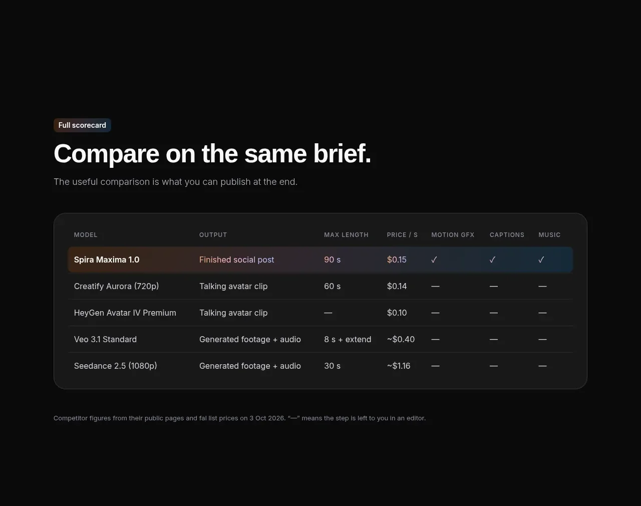
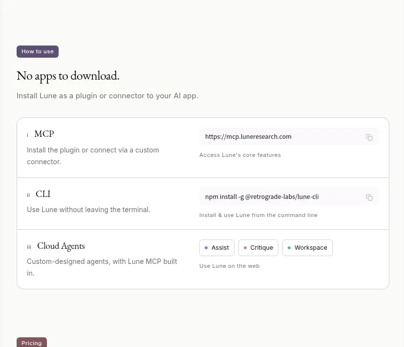
A practical three-row table compares installation or access methods, with the method on the left and endpoint/details on the right.
Prompt preview
## Reference images

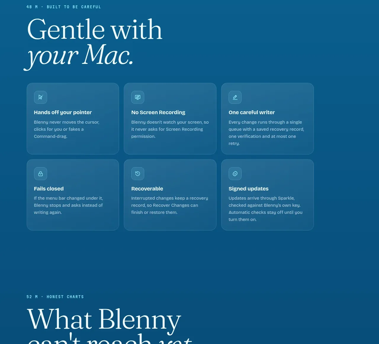
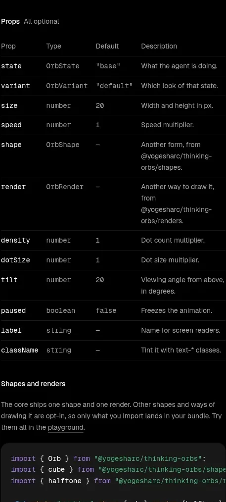
Study these alongside the description below: hierarchy, rhythm, spacing, colour. Build for the product you are asked about, using this design language.

- Component: https://kage-design-assets.t3.tigrisfiles.io/components/lune/4bf7ff48-f6a1-4cc9-aba1-cb69c6f24fa8-1791698509-4.webp
- Full page it was cut from: https://kage-design-assets.t3.tigrisfiles.io/screenshots/lune/4bf7ff48-f6a1-4cc9-aba1-cb69c6f24fa8-1791698434673-full.webp
- Component on Kage: https://kage.design/component/lune-table

## Before you start
Ask which installation, access, or deployment methods your product supports. Translate those into a concise comparison rather than copying the example rows.

Build a compact bordered options table beneath a small eyebrow, serif heading, and supporting sentence. Use three or four rows, each with a method name and icon on the left, a short explanation below it, and a right-side endpoint, command, or action area. Separate rows with hairlines; use small copy affordances where a command or URL is shown. Keep the table inside a white rounded container with 8px radius, #deded8 border, and 18–22px cell padding. Use #f8f8f5 background, #181817 text, #777772 metadata, and one subtle accent for badges. Typography should be 14–16px for method names, 11–12px for metadata, and monospace only for commands or URLs. Support keyboard copy buttons, responsive stacking, and clear hover/focus states.

Never: use the reference's logos, product names, copy, illustrations, imagery, or exact commands.