kage
kage
opensend.cc
Design analysis
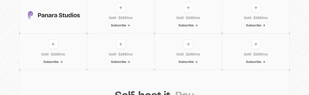
A bordered multi-column sponsor table repeats a simple tier offer across cells, creating a transparent, low-friction sponsorship surface.
Prompt preview
## Reference images

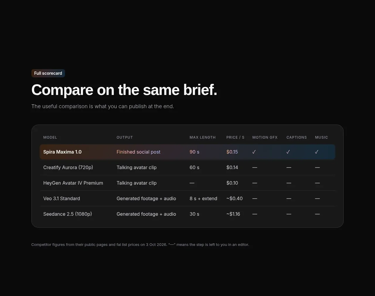
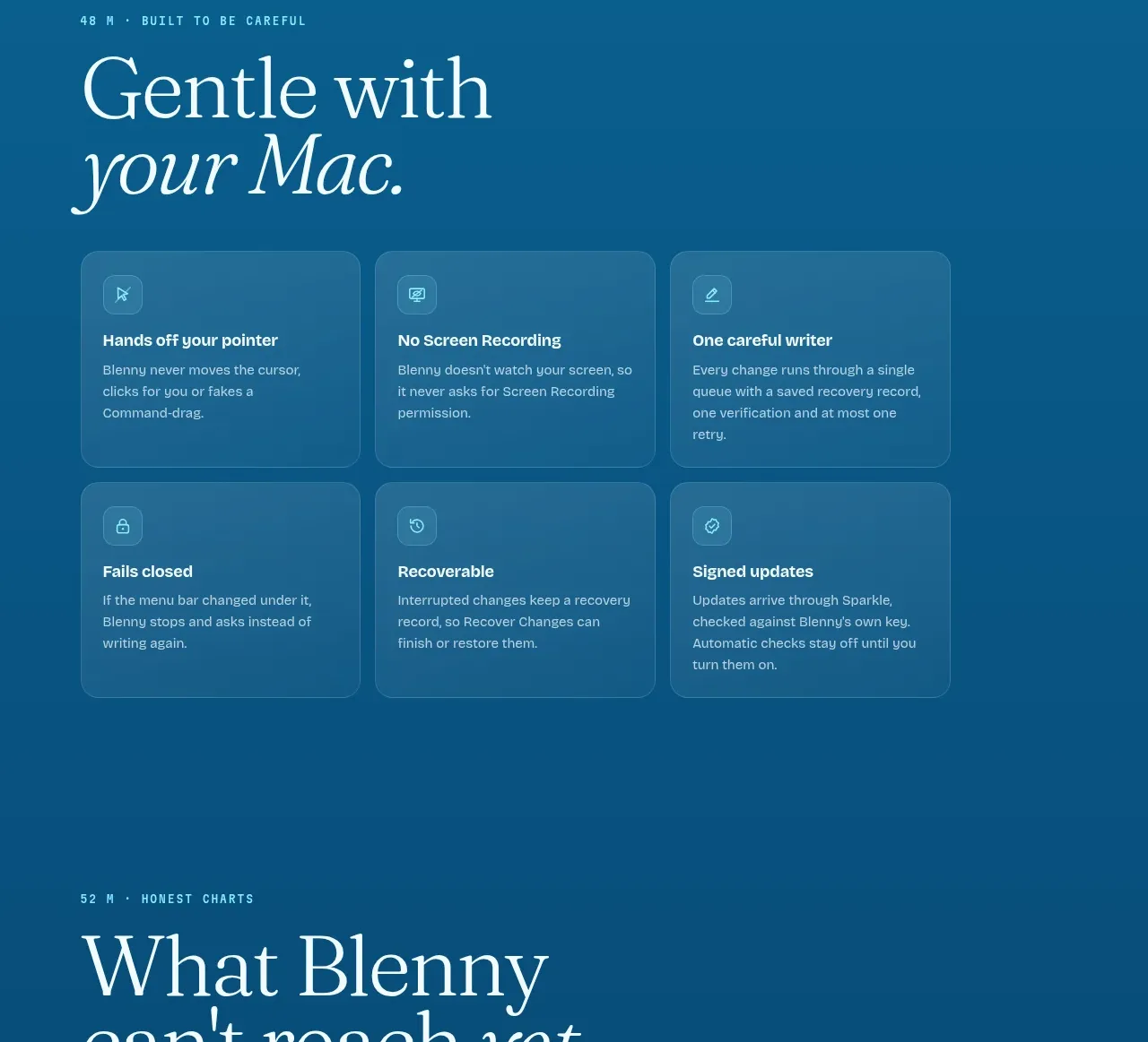
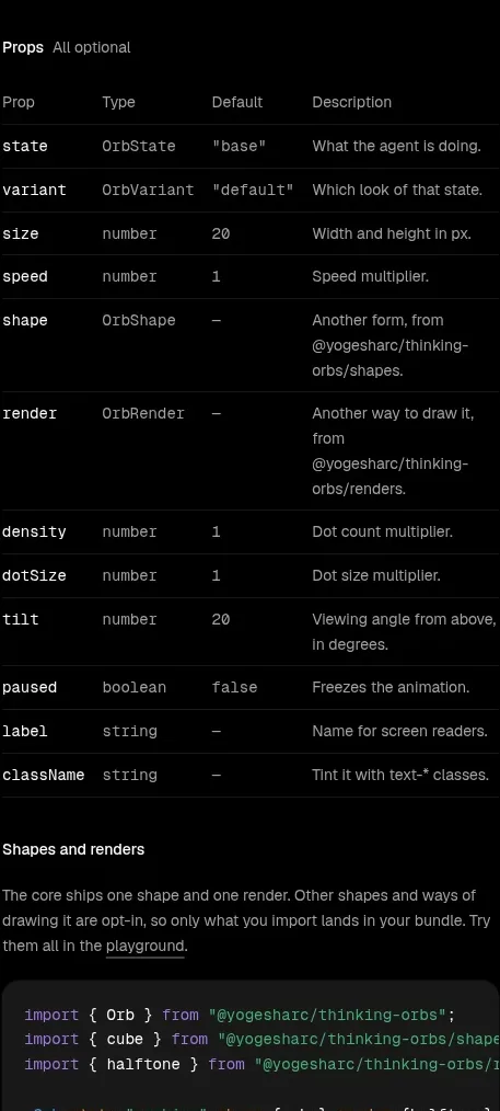
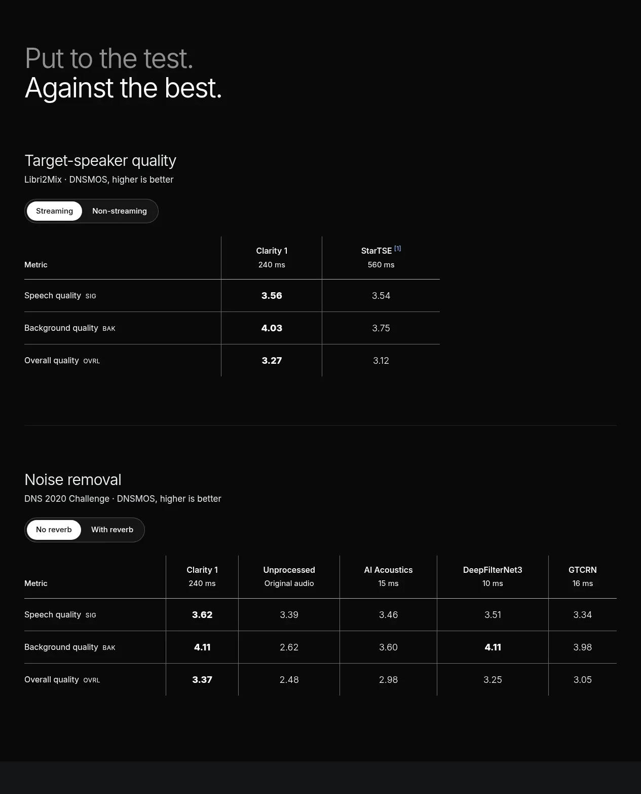
Study these alongside the description below: hierarchy, rhythm, spacing, colour. Build for the product you are asked about, using this design language.

- Component: https://kage-design-assets.t3.tigrisfiles.io/components/opensend-cc/cb8c9d86-a0e5-47f8-893c-550f6137189a-1791180192-9.webp
- Full page it was cut from: https://kage-design-assets.t3.tigrisfiles.io/screenshots/opensend-cc/cb8c9d86-a0e5-47f8-893c-550f6137189a-1791180114349-full.webp
- Component on Kage: https://kage.design/component/opensend-table

## Before you start
Ask what tiers, inventory, pricing, and action labels are appropriate for the user's sponsorship or plan table, then apply the principles below to that product.

Build a sparse bordered sponsorship table with a wider left identity column and several equal offer columns. Each offer cell should include a small plus or placeholder icon, tier label, price or commitment, and a compact subscribe/action link. Use a precise 1px grid (#dedede), white background, 14px identity text, 12px offer metadata, and generous cell padding. Avoid heavy headers; let alignment and repetition make the table understandable. Make the table horizontally scrollable on mobile.

Never: use logos, product names, copy, illustrations, or imagery from the reference.