kage
kage
thinkingorbs.com
Design analysis
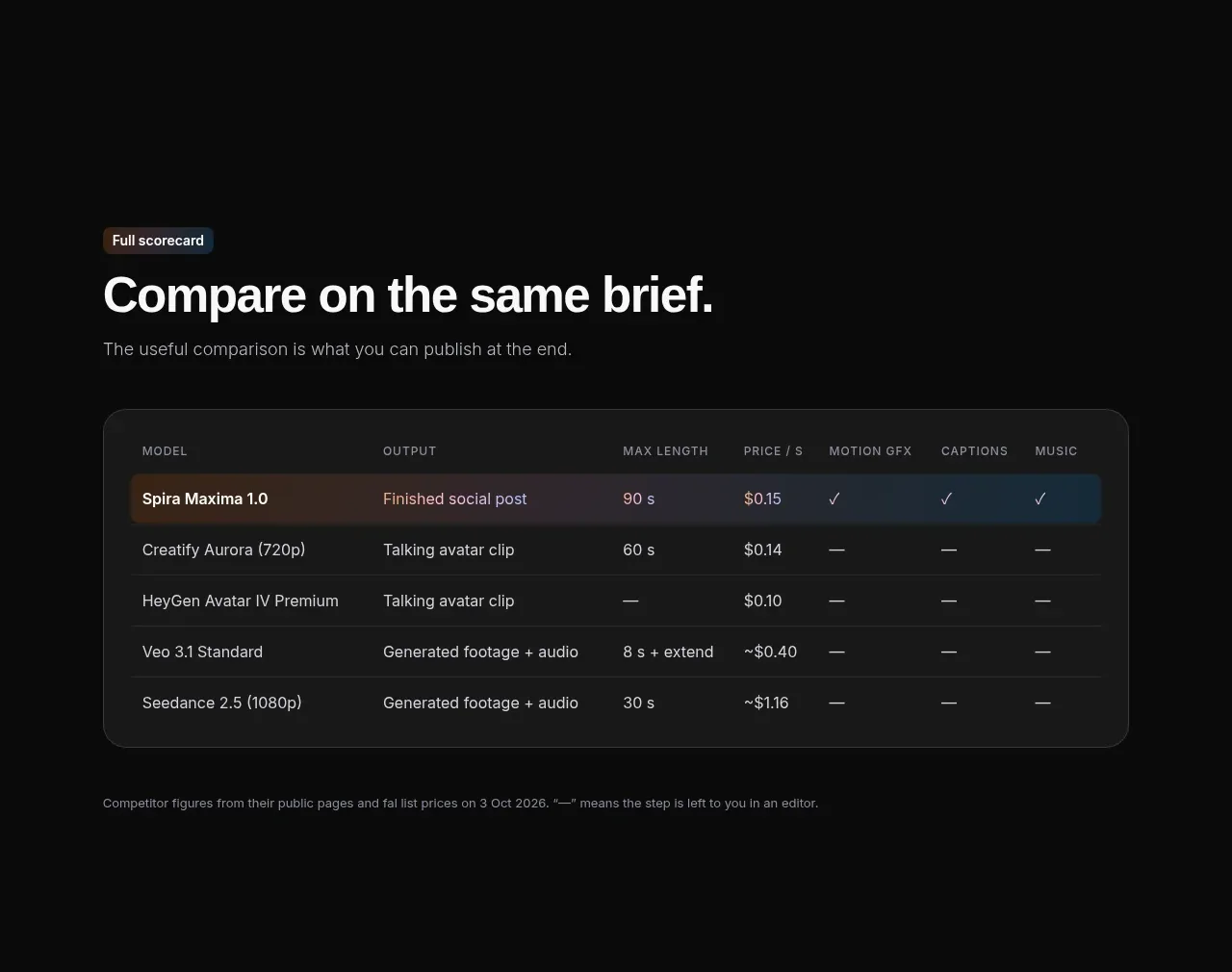
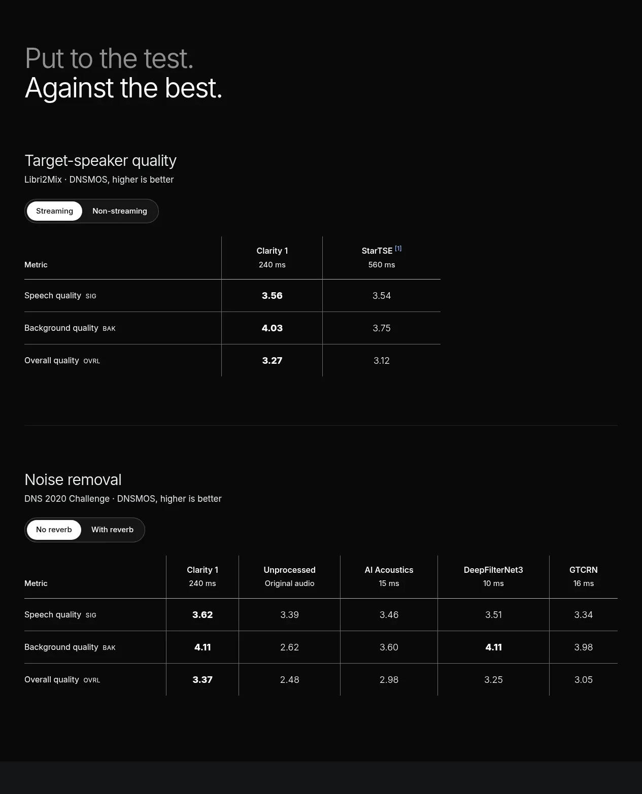
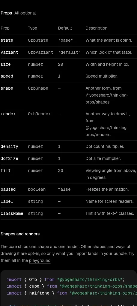
A dense API reference table presents prop, type, default, and description columns, with faint row separators and occasional wrapped descriptions for scanning.
Prompt preview
## Reference images

Study these alongside the description below: hierarchy, rhythm, spacing, colour. Build for the product you are asked about, using this design language.

- Component: https://kage-design-assets.t3.tigrisfiles.io/components/thinking-orbs/1e178b90-85cc-40c4-86e5-bc16130bc9ab-1791180317-4.webp
- Full page it was cut from: https://kage-design-assets.t3.tigrisfiles.io/screenshots/thinking-orbs/1e178b90-85cc-40c4-86e5-bc16130bc9ab-1791180214590-full.webp
- Component on Kage: https://kage.design/component/thinking-orbs-table

## Before you start
Ask what the user's product and brand are, then apply the principles below to that product rather than reproducing the reference.

Build a compact API props reference table for a dark documentation site. Keep it inside a narrow max-width column and introduce it with a small heading and an optional muted qualifier. Use a four-column desktop layout for prop, type, default, and description; allow the final column to wrap and collapse the table into stacked definition rows on mobile. Use 11–12px monospace for prop/type/default values and 11–12px sans-serif for descriptions. The page is #030303, text is #dedede, secondary text is #777777, and separators are extremely subtle (#171717). Avoid heavy borders; use 1px horizontal rules, generous row padding, and a highlighted row only on hover/focus. Keep long type names readable with wrapping or horizontal scrolling and preserve semantic table markup.

Never: use logos, product names, copy, illustrations, or imagery from the reference.