kage
kage
spira.ai
Design analysis
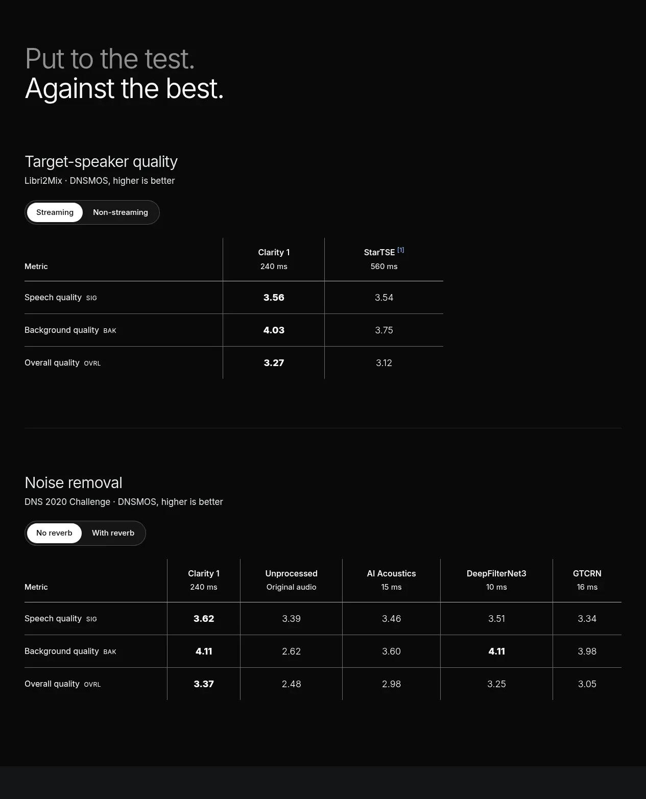
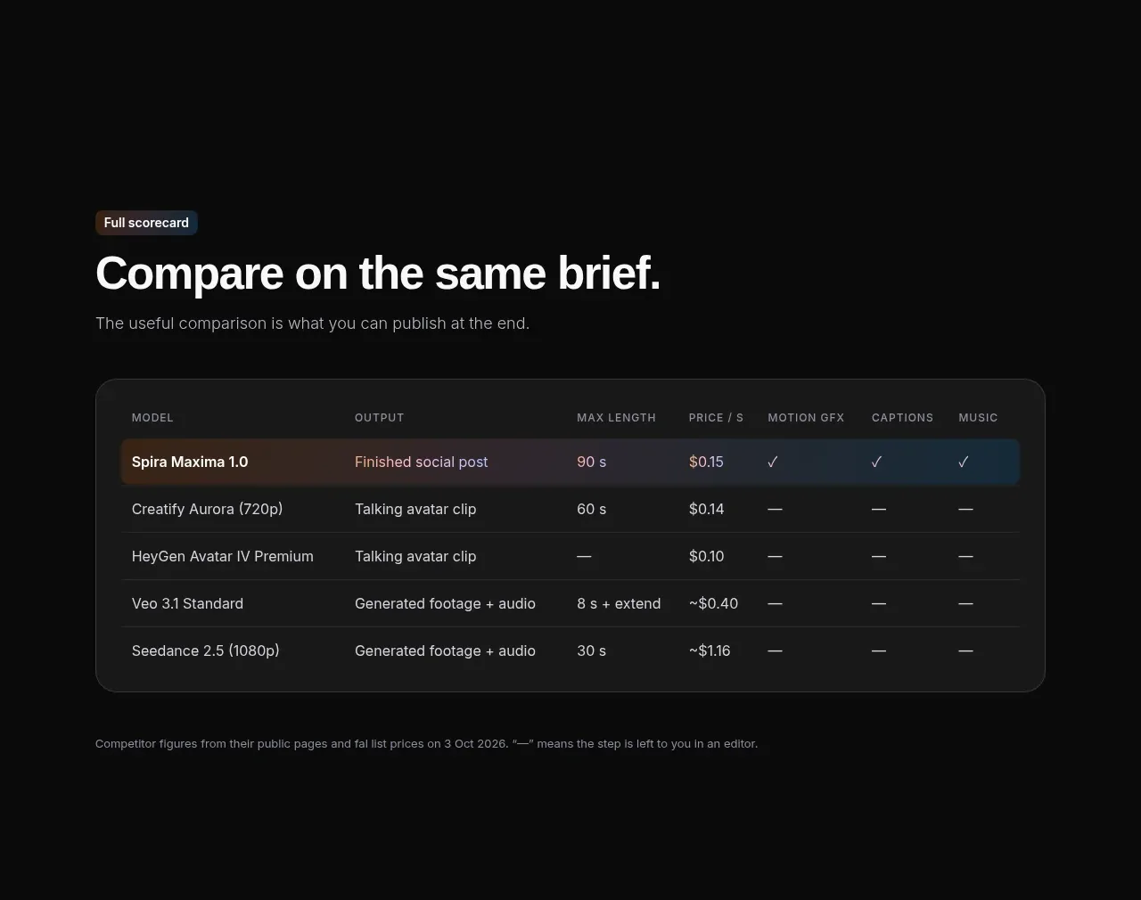
A short setup paragraph leads into a rounded comparison table with a highlighted first row. The table is dense but readable, using compact column headings and restrained separators.
Prompt preview
## Reference images

Study these alongside the description below: hierarchy, rhythm, spacing, colour. Build for the product you are asked about, using this design language.

- Component: https://kage-design-assets.t3.tigrisfiles.io/components/spira-maxima/726c84dd-363c-4980-b0d9-b04757b4422a-1791266566-7.webp
- Full page it was cut from: https://kage-design-assets.t3.tigrisfiles.io/screenshots/spira-maxima/726c84dd-363c-4980-b0d9-b04757b4422a-1791266451959-full.webp
- Component on Kage: https://kage.design/component/spira-maxima-table

## Before you start
Ask what products, plans, capabilities, and comparison criteria the user's audience needs, then apply these principles to that product.

Create a dark comparison section with a small eyebrow, a strong heading, and one explanatory sentence. Place a wide responsive table inside a rounded container with #171819 fill, #2b2d2e border, and 16px radius. Use compact uppercase column labels, 13–15px body text, generous row height, subtle horizontal dividers, and a highlighted primary row with a soft blue/orange tinted background. Render supported features with simple check marks or dashes and keep notes outside the table. Ensure horizontal overflow is usable on mobile and preserve readable alignment for numeric columns.

Never: use logos, product names, copy, illustrations, or imagery from the reference.