 kage
kage
geardex.app
Design analysis
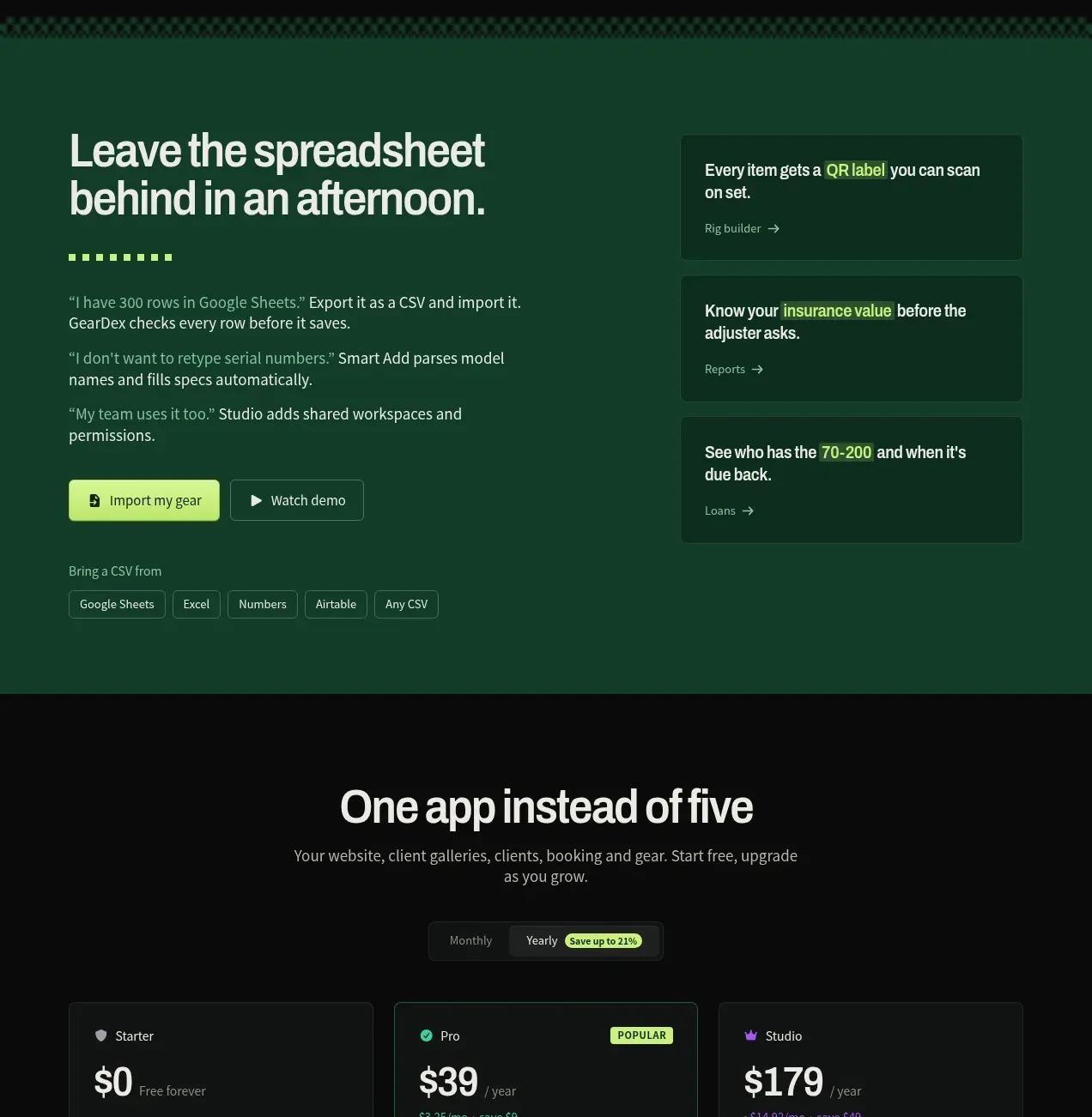
A contrasting green panel makes the spreadsheet-import promise tangible with proof points, action buttons, and three supporting outcome cards.
Prompt preview
## Reference images

Study these alongside the description below: hierarchy, rhythm, spacing, colour. Build for the product you are asked about, using this design language.

- Component: https://kage-design-assets.t3.tigrisfiles.io/components/geardex-app/fc33b7d0-970c-45a6-93bf-9b94f05b130c-1791941532-8.webp
- Full page it was cut from: https://kage-design-assets.t3.tigrisfiles.io/screenshots/geardex-app/fc33b7d0-970c-45a6-93bf-9b94f05b130c-1791941487258-full.webp
- Component on Kage: https://kage.design/component/geardex-cta

## Before you start
Ask what the user's product, audience, and brand are, then apply these principles to that product rather than reproducing the reference.

Create a high-contrast conversion section using a deep forest-green background (#0d432f) rather than the page black. On the left, place a large two-line headline, short proof-oriented paragraphs, and primary/secondary buttons. On the right, stack three dark translucent cards describing concrete outcomes, each with a short title and arrow link. Add a small row of supported import/source pills near the bottom. Use pale cream text #eaf3e9, lime #bce95b for the main CTA, muted mint #b4cbbb, and subtle green borders. Maintain a clear two-column layout with generous padding, then stack on mobile while preserving the CTA first.

Never use logos, product names, copy, illustrations, or imagery from the reference.
More components

 High-contrast demo CTA
Agent Craft · Call to action
High-contrast demo CTA
Agent Craft · Call to action

 Cinematic product preview
OpenFlowKit 2 · Call to action
Cinematic product preview
OpenFlowKit 2 · Call to action
 Open-source closing CTA
OpenFlowKit 2 · Call to action
Open-source closing CTA
OpenFlowKit 2 · Call to action

 Free download call to action
OpenWhispr for iOS · Call to action
Free download call to action
OpenWhispr for iOS · Call to action

 Final conversion call to action
geardex.app · Call to action
Final conversion call to action
geardex.app · Call to action

 Cross-device story CTA
Milepost · Call to action
Cross-device story CTA
Milepost · Call to action