 kage
kage
openflowkit.com
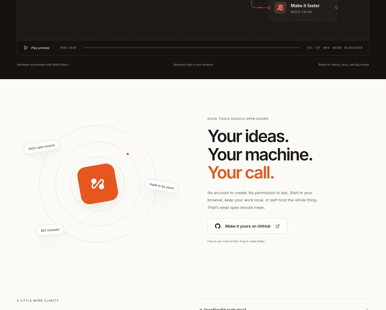
Design analysis
A dark, high-contrast feature band turns the product workflow into a cinematic moment, with an embedded preview and a clear exploration link.
Prompt preview
## Reference images

Study these alongside the description below: hierarchy, rhythm, spacing, colour. Build for the product you are asked about, using this design language.

- Component: https://kage-design-assets.t3.tigrisfiles.io/components/openflowkit-2/3de20331-4179-415d-a7ba-29915155b155-1791957763-10.webp
- Full page it was cut from: https://kage-design-assets.t3.tigrisfiles.io/screenshots/openflowkit-2/3de20331-4179-415d-a7ba-29915155b155-1791957697393-full.webp
- Component on Kage: https://kage.design/component/openflowkit-2-cta

## Before you start
Ask what product moment deserves a cinematic presentation and what action users should take after seeing it. Match the treatment to the user's brand.

Build a dark feature/CTA band using near-black brown (`#151310`) with warm off-white text and burnt-orange emphasis (`#ef5a21`). Start with a two-column heading row: small eyebrow and large 40–52px statement on the left, concise explanation and link on the right. Below, place a wide dark media frame with a subtle `#342b25` border, 10–12px radius, faint grid, connected glowing nodes, and a compact playback bar. Keep the visual abstract and product-relevant without relying on stock media. Use high contrast, generous padding, and restrained orange highlights. If interactive, provide play/pause controls, keyboard focus, and a reduced-motion fallback.

Never use the reference's logo, product name, copy, illustrations, imagery, or exact animation/storyboard.
More components

 High-contrast demo CTA
Agent Craft · Call to action
High-contrast demo CTA
Agent Craft · Call to action

 Open-source closing CTA
OpenFlowKit 2 · Call to action
Open-source closing CTA
OpenFlowKit 2 · Call to action
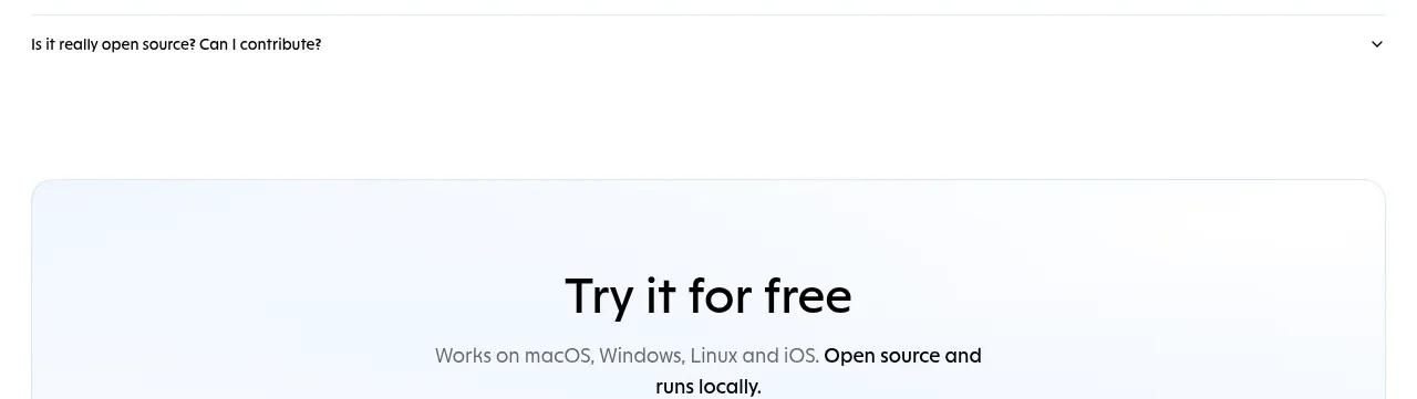
 Free download call to action
OpenWhispr for iOS · Call to action
Free download call to action
OpenWhispr for iOS · Call to action
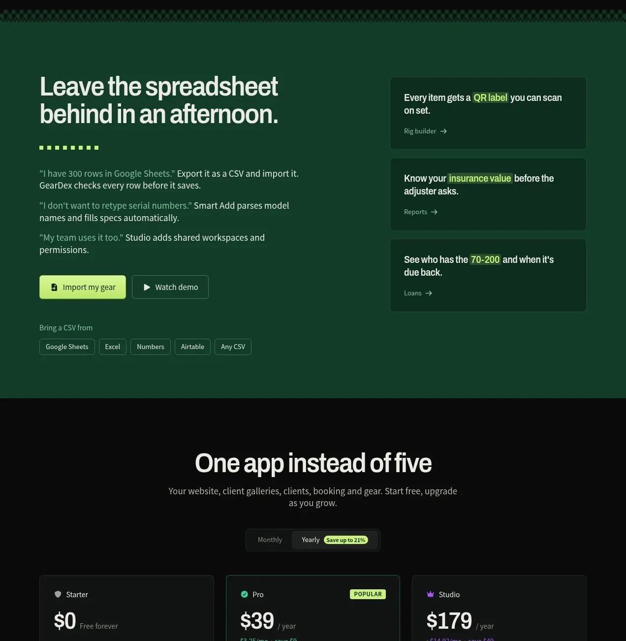
 Spreadsheet replacement import CTA
geardex.app · Call to action
Spreadsheet replacement import CTA
geardex.app · Call to action
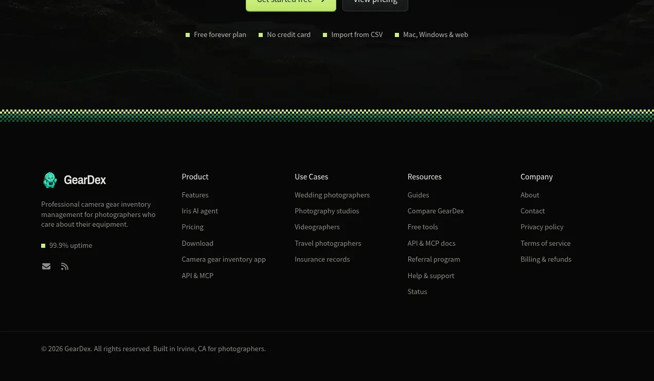 Final conversion call to action
geardex.app · Call to action
Final conversion call to action
geardex.app · Call to action

 Cross-device story CTA
Milepost · Call to action
Cross-device story CTA
Milepost · Call to action