 kage
kage
geardex.app
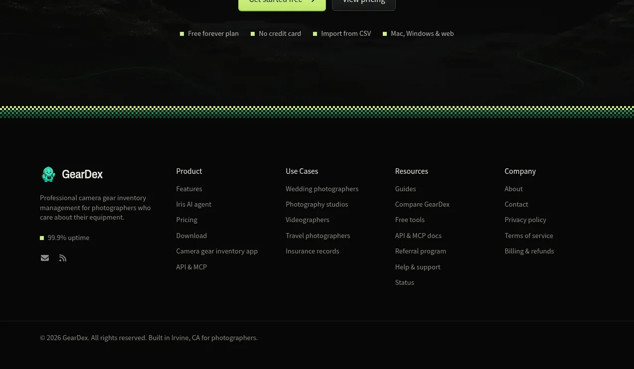
Design analysis
A compact closing CTA repeats the core outcome over a faint landscape backdrop, with two buttons and concise trust assurances.
Prompt preview
## Reference images

Study these alongside the description below: hierarchy, rhythm, spacing, colour. Build for the product you are asked about, using this design language.

- Component: https://kage-design-assets.t3.tigrisfiles.io/components/geardex-app/fc33b7d0-970c-45a6-93bf-9b94f05b130c-1791941534-11.webp
- Full page it was cut from: https://kage-design-assets.t3.tigrisfiles.io/screenshots/geardex-app/fc33b7d0-970c-45a6-93bf-9b94f05b130c-1791941487258-full.webp
- Component on Kage: https://kage.design/component/geardex-cta-2

## Before you start
Ask what the user's product, audience, and brand are, then apply these principles to that product rather than reproducing the reference.

Design a centered closing conversion panel with a short two-line outcome headline, one sentence of reassurance, a primary signup button, and a secondary pricing/details button. Place it over a very subtle dark atmospheric backdrop with a soft fade so text remains dominant. Add a small horizontal row of trust claims beneath the buttons, each preceded by a tiny colored square or dot. Use #090b0a, #edf1ec, muted #a0aaa2, green #bce95b and emerald #2cca89. Keep it concise with 72–96px vertical padding and provide strong focus states for both buttons.

Never use logos, product names, copy, illustrations, or imagery from the reference.
More components

 High-contrast demo CTA
Agent Craft · Call to action
High-contrast demo CTA
Agent Craft · Call to action
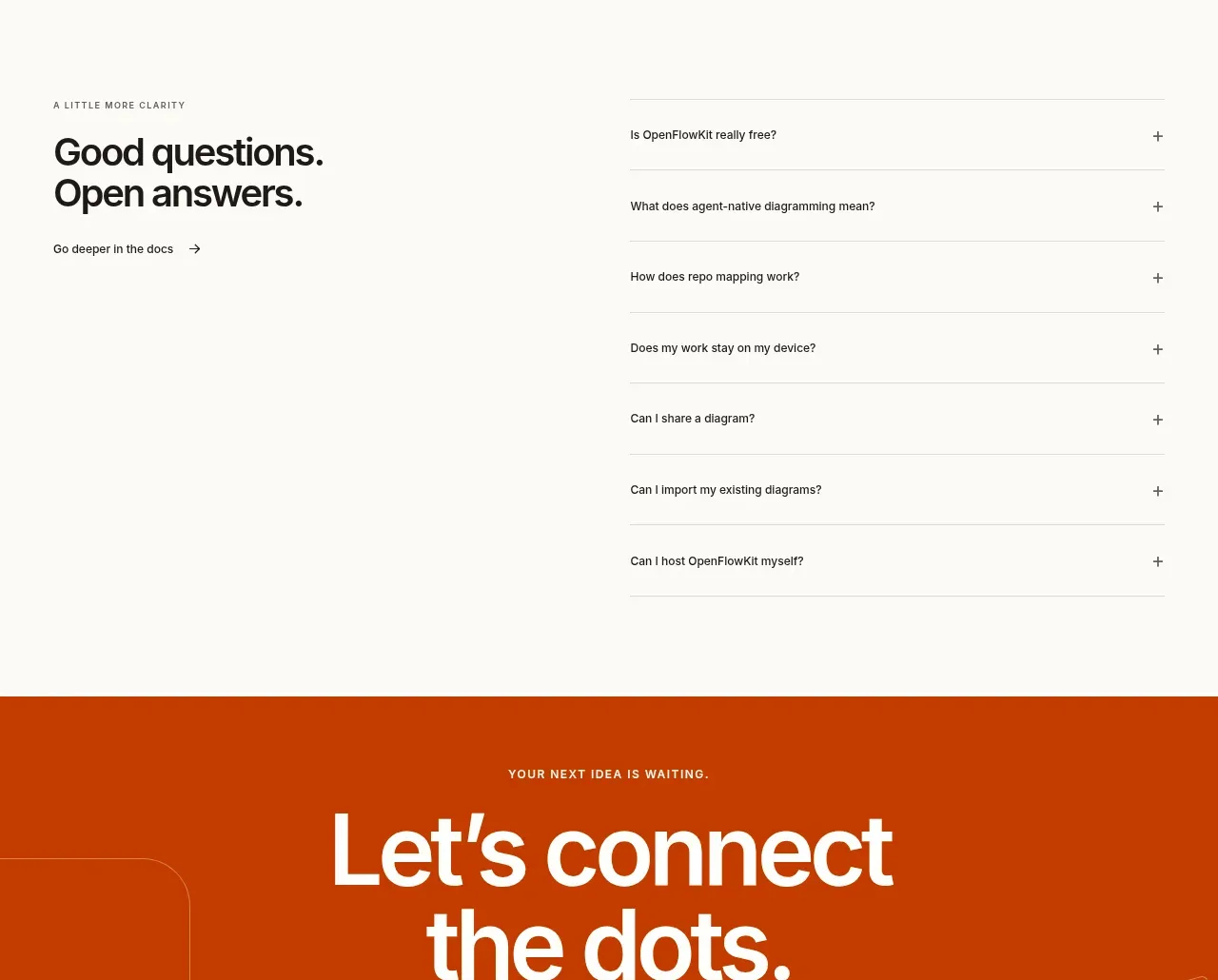
 Open-source closing CTA
OpenFlowKit 2 · Call to action
Open-source closing CTA
OpenFlowKit 2 · Call to action
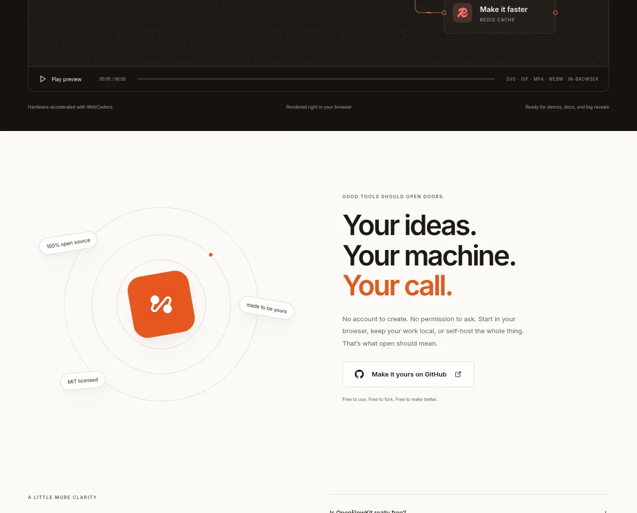 Cinematic product preview
OpenFlowKit 2 · Call to action
Cinematic product preview
OpenFlowKit 2 · Call to action

 Free download call to action
OpenWhispr for iOS · Call to action
Free download call to action
OpenWhispr for iOS · Call to action
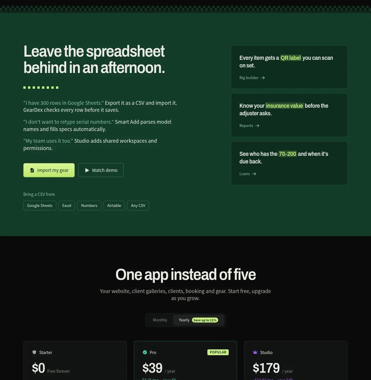
 Spreadsheet replacement import CTA
geardex.app · Call to action
Spreadsheet replacement import CTA
geardex.app · Call to action
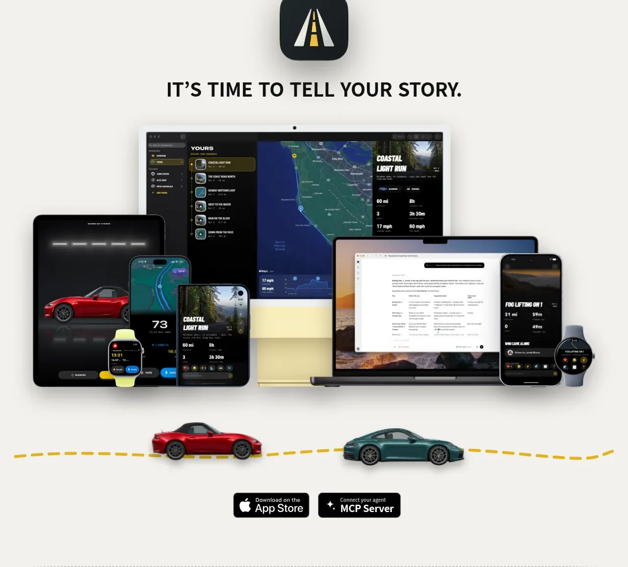
 Cross-device story CTA
Milepost · Call to action
Cross-device story CTA
Milepost · Call to action