 kage
kage
openwhispr.com

Design analysis
A centered conversion panel repeats the product promise, platform availability, and a single blue download button inside a large pale rounded container.
Prompt preview
## Reference images

Study these alongside the description below: hierarchy, rhythm, spacing, colour. Build for the product you are asked about, using this design language.

- Component: https://kage-design-assets.t3.tigrisfiles.io/components/openwhispr-for-ios/fdca984f-87fc-4407-a067-b1821a770c20-1791957717-7.webp
- Full page it was cut from: https://kage-design-assets.t3.tigrisfiles.io/screenshots/openwhispr-for-ios/fdca984f-87fc-4407-a067-b1821a770c20-1791957682462-full.webp
- Component on Kage: https://kage.design/component/openwhispr-for-ios-cta

## Before you start
Ask what the user's product, audience, and brand are, then apply the principles below to that product rather than reproducing this reference.

Create a centered end-of-page CTA inside a wide pale blue-gray panel. Use a concise headline, one or two lines of supporting platform/benefit text, and one prominent pill-shaped primary button. Center everything vertically and horizontally with generous padding, approximately 64–88px top and bottom. Use a 32–40px headline, 15–17px supporting text, a blue button around #3978df with white text, 12–14px radius or full pill radius, and a large 20–24px panel radius with a subtle #e8eef4 border. Keep the CTA focused: no competing links or multiple buttons. Add a gentle hover lift or color shift to the button and ensure the panel stacks comfortably on mobile.

Never: use logos, product names, copy, illustrations, or imagery from the reference.
More components

 High-contrast demo CTA
Agent Craft · Call to action
High-contrast demo CTA
Agent Craft · Call to action
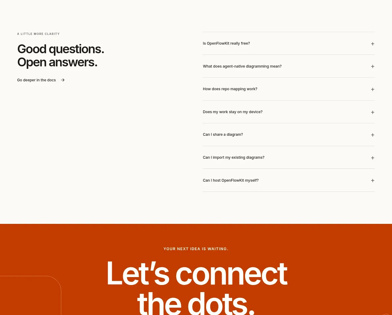
 Open-source closing CTA
OpenFlowKit 2 · Call to action
Open-source closing CTA
OpenFlowKit 2 · Call to action
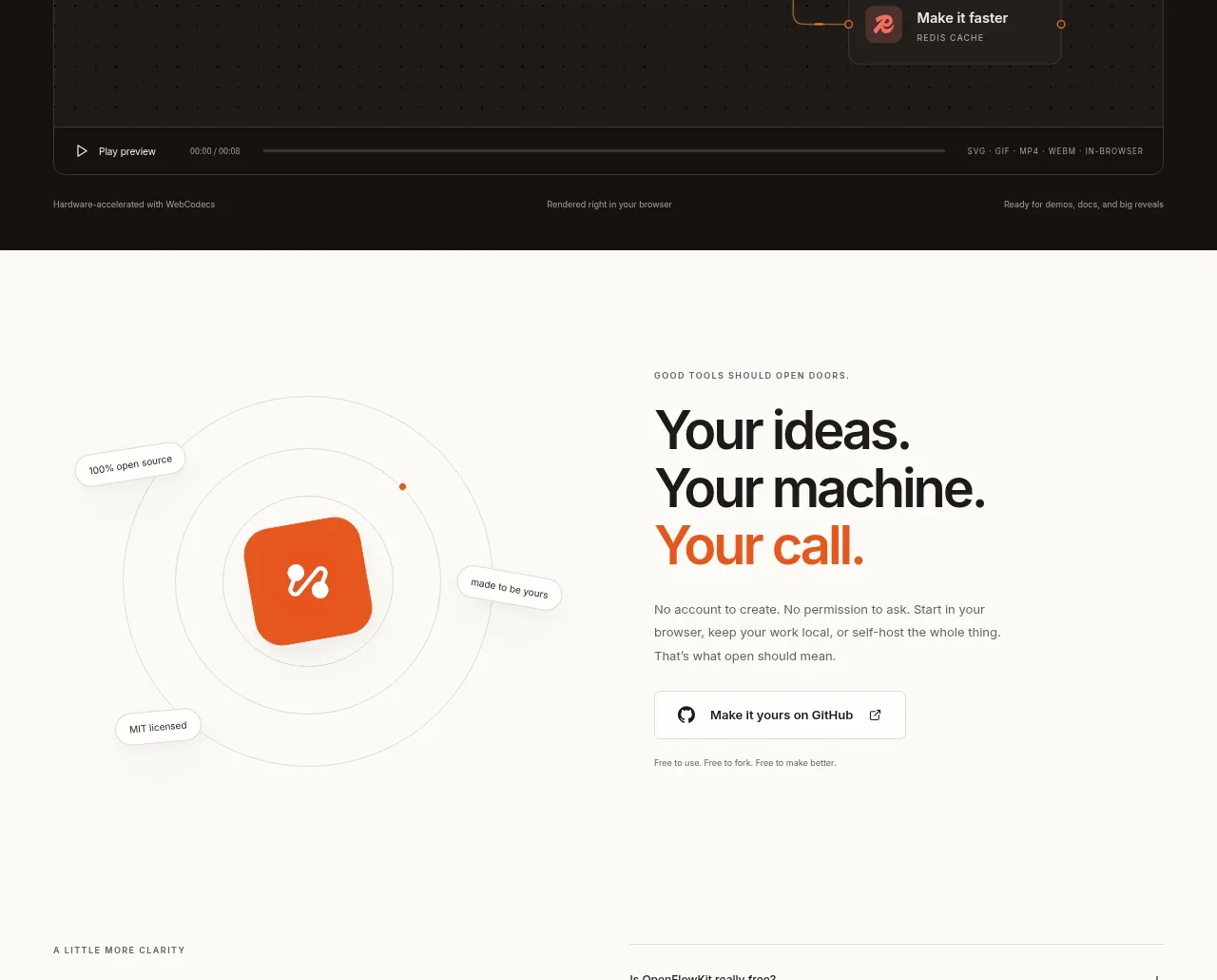 Cinematic product preview
OpenFlowKit 2 · Call to action
Cinematic product preview
OpenFlowKit 2 · Call to action
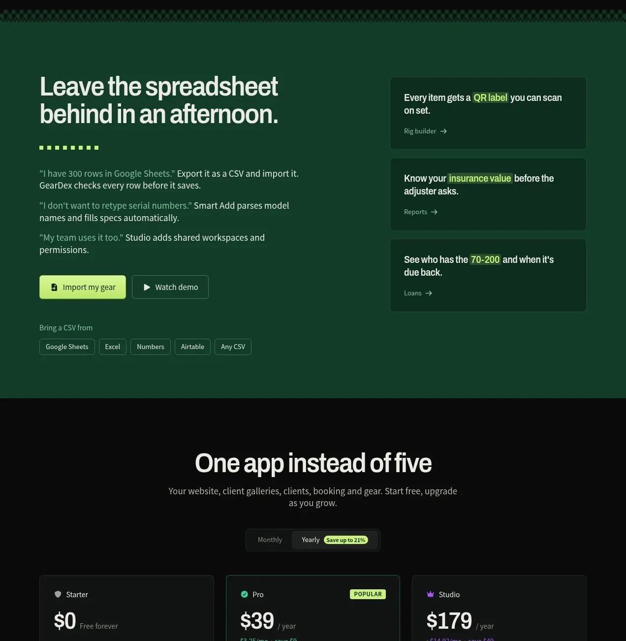
 Spreadsheet replacement import CTA
geardex.app · Call to action
Spreadsheet replacement import CTA
geardex.app · Call to action
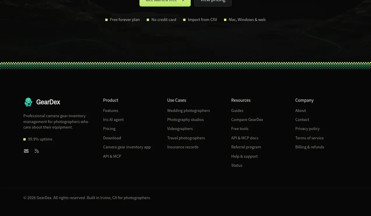 Final conversion call to action
geardex.app · Call to action
Final conversion call to action
geardex.app · Call to action

 Cross-device story CTA
Milepost · Call to action
Cross-device story CTA
Milepost · Call to action