 kage
agentgrid.io

Design analysis
A full-width closing CTA uses a soft pixelated blue-to-pink abstract background, centered headline, supporting line, and dark action button.
Prompt preview
## Reference images

Study these alongside the description below: hierarchy, rhythm, spacing, colour. Build for the product you are asked about, using this design language.

- Component: https://kage-design-assets.t3.tigrisfiles.io/components/agentgrid-io/a4a816d7-f557-4fb4-82e6-3348f23e6057-1792994475-9.webp
- Full page it was cut from: https://kage-design-assets.t3.tigrisfiles.io/screenshots/agentgrid-io/a4a816d7-f557-4fb4-82e6-3348f23e6057-1792994443669-full.webp
- Component on Kage: https://kage.design/component/agentgrid-cta

## Before you start
Ask what the user's product and brand are, then apply these principles to that product rather than copying the reference.

Create a full-bleed closing CTA with a soft abstract background: a mostly white center surrounded by diffused blue and blush gradients, optionally rendered with a low-opacity pixel/noise mask. Center a small brand-neutral mark or decorative shape above a two-line headline, with the second phrase italicized, then a short supporting sentence and dark rounded button with an arrow. Use 72–110px vertical padding, 48–56px headline size, strong contrast, and a 10px button radius. Add accessible focus states and keep the background decorative only.

Never: use logos, product names, copy, illustrations, or imagery from the reference.
More components

 Conversion banner
Papermark Data Rooms · Call to action
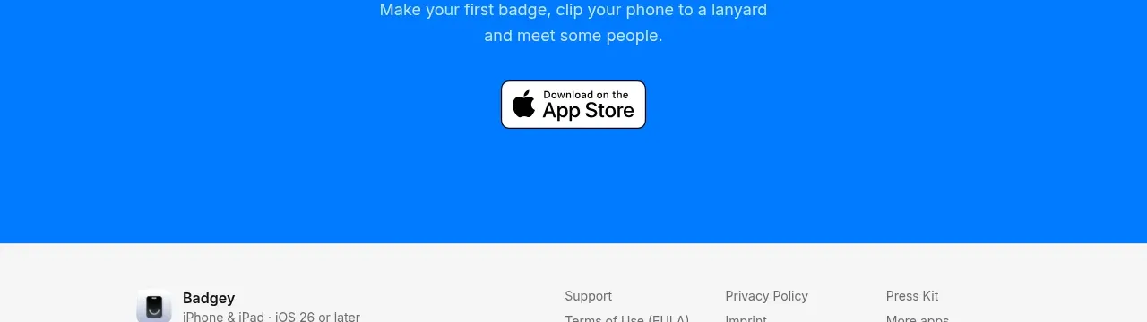
 Final download call to action
Badgey · Call to action

 Final conversion call to action
Context Engine · Call to action
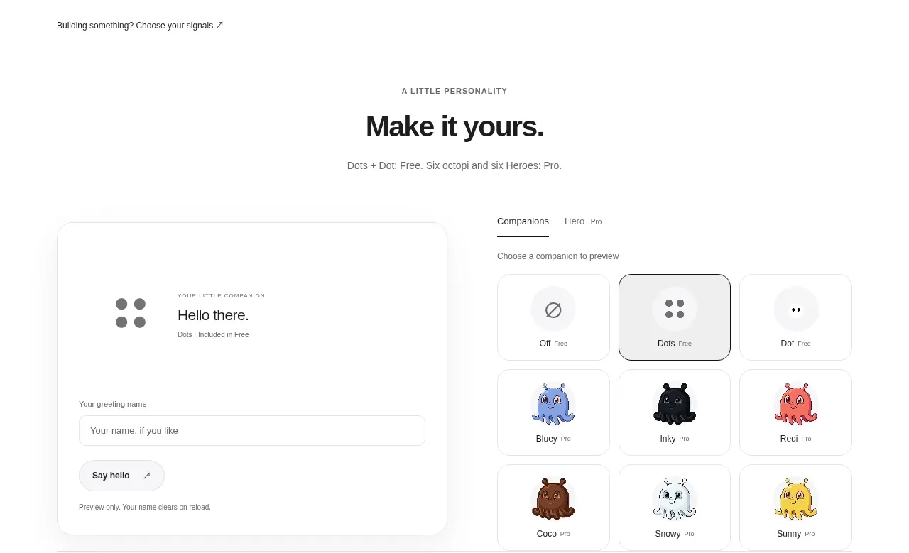
 Developer workflow callout
Dots · Call to action
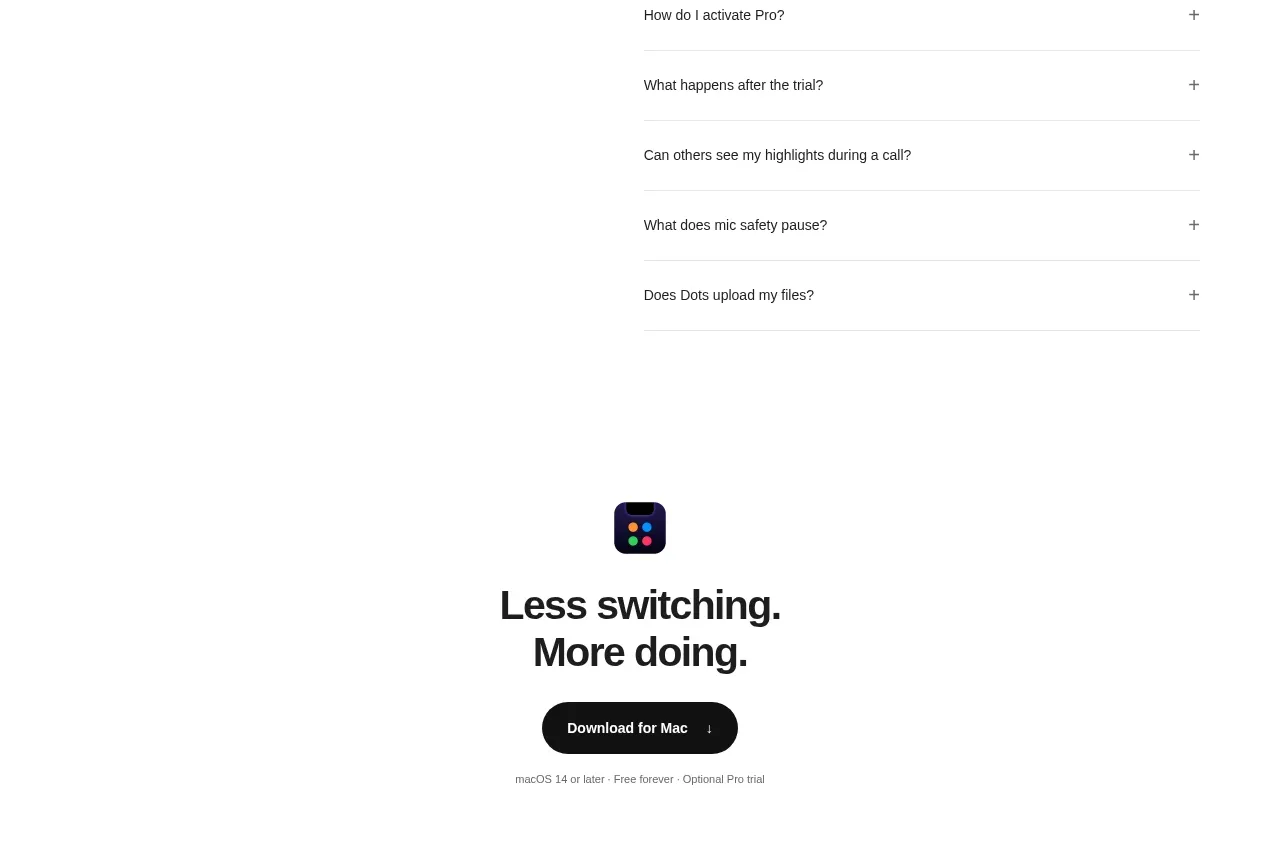 Final download CTA
Dots · Call to action
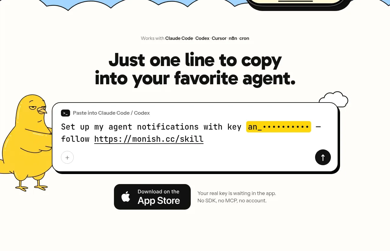
 One-line setup call to action
Monish · Call to action