 kage
contextengine.com

Design analysis
A compact centered CTA repeats the core promise, pairs primary and secondary actions, and uses a soft mint glow to distinguish the closing moment.
Prompt preview
## Reference images

Study these alongside the description below: hierarchy, rhythm, spacing, colour. Build for the product you are asked about, using this design language.

- Component: https://kage-design-assets.t3.tigrisfiles.io/components/context-engine/37fe6fcb-aa91-474a-8a89-1c1cadc0a655-1792821975-11.webp
- Full page it was cut from: https://kage-design-assets.t3.tigrisfiles.io/screenshots/context-engine/37fe6fcb-aa91-474a-8a89-1c1cadc0a655-1792821825382-full.webp
- Component on Kage: https://kage.design/component/context-engine-cta

## Before you start
Ask what action the user should take next and what reassurance removes friction. Use the answers to create a concise closing CTA.

Build a centered closing call-to-action band with a small abstract product mark or shape, a bold two-line headline, two adjacent buttons, and a tiny reassurance note. Use a white-to-pale-mint background treatment, black headline text, dark primary button, light secondary button, 8px radius, and a soft mint radial glow behind the content. Keep the section compact but airy, with clear separation from the footer. Buttons must have hover, focus, and pressed states and stack on narrow screens.

Never: use logos, product names, copy, illustrations, or imagery from the reference.
More components

 Conversion banner
Papermark Data Rooms · Call to action
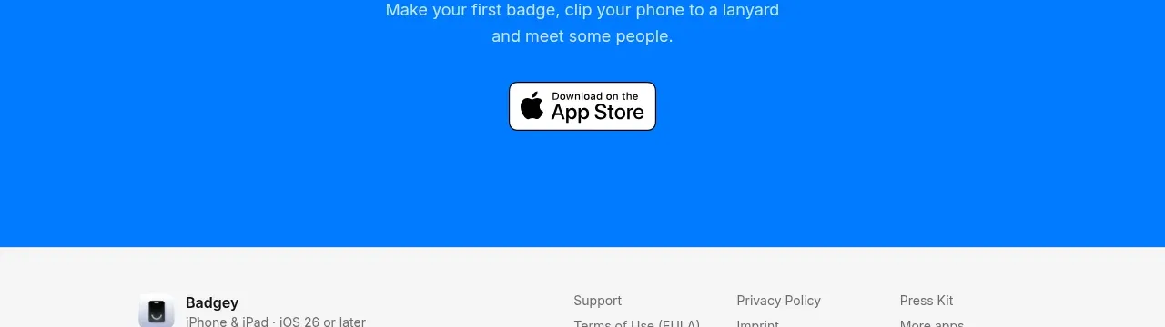
 Final download call to action
Badgey · Call to action

 Final signup call to action
AgentGrid.io · Call to action
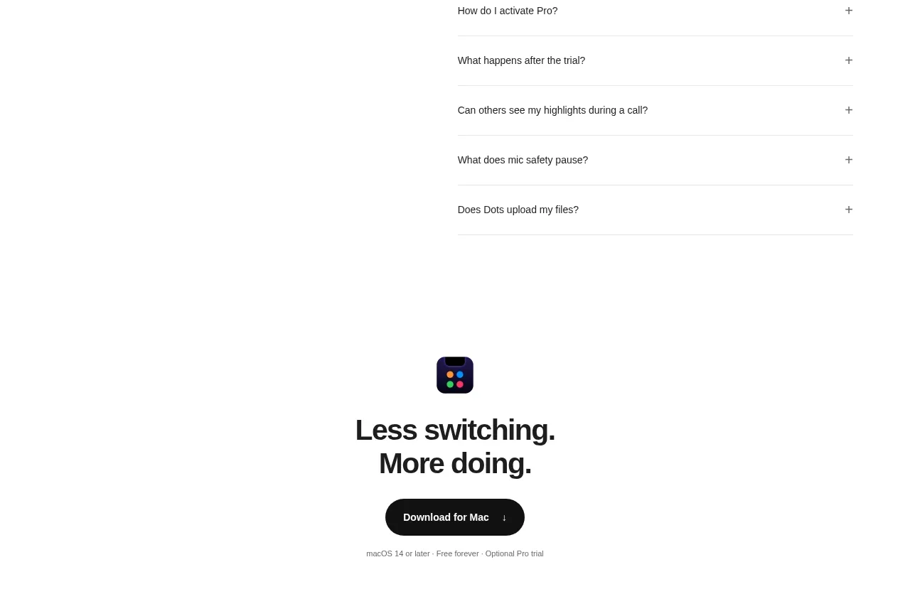
 Final download CTA
Dots · Call to action
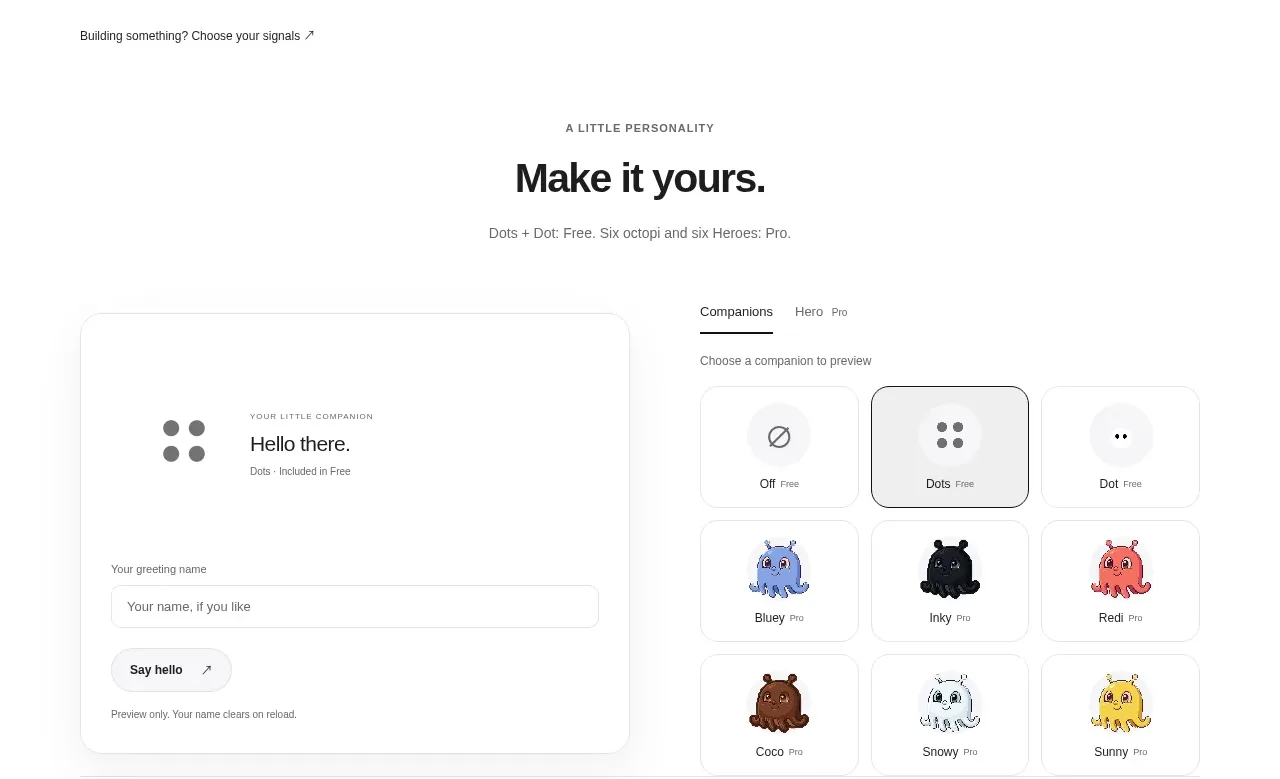 Developer workflow callout
Dots · Call to action
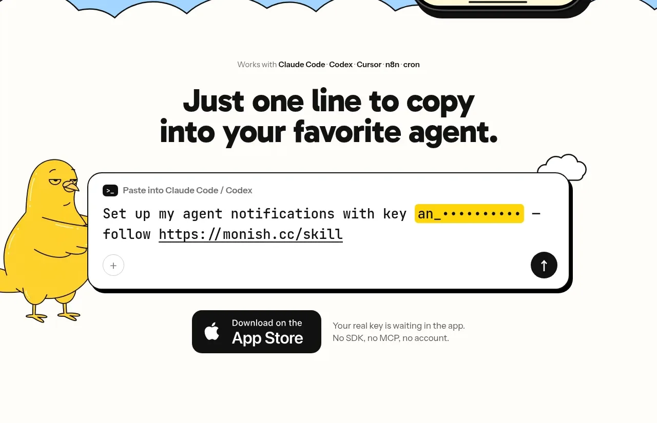
 One-line setup call to action
Monish · Call to action