kage
agentgrid.io
Design analysis
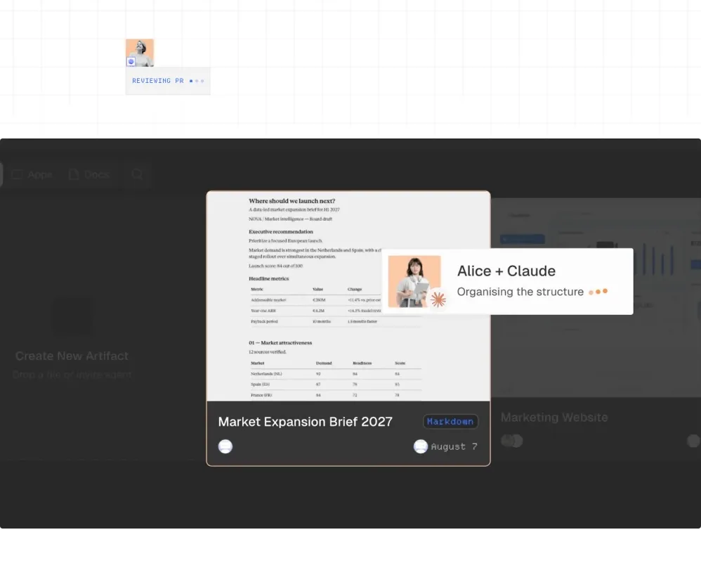
A large darkened product visual demonstrates shared artifacts and agent activity, with layered document and collaborator cards creating depth.
Prompt preview
## Reference images

Study these alongside the description below: hierarchy, rhythm, spacing, colour. Build for the product you are asked about, using this design language.

- Component: https://kage-design-assets.t3.tigrisfiles.io/components/agentgrid-io/a4a816d7-f557-4fb4-82e6-3348f23e6057-1792994473-2.webp
- Full page it was cut from: https://kage-design-assets.t3.tigrisfiles.io/screenshots/agentgrid-io/a4a816d7-f557-4fb4-82e6-3348f23e6057-1792994443669-full.webp
- Component on Kage: https://kage.design/component/agentgrid-gallery

## Before you start
Ask what the user's product and brand are, then apply these principles to that product rather than copying the reference.

Build a wide product-preview gallery on a white background. Place a large dark charcoal workspace frame, approximately 78% of the page width, with a 10px radius and subtle shadow. Inside, use a dimmed dashboard-like surface plus one bright central artifact card and one overlapping collaborator/status card to show shared work. Keep the composition editorial and sparse, with soft translucency, slight offsets, and a clear focal artifact. Add responsive scaling so the visual remains legible on mobile. Use #242424, off-white cards, muted gray UI text, and one warm accent for agent activity.

Never: use logos, product names, copy, illustrations, or imagery from the reference.