kage
agentgrid.io
Design analysis
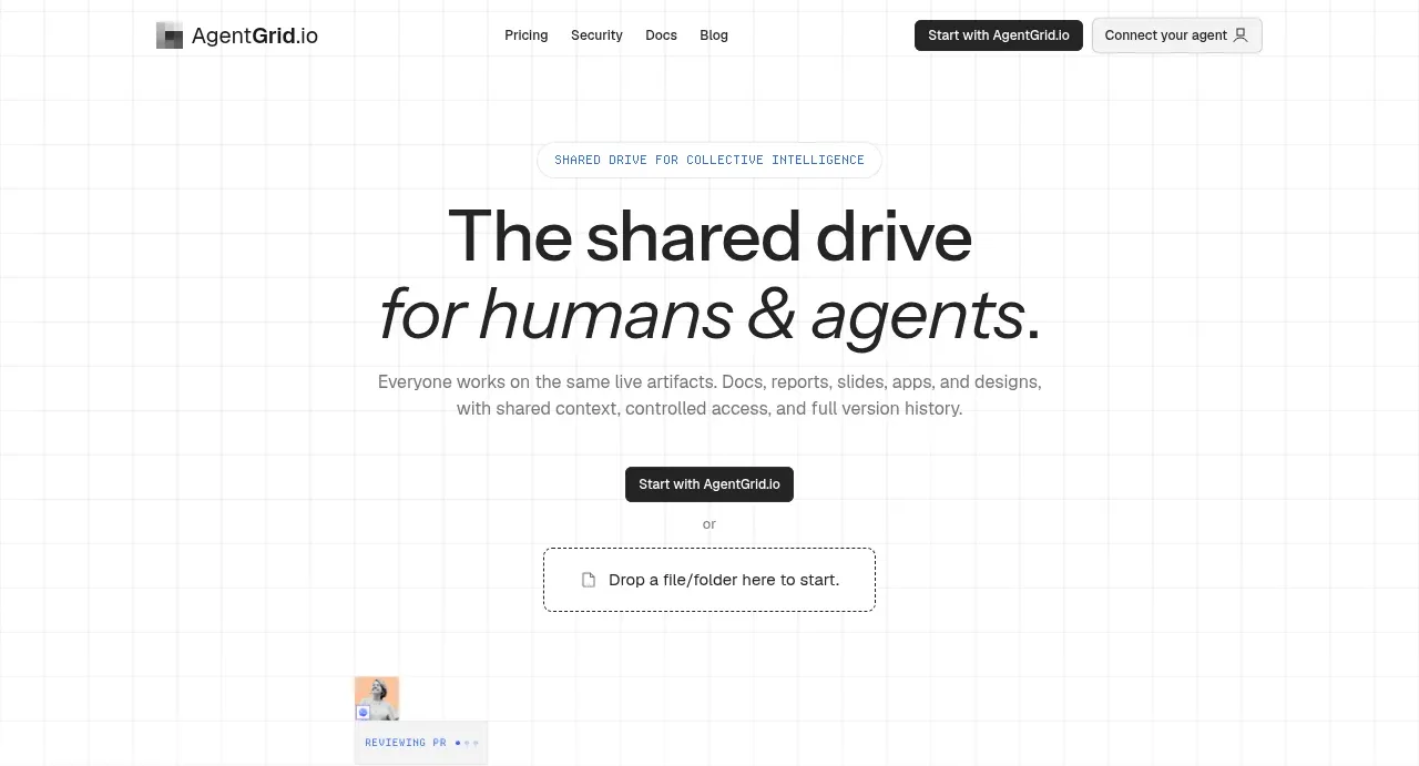
The hero uses a faint grid background, an oversized two-line headline, concise supporting copy, a primary CTA, and a dashed file-drop alternative.
Prompt preview
## Reference images

Study these alongside the description below: hierarchy, rhythm, spacing, colour. Build for the product you are asked about, using this design language.

- Component: https://kage-design-assets.t3.tigrisfiles.io/components/agentgrid-io/a4a816d7-f557-4fb4-82e6-3348f23e6057-1792994472-1.webp
- Full page it was cut from: https://kage-design-assets.t3.tigrisfiles.io/screenshots/agentgrid-io/a4a816d7-f557-4fb4-82e6-3348f23e6057-1792994443669-full.webp
- Component on Kage: https://kage.design/component/agentgrid-hero

## Before you start
Ask what the user's product and brand are, then apply these principles to that product rather than copying the reference.

Create a centered hero directly below the navigation with a very subtle square grid background using near-white #fafafa and #eeeeee lines. Use a small uppercase eyebrow, a large two-line black headline with the second line in an italic or lighter expressive style, and a muted supporting paragraph constrained to about 520px. Stack a dark rounded primary CTA, a small “or” separator, and a dashed rectangular upload/drop target with a document icon. Use a 64–88px top breathing space, 18–22px line-height for body copy, 48–64px headline size, and a calm monochrome palette with one restrained accent. The drop zone should show hover and drag-over feedback.

Never: use logos, product names, copy, illustrations, or imagery from the reference.