kage
contextengine.com
Design analysis
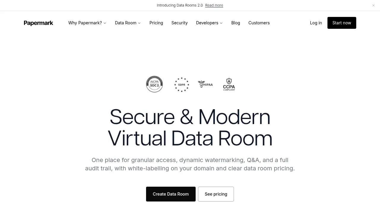
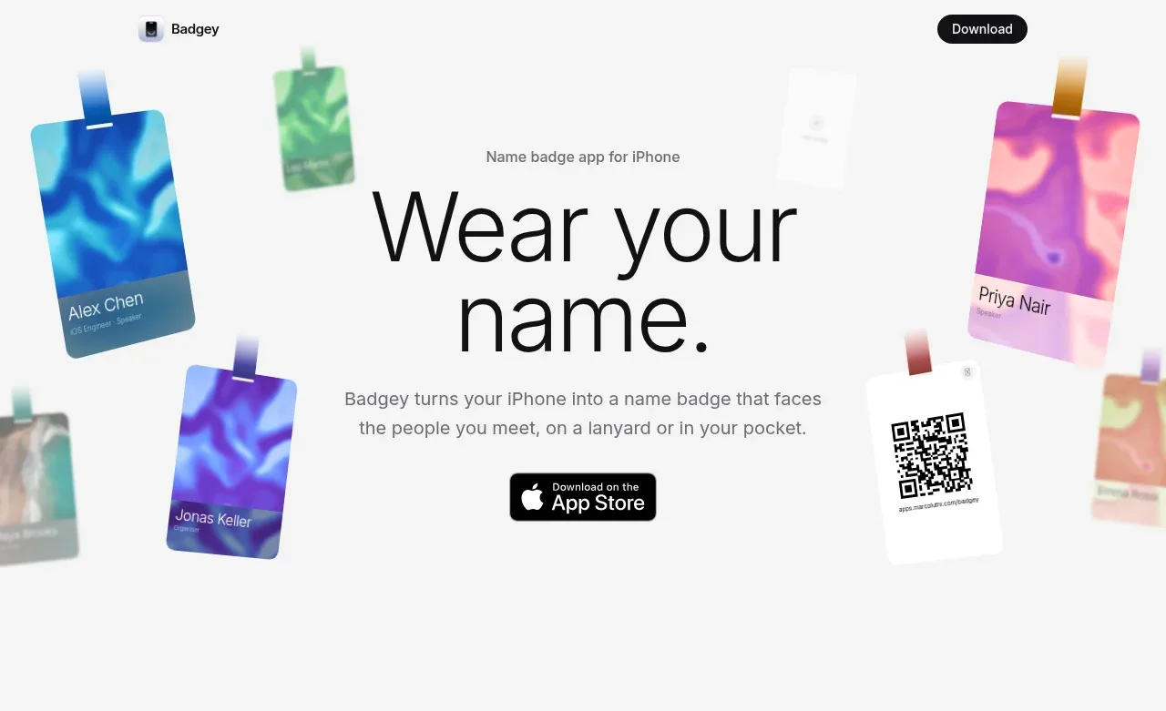
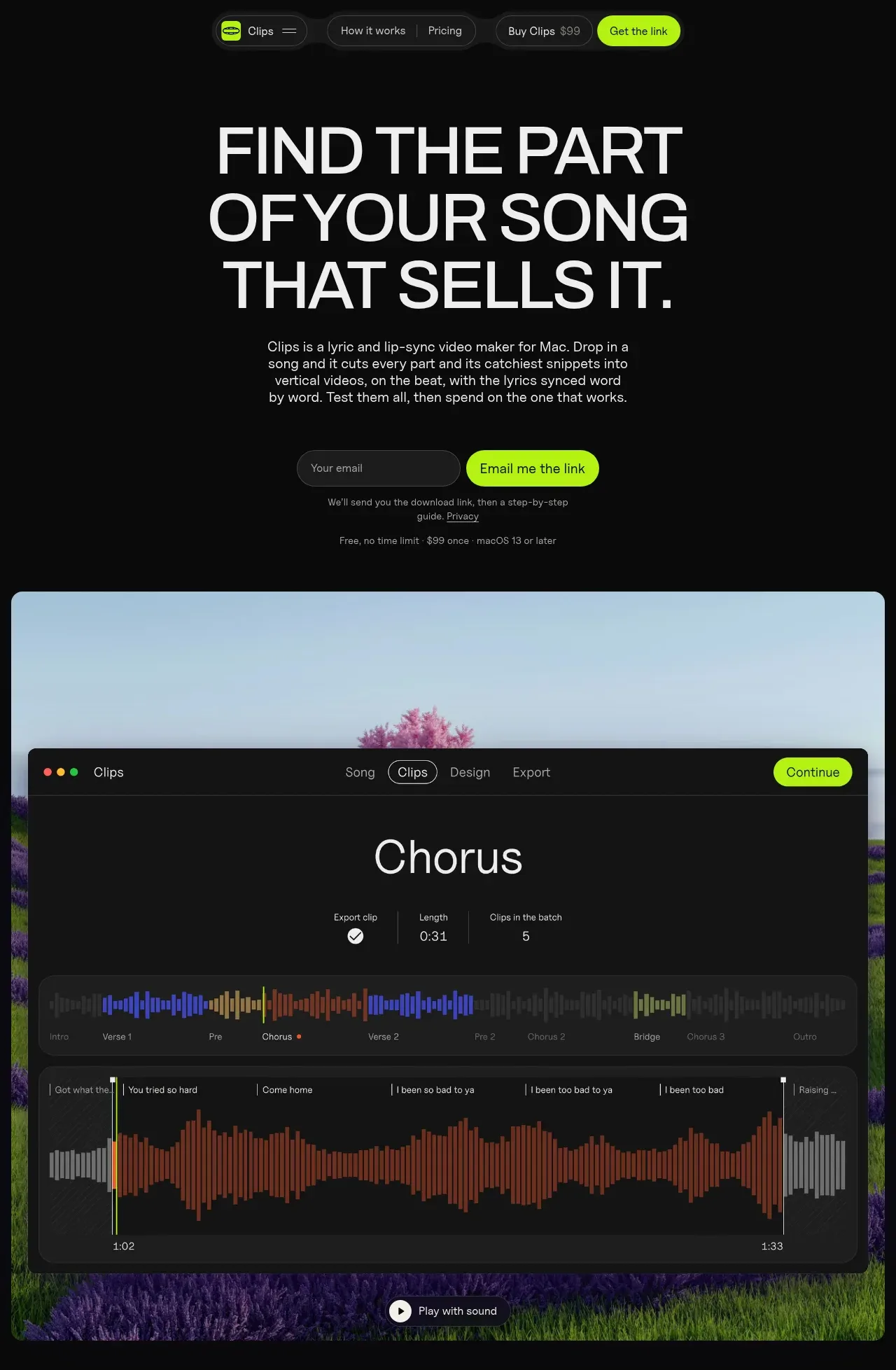
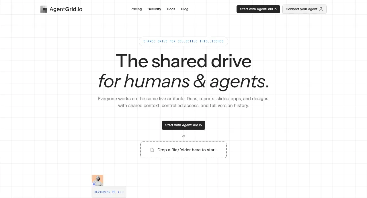
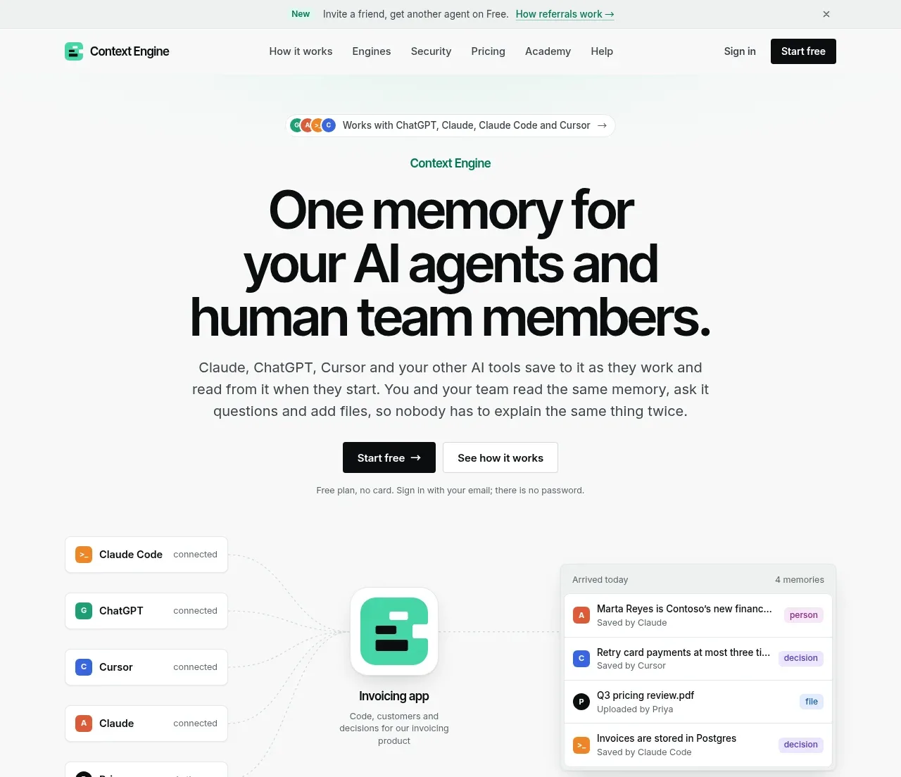
The hero uses a centered, oversized statement, concise explanatory copy, paired calls to action, and a product-style connection diagram below.
Prompt preview
## Reference images

Study these alongside the description below: hierarchy, rhythm, spacing, colour. Build for the product you are asked about, using this design language.

- Component: https://kage-design-assets.t3.tigrisfiles.io/components/context-engine/37fe6fcb-aa91-474a-8a89-1c1cadc0a655-1792821970-1.webp
- Full page it was cut from: https://kage-design-assets.t3.tigrisfiles.io/screenshots/context-engine/37fe6fcb-aa91-474a-8a89-1c1cadc0a655-1792821825382-full.webp
- Component on Kage: https://kage.design/component/context-engine-hero

## Before you start
Ask what the user's product is, what transformation it offers, and what brand personality it should express. Apply these principles to that product, not to the reference content.

Create a centered hero directly below the header. Start with a small pill communicating compatibility or audience, then a small green eyebrow, a very large two-to-three-line headline, and a readable supporting paragraph. Place a dark primary CTA beside a light secondary CTA, followed by a tiny reassurance line. Below the actions, show an abstract interface visualization: several compact source cards connected by faint curved lines to a central rounded-square product node and a destination memory/list card. Use lots of white space and a restrained near-white canvas (#FAFBFA), black headline text (#0A0B0B), muted copy (#5C6261), mint accent (#35D3A0), and pale gray surfaces (#F0F3F1). Headline should be tight and bold at roughly 52–64px desktop, with a responsive 38–44px mobile size. Use 8–12px radii, very soft shadows, and subtle connector animation only if it improves comprehension. Keep all visual elements secondary to the proposition.

Never: use logos, product names, copy, illustrations, or imagery from the reference.