 kage
kage
latitude.so
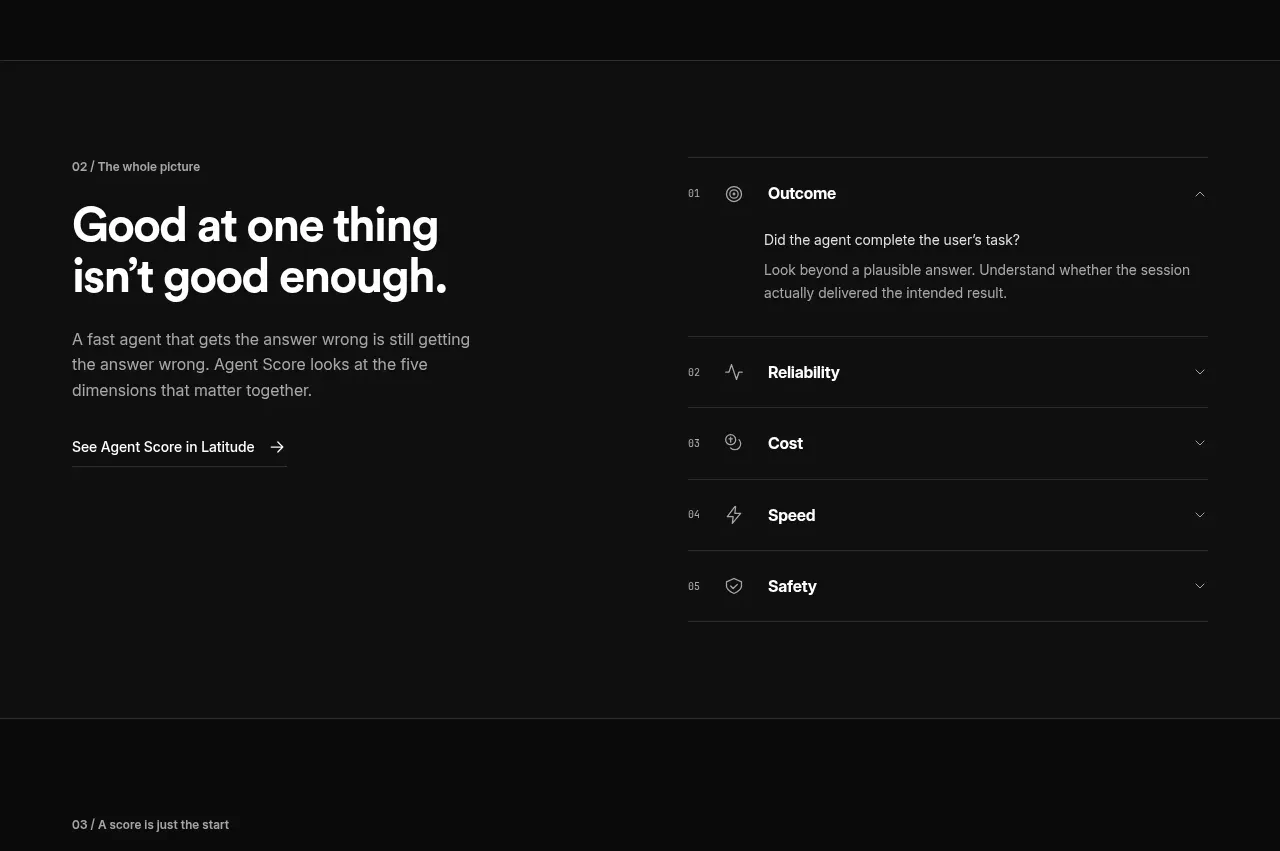
Design analysis
A split layout explains why one metric is insufficient while an accordion-like list makes the five score dimensions scannable and expandable.
Prompt preview
## Reference images

Study these alongside the description below: hierarchy, rhythm, spacing, colour. Build for the product you are asked about, using this design language.

- Component: https://kage-design-assets.t3.tigrisfiles.io/components/agentscore/bf3a39fb-f256-40cb-bcdd-3b9ee37cde16-1790229737-3.webp
- Full page it was cut from: https://kage-design-assets.t3.tigrisfiles.io/screenshots/agentscore/bf3a39fb-f256-40cb-bcdd-3b9ee37cde16-1790229689528-full.webp
- Component on Kage: https://kage.design/component/agentscore-tabs

## Before you start
Ask what dimensions or criteria your product measures and what explanation users need before trusting the result. Apply these principles to that product.

Create a dark split section with an editorial heading and supporting paragraph on the left, plus a vertical accordion list on the right. The list should contain five rows, each with a small index, a simple neutral icon, a dimension title, and a chevron; one row is expanded to show one or two explanatory lines. Use a centered 800px content frame with a roughly 45/55 split and 50px side padding. Use #101010 or #0b0b0b for the background, #f6f6f6 for headings, #9c9c9c for descriptions, and #292929 for row separators. Headings should be 32–38px with tight line height; row titles 14–15px; descriptions 13–14px. Give rows 50–70px height, 18px horizontal padding, and subtle open/close transitions. Ensure keyboard-accessible disclosure behavior and clear focus states.

Never: use logos, product names, copy, illustrations, or imagery from the reference.
More components

 Language selection cloud
Speechka · Tabs & steps
Language selection cloud
Speechka · Tabs & steps
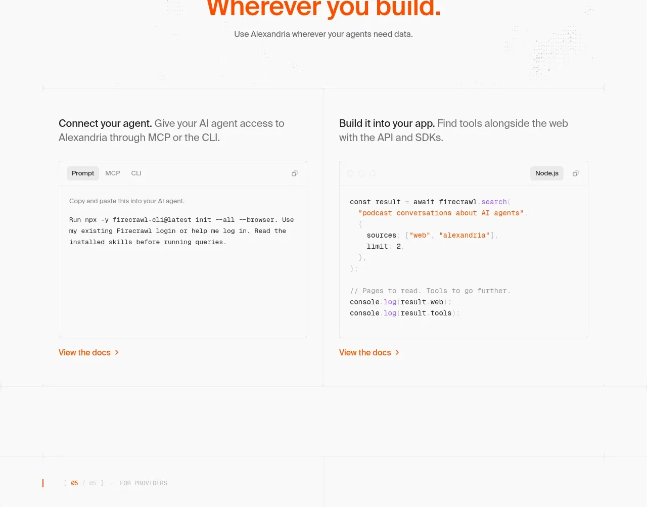
 Build and integration options
Alexandria by Firecrawl · Tabs & steps
Build and integration options
Alexandria by Firecrawl · Tabs & steps
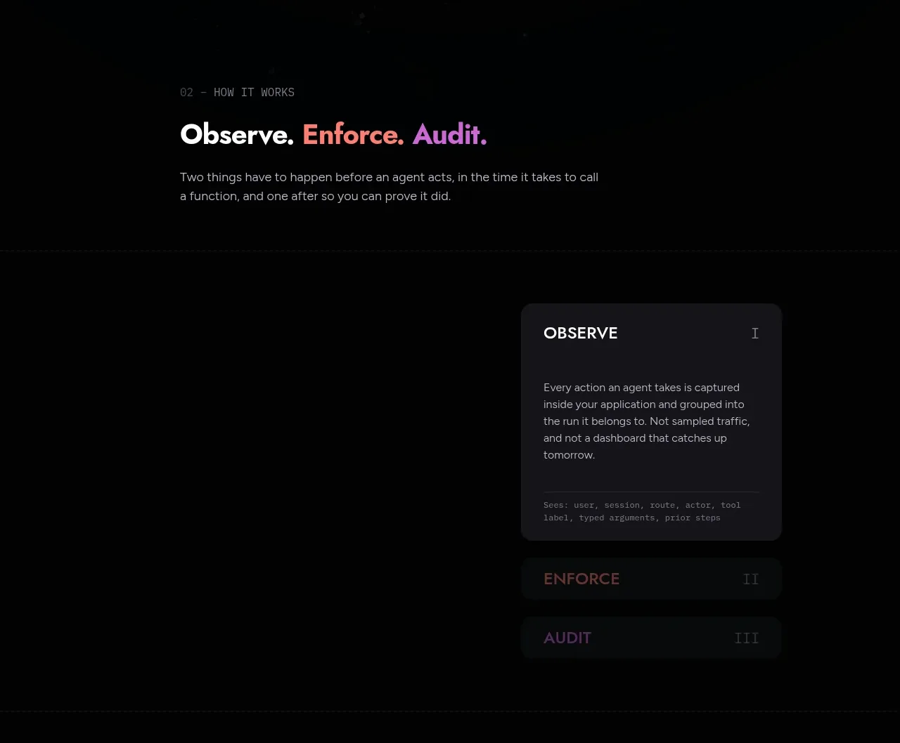
 Observe, enforce, audit workflow
Arcjet · Tabs & steps
Observe, enforce, audit workflow
Arcjet · Tabs & steps
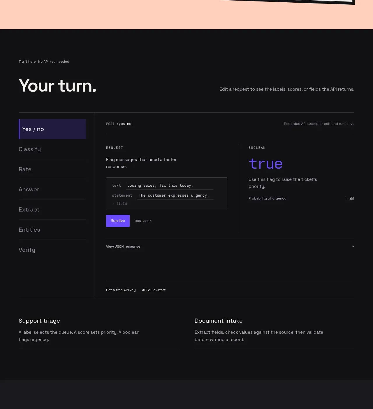
 Interactive API playground
Milliseconds.ai · Tabs & steps
Interactive API playground
Milliseconds.ai · Tabs & steps
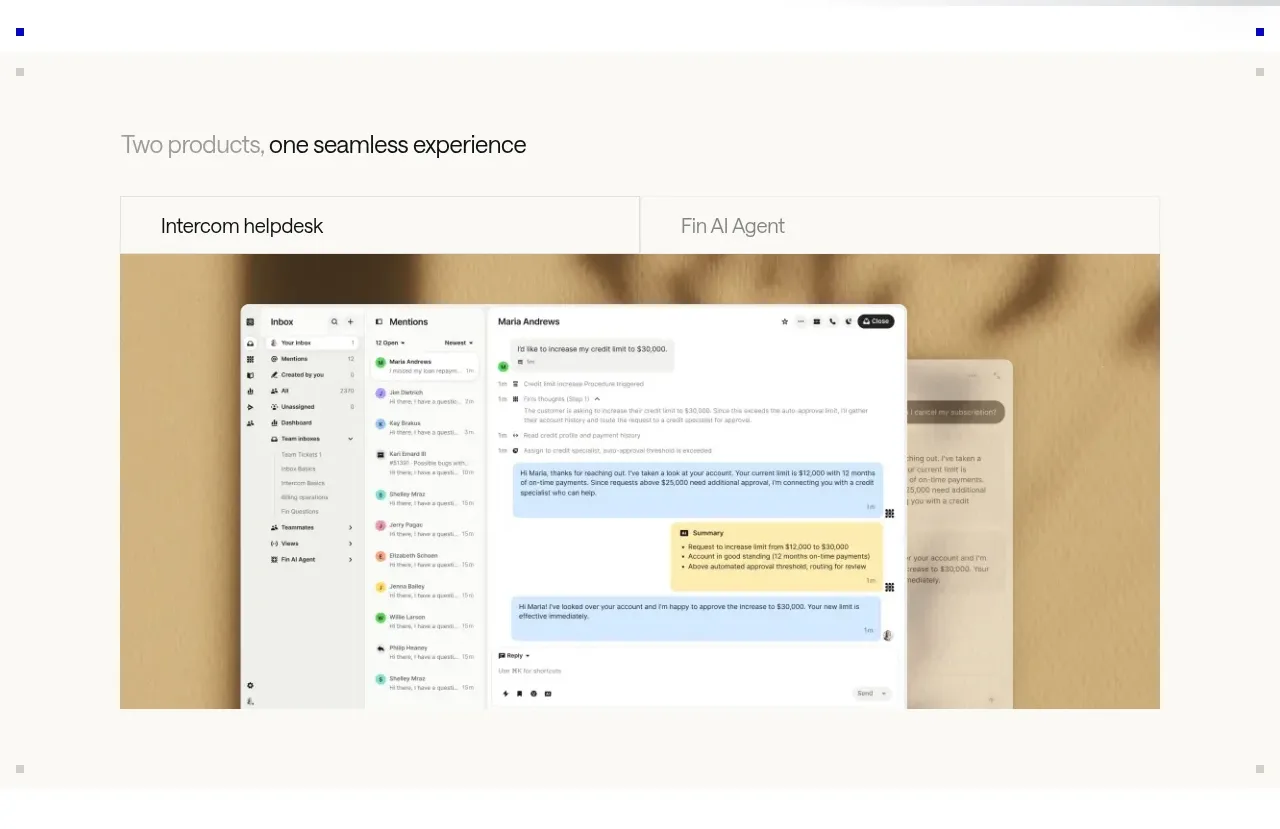
 Product overview showcase
intercom.com · Tabs & steps
Product overview showcase
intercom.com · Tabs & steps
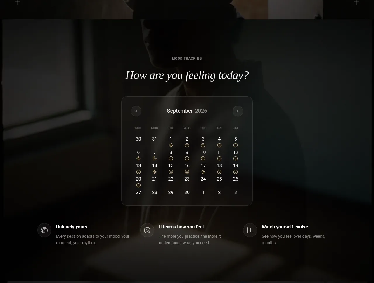
 Mood tracking calendar
Lull · Tabs & steps
Mood tracking calendar
Lull · Tabs & steps