kage
kage
Design analysis
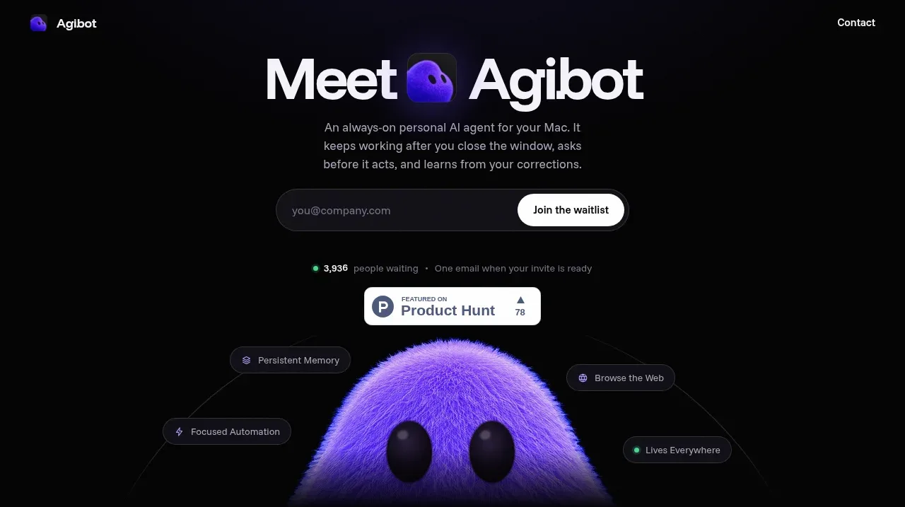
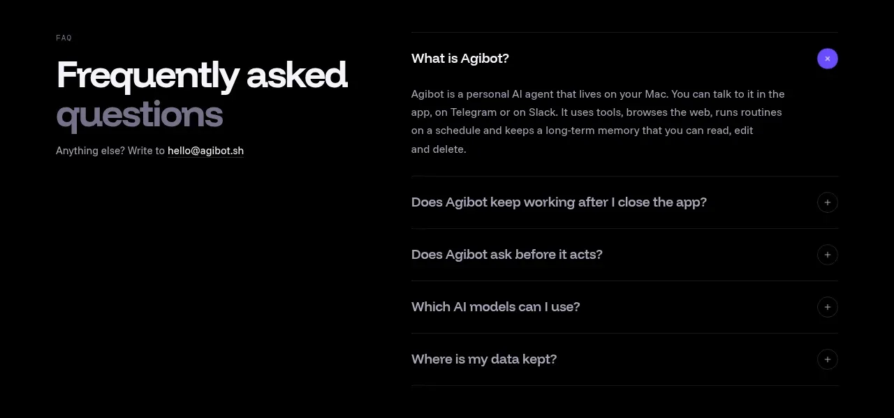
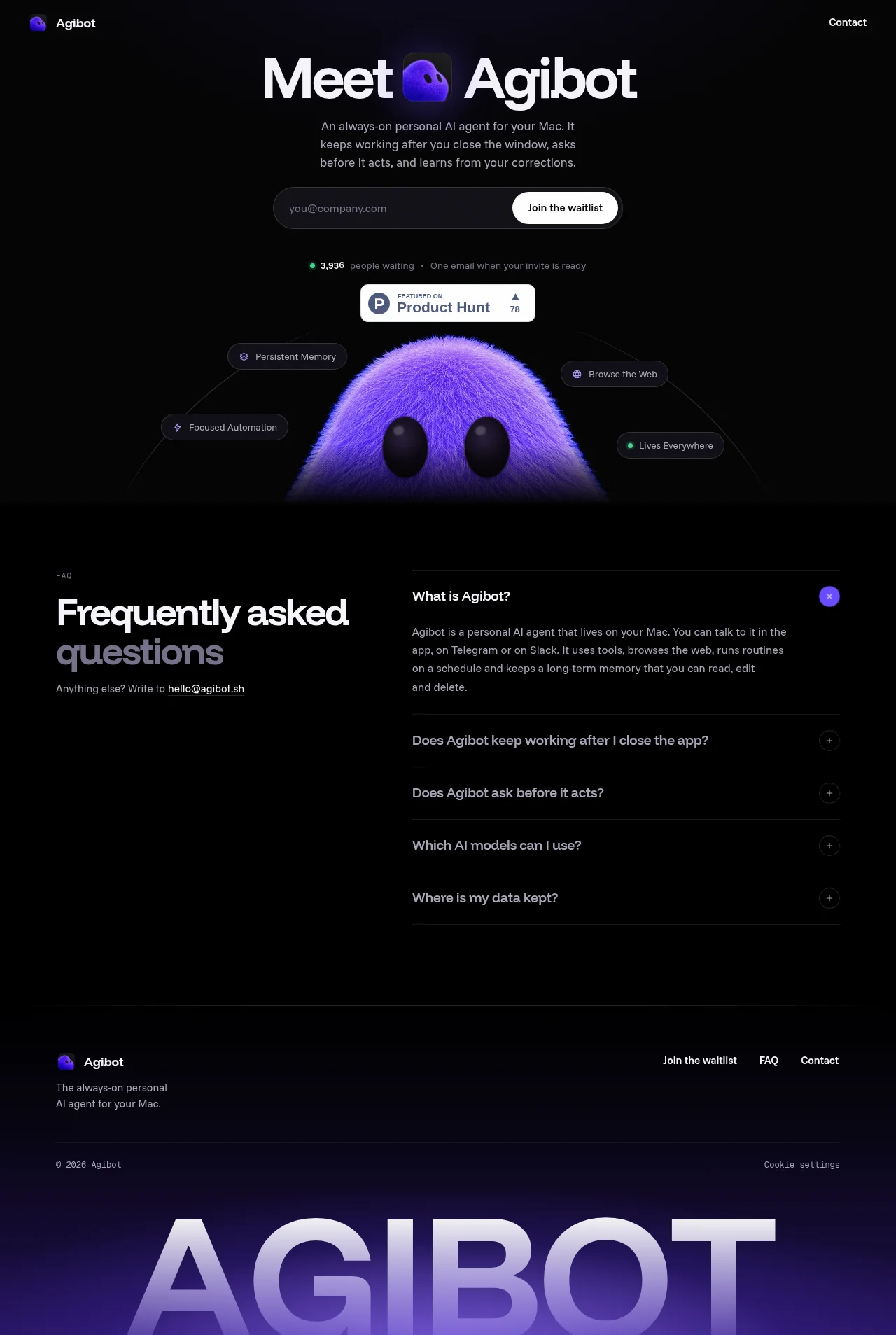
A dark single-page waitlist site built around one fuzzy purple mascot. The hero keeps a tight single column: a display-scale headline with the app icon set inline inside the sentence, a pill email capture, a live waiting counter with a green status dot and a white Product Hunt card, all floating above the mascot's head as it rises from the fold with four dark feature pills orbiting it. The page then drops density into a split FAQ — an editorial left column with a two-tone headline and monospace eyebrow, and a thin-ruled accordion on the right — before closing with a footer and a giant cropped lavender "AGIBOT" wordmark sitting on a purple glow. The rhythm is sparse-and-centred at the top, dense-and-two-column in the middle, and typographic at the end.
Prompt preview
## Reference images

Study these alongside the description below: hierarchy, rhythm, spacing, colour. Build for the product you are asked about, using this design language.

- Full page: https://kage-design-assets.t3.tigrisfiles.io/screenshots/agibot/caf89d58-757f-4493-9c2d-6456be940e33-1791784894236-full.webp
- Above the fold: https://kage-design-assets.t3.tigrisfiles.io/screenshots/agibot/caf89d58-757f-4493-9c2d-6456be940e33-1791784892283.webp
- Design on Kage: https://kage.design/designs/agibot-landing-page

## Before you start
Ask the user what product they are building, who it is for, and what brand assets they already have (name, colours, mascot or icon, typefaces). Wait for the answers before writing any code. Everything below is applied to *their* product, not to the reference site.

## Page structure
Build a single dark landing page for a waitlist-first product, top to bottom:

1. **Header** — slim bar on the page background: small mascot/logo mark plus wordmark at the left, a single "Contact" text link at the right. No nav menu beyond that.
2. **Hero** — centred single column. A very large display headline (64–88px, tight tracking) with the product's app icon dropped inline into the sentence itself. Below it, a two-to-three-line muted subheadline stating what the product does. Then the primary conversion unit: a pill-shaped email input with a white pill "Join the waitlist" button inside it on the right. Under that, a trust row: a small pulsing green dot + "N,NNN people waiting" with the number in the accent colour, a separator dot, and a reassurance line ("one email when your invite is ready"). Beneath that, one small white third-party badge card (e.g. Product Hunt style) with rounded corners and a subtle shadow.
3. **Mascot visual** — the hero's supporting character (fuzzy mascot, 3D-render or illustration) rising from the bottom edge of the hero section, cropped by the fold. Four dark pill badges with small line icons orbit it ("Persistent Memory", "Browse the Web", etc.), each a rounded rectangle with a 1px translucent border, floating at varied heights so they arc around the character.
4. **FAQ section** — switch to a two-column layout. Left column (~40%): a tiny monospace uppercase eyebrow ("FAQ"), a large two-line headline where the first line is white and the second is dimmed grey, and a small line "Anything else? Write to hello@…" with the email as a link. Right column (~60%): an accordion of 5 questions separated by 1px hairlines; the first item is open by default showing a short paragraph, with a circular accent-coloured button showing a minus/close icon at the far right of open items and a subtle circular plus icon on closed ones.
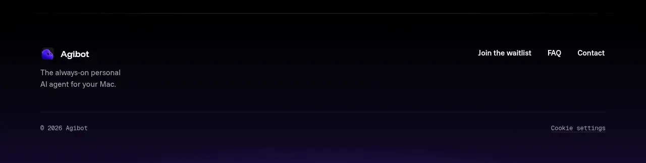
5. **Footer** — top row: logo mark + wordmark with a two-line muted tagline on the left; three text links ("Join the waitlist", "FAQ", "Contact") on the right. Bottom row: "© 2026 Name" in monospace at the left, "Cookie settings" in monospace at the right.
6. **Signature close** — below the footer, a giant wordmark of the product name in all-caps, ~20vw size, in a pale lavender gradient, cropped roughly in half by the bottom edge of the page, sitting on a purple radial glow rising from the bottom.

## Design language
- **Dark base, single accent.** Background is near-black (#0A0A0C) with a slightly lighter panel tone (#111114) for the FAQ section. One accent only: violet ≈ #6C4CF1 used for the mascot, open-state buttons and glows; pale lavender ≈ #C9B8FF for the giant footer wordmark; a single green (#34D399) status dot is the only other colour.
- **Hierarchy by scale, not decoration.** No gradients on text in the body, no cards in the hero. Contrast comes from a massive headline next to small muted copy (14–16px, grey ≈ #9A9AA2). Whitespace does the sectioning.
- **Pill geometry everywhere interactive.** Email capture, buttons, feature badges and accordion controls are fully rounded pills/circles. Panels are minimal: 1px rgba(255,255,255,0.12) borders, no drop shadows except the white third-party badge card.
- **Hairline dividers for lists.** FAQ items are separated by 1px low-opacity rules rather than card boxes — the section reads as a table of questions.
- **Type pairing.** One grotesque sans (e.g. Inter/Neue Haas style) for everything headline and body; a monospace face reserved for micro-labels (eyebrows, copyright, "Cookie settings") to give the page a technical, terminal-adjacent texture.
- **Rhythm down the page.** Sparse and centred at the top (hero + mascot), then dense and two-column in the middle (FAQ), then typographic and cropped at the bottom (giant wordmark). Alternate centred/single-column with split layouts to mark section changes instead of using background colour swaps alone.
- **Motion.** Keep it subtle: a soft pulse on the green "waiting" dot, accordion items expanding smoothly with the icon rotating from + to −, feature pills gently bobbing around the mascot. Nothing parallax-heavy.
- **Mascot as identity.** If the user has a character/icon, let it do the emotional work: place it inline in the headline, large and cropped in the hero, and small in the header/footer, so the page stays austere around it.

## Never
Do not use the Agibot name, wordmark, mascot character, copy, Product Hunt badge, or any of the FAQ text from the reference. Never present the result as Agibot; build the same visual system for the user's own product and their own assets.