kage
kage
busabase.com

Design analysis
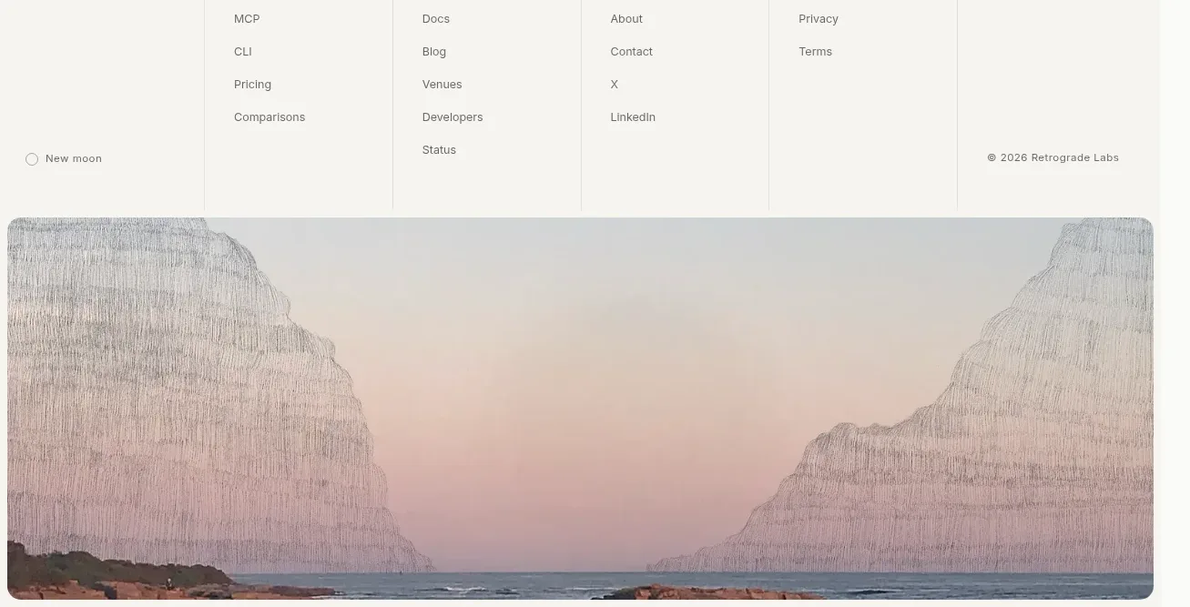
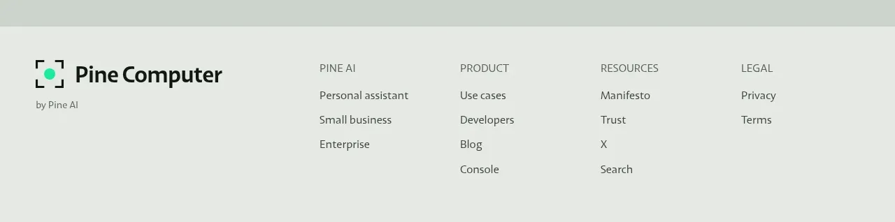
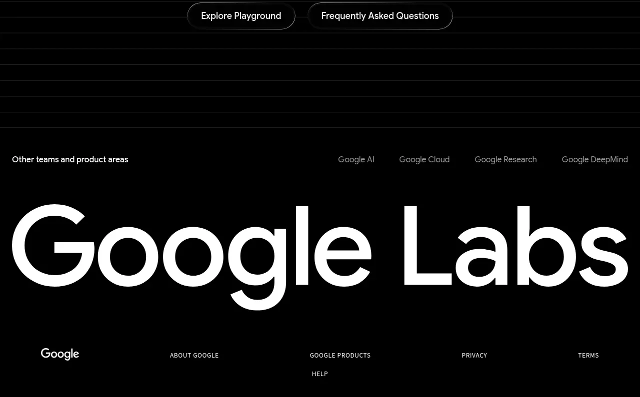
The footer separates a short brand/support block from grouped product, resource, company, and legal links. A thin divider and small copyright line provide a quiet, complete ending.
Prompt preview
## Reference images

Study these alongside the description below: hierarchy, rhythm, spacing, colour. Build for the product you are asked about, using this design language.

- Component: https://kage-design-assets.t3.tigrisfiles.io/components/busabase/7d05ddcb-d0f9-4d81-8382-8bbb1120492e-1791612080-10.webp
- Full page it was cut from: https://kage-design-assets.t3.tigrisfiles.io/screenshots/busabase/7d05ddcb-d0f9-4d81-8382-8bbb1120492e-1791612035007-full.webp
- Component on Kage: https://kage.design/component/busabase-footer

## Before you start
Ask for the user's required footer links, support contact, legal pages, social destinations, and brand voice. Apply these rules to that information rather than copying the reference.

Build a spacious multi-column footer with a thin top border. Put a compact brand/support block in the first column, including a small brand treatment, one-line positioning statement, and support contact. Place grouped navigation links in four additional columns with bold 12px headings and muted 13px links. Finish with a horizontal divider and a small copyright or company note aligned along the bottom. Use #f3f5f4 background, #d9dedb dividers, near-black #1b1d1c headings, #737976 links, 12–14px sans-serif type, and 32–48px desktop padding. Keep link rows comfortably spaced, add clear hover/focus states, and collapse into two columns or an accordion on mobile.

Never: use logos, product names, copy, illustrations, or imagery from the reference.