kage
kage
requesteagle.tokarev.work

Design analysis
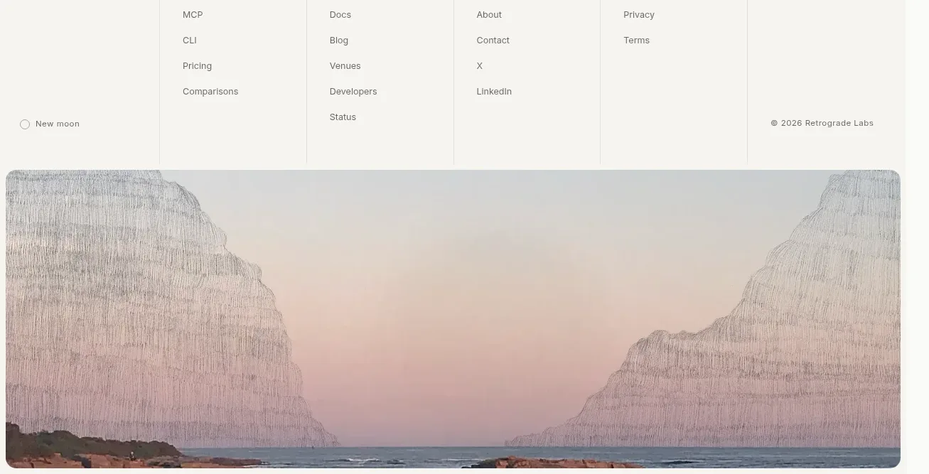
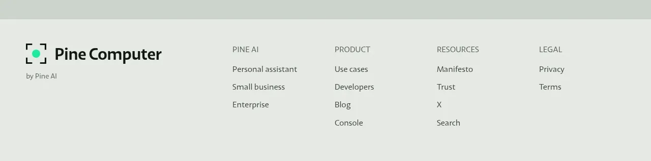
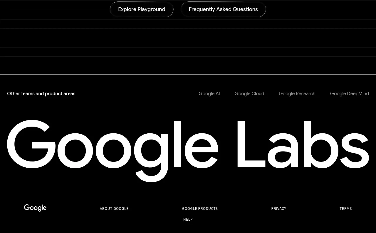
A bright cyan footer provides a final oversized wordmark treatment, a horizontal divider, and a compact row of utility links. The high-contrast inversion gives the page a clean, memorable finish.
Prompt preview
## Reference images

Study these alongside the description below: hierarchy, rhythm, spacing, colour. Build for the product you are asked about, using this design language.

- Component: https://kage-design-assets.t3.tigrisfiles.io/components/request-eagle/fb8c7e5d-6253-47fd-b840-135fd368731b-1791612078-10.webp
- Full page it was cut from: https://kage-design-assets.t3.tigrisfiles.io/screenshots/request-eagle/fb8c7e5d-6253-47fd-b840-135fd368731b-1791612032869-full.webp
- Component on Kage: https://kage.design/component/request-eagle-footer

## Before you start
Ask what brand name, utility links, legal links, and short product descriptor the user's footer needs. Apply the principles below to that product.

Build a short, high-contrast footer on a light cyan background around `#7ed5f5`. Place a large dark italic uppercase brand wordmark or text treatment at the top, followed by a thin dark divider. Below it, align a small descriptor on the left and a compact row of utility links on the right.

Use 20–24px horizontal padding, 34–48px top padding, and 12–14px bottom padding. The brand treatment should be 54–78px desktop, heavy and condensed, with a responsive reduction on mobile. Use dark navy `#07101d` for text and rules, 11–12px uppercase or sentence-case utility links, and 20–28px gaps. Collapse the link row beneath the descriptor on narrow screens while maintaining strong contrast and keyboard focus states.

Never use logos, product names, copy, illustrations, or imagery from the reference.