kage
kage
heypi.xyz

Design analysis
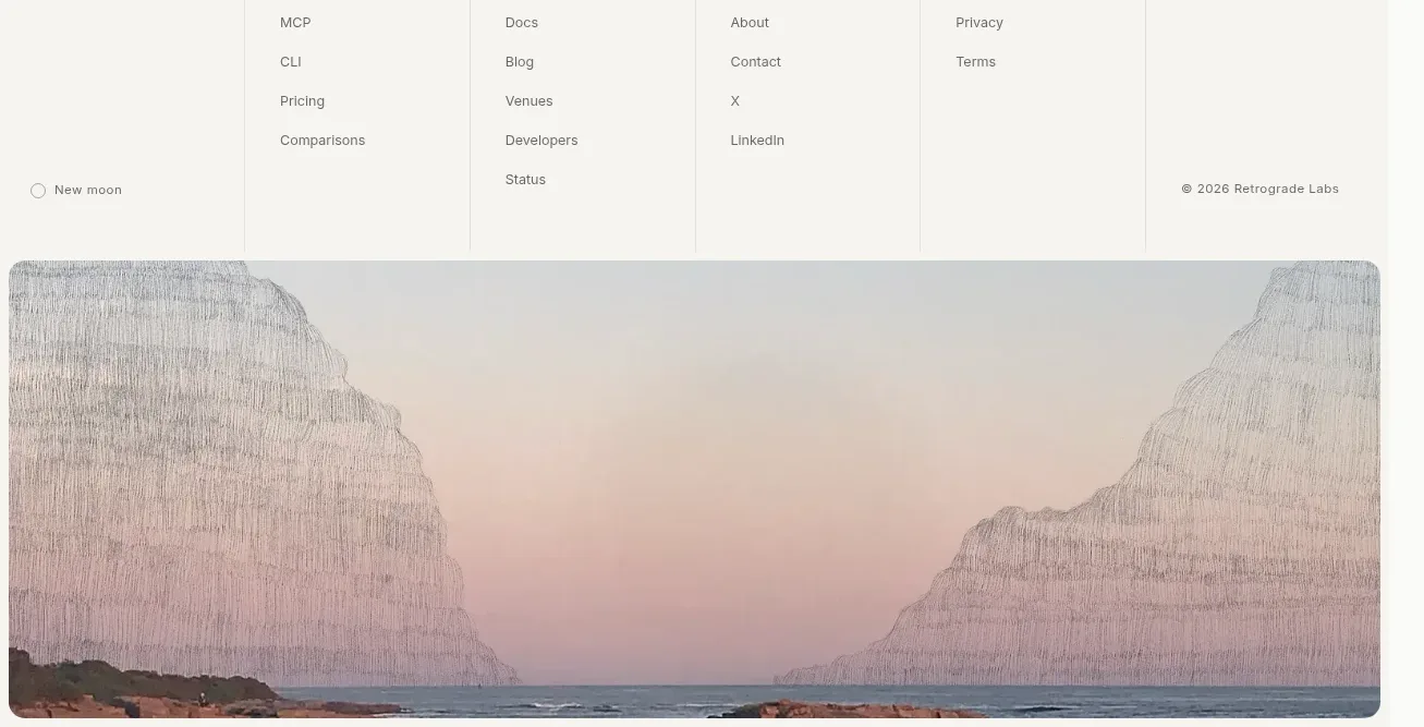
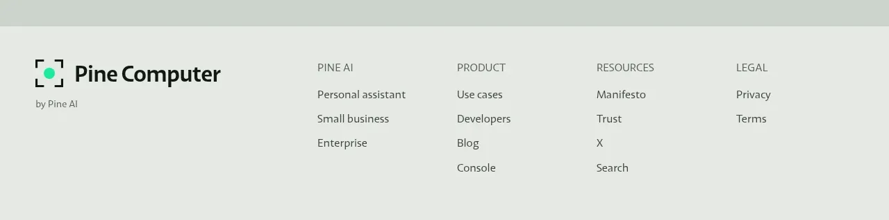
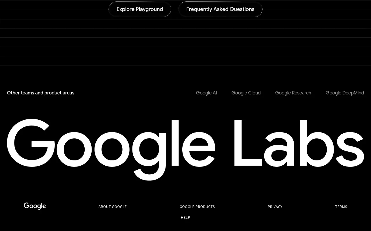
The footer closes with a small brand description, a horizontal set of utility links, and a low-contrast legal line.
Prompt preview
## Reference images

Study these alongside the description below: hierarchy, rhythm, spacing, colour. Build for the product you are asked about, using this design language.

- Component: https://kage-design-assets.t3.tigrisfiles.io/components/heypi/9fccb756-63dd-4cec-9422-c066b077bc89-1791612278-7.webp
- Full page it was cut from: https://kage-design-assets.t3.tigrisfiles.io/screenshots/heypi/9fccb756-63dd-4cec-9422-c066b077bc89-1791612175185-full.webp
- Component on Kage: https://kage.design/component/heypi-footer

## Before you start
Ask the user which navigation, contact, social, and legal destinations their product needs. Match the footer to their brand system.

Create a compact dark footer with a thin upper separation, a small brand/name area and one-sentence description on the left, and a single row of utility links on the right. Place a subdued copyright or legal line below. Use a near-black background, warm off-white text, grey secondary text, and a restrained gold accent. Suggested colours: #111214, #EEECE3, #A09F98, #D9C863. Align content to a shared max-width, use 14–16px body text, 10–12px metadata, 16–24px gaps, and wrap links cleanly on mobile. Add visible keyboard focus and underline or colour transitions on hover.

Never use logos, product names, copy, illustrations, or imagery from the reference.