 kage
kage
firecrawl.dev
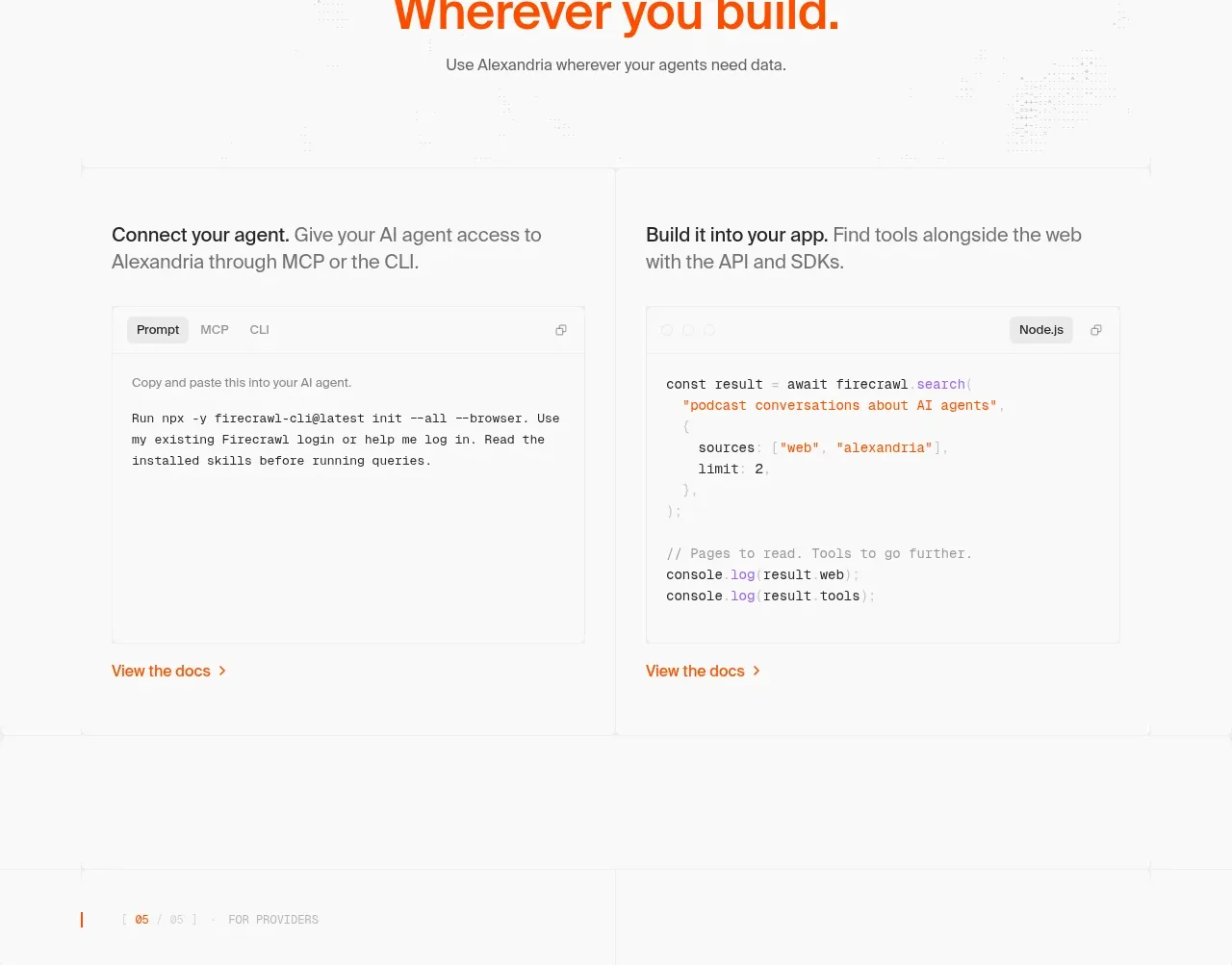
Design analysis
A developer-focused panel presents two parallel ways to use the product, with tab-like labels and readable code/configuration areas.
Prompt preview
## Reference images

Study these alongside the description below: hierarchy, rhythm, spacing, colour. Build for the product you are asked about, using this design language.

- Component: https://kage-design-assets.t3.tigrisfiles.io/components/alexandria-by-firecrawl/0b1c70de-f8b6-4b9f-90b5-f9bf706672fa-1790229692-6.webp
- Full page it was cut from: https://kage-design-assets.t3.tigrisfiles.io/screenshots/alexandria-by-firecrawl/0b1c70de-f8b6-4b9f-90b5-f9bf706672fa-1790229655966-full.webp
- Component on Kage: https://kage.design/component/alexandria-by-firecrawl-tabs

## Before you start
Ask what integration methods the user's product supports and which developer workflows matter most. Ask whether the brand should feel technical, friendly, or enterprise-grade.

Build a section with a small eyebrow, a centered two-line heading, and supporting copy. Below it, place two equal-width integration panels side by side: one for a fast agent/CLI setup and one for embedding an SDK or API in an application. Give each panel a bold intro sentence, a short explanation, a compact tab row, a light code block with syntax-colored tokens, and a text link to documentation. Use a white background, #f4f4f4 code surfaces, #202020 text, orange #f15a24 for active tabs and links, 1px #e8e8e8 borders, and 8–12px radii. Use monospace code at 12–14px, body text at 14–16px, and preserve generous 40–64px padding. Tabs should visibly switch content and be keyboard accessible.

Never: use Firecrawl or Alexandria names, exact reference code, logos, copy, illustrations, or imagery.
More components
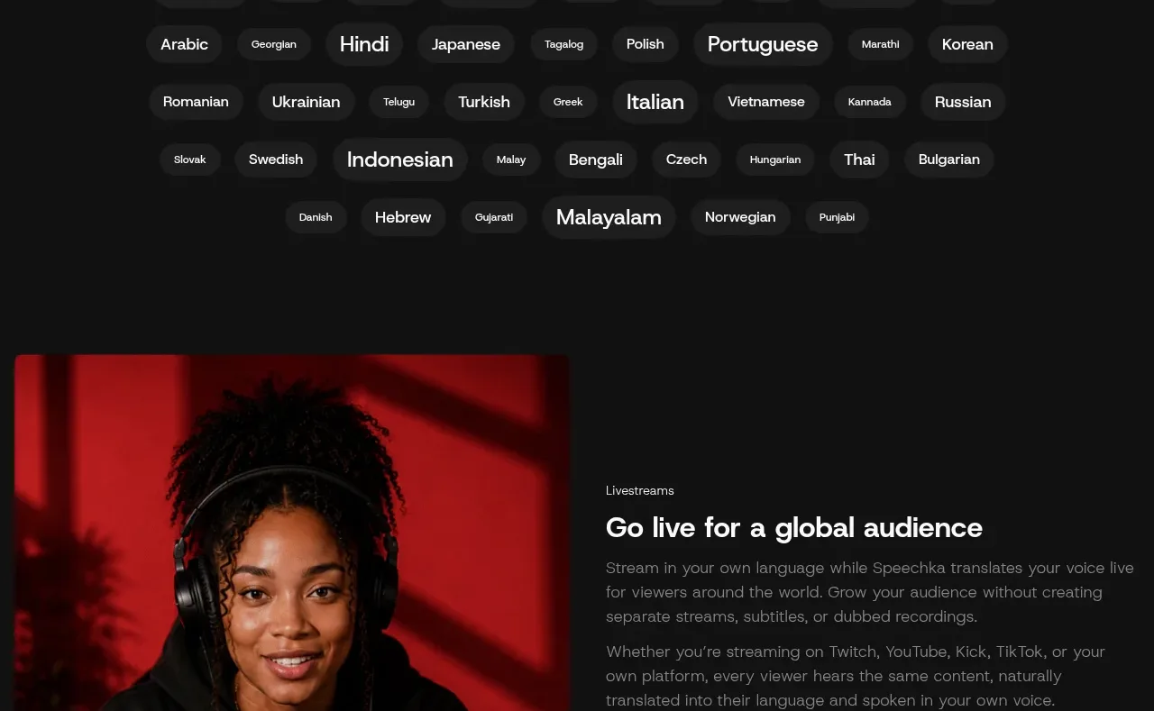
 Language selection cloud
Speechka · Tabs & steps
Language selection cloud
Speechka · Tabs & steps
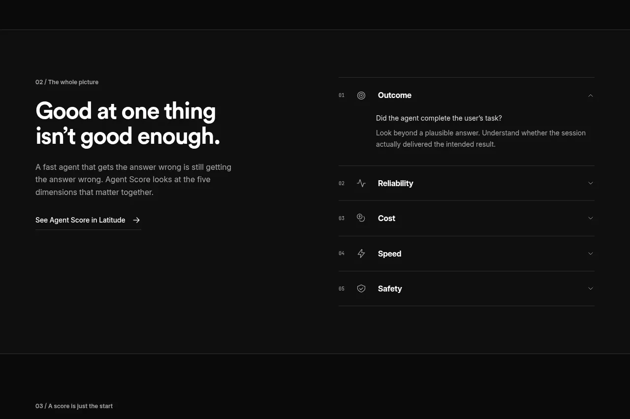
 Five-dimension score breakdown
AgentScore · Tabs & steps
Five-dimension score breakdown
AgentScore · Tabs & steps
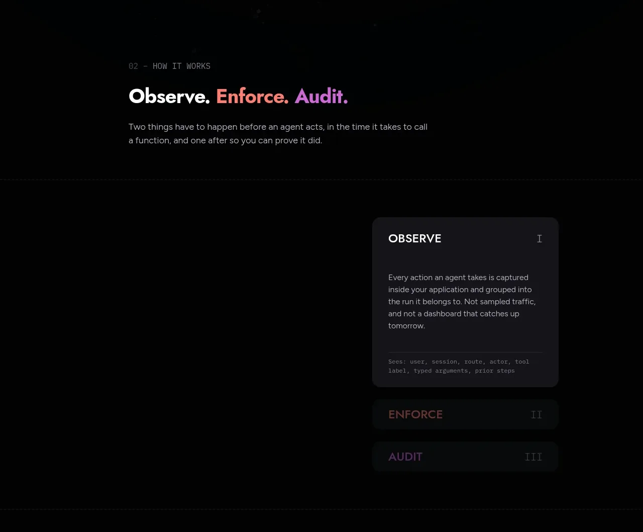
 Observe, enforce, audit workflow
Arcjet · Tabs & steps
Observe, enforce, audit workflow
Arcjet · Tabs & steps
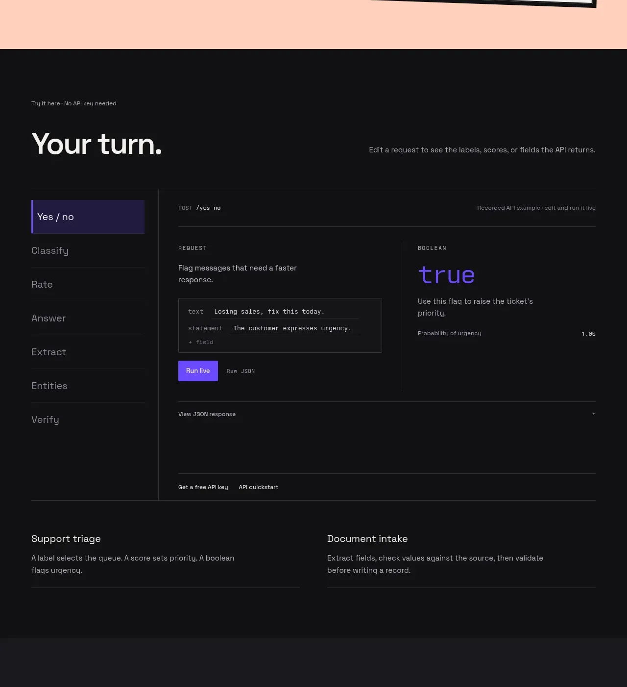
 Interactive API playground
Milliseconds.ai · Tabs & steps
Interactive API playground
Milliseconds.ai · Tabs & steps
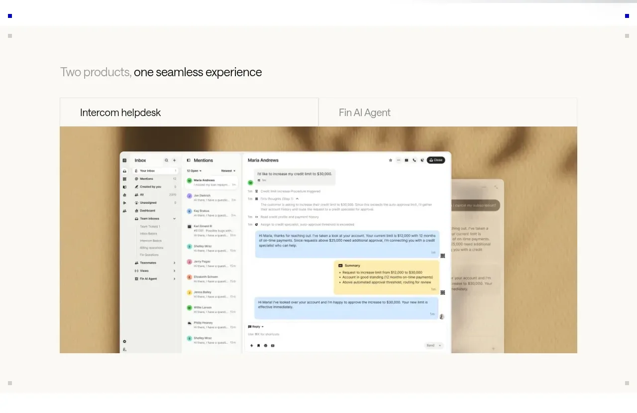
 Product overview showcase
intercom.com · Tabs & steps
Product overview showcase
intercom.com · Tabs & steps
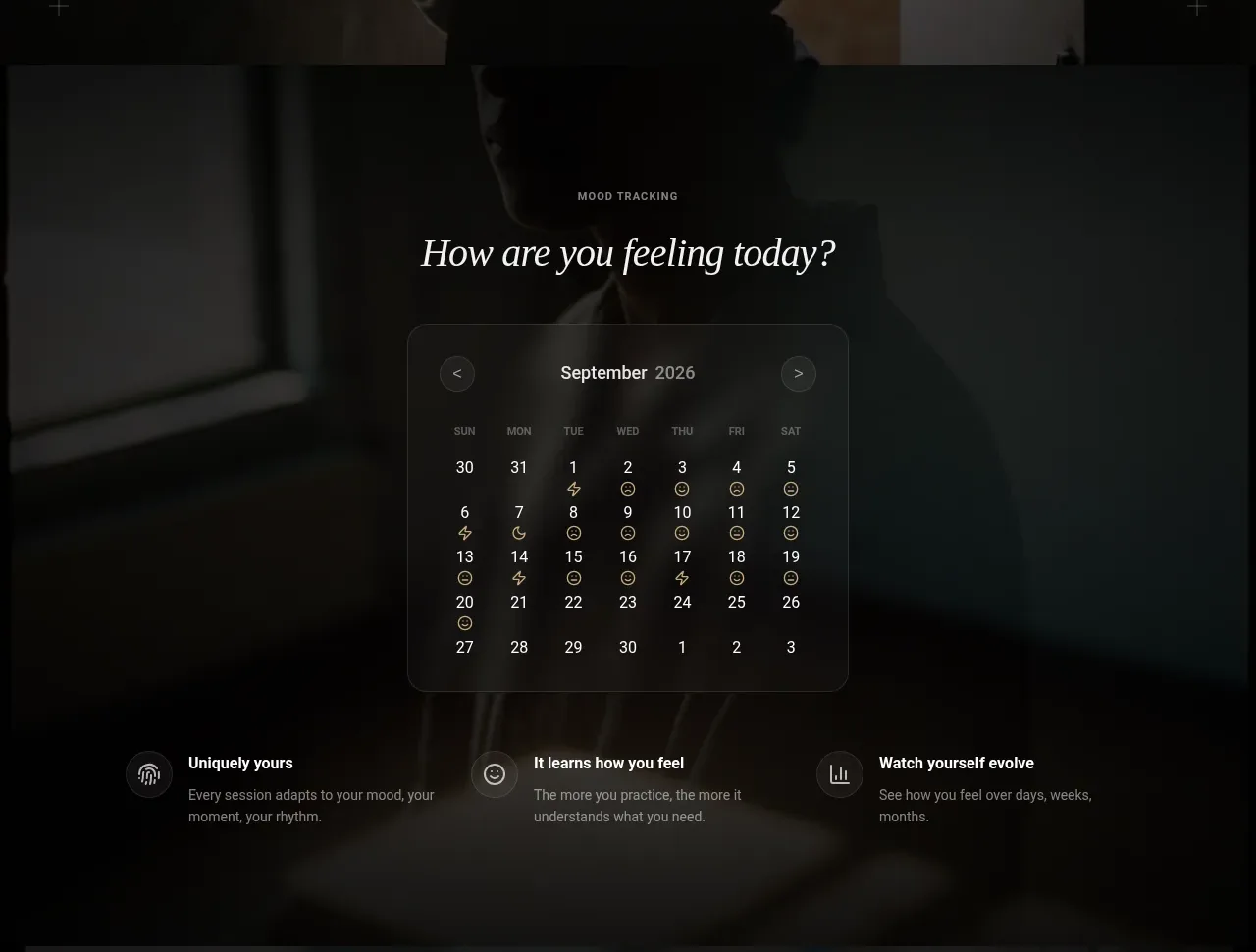
 Mood tracking calendar
Lull · Tabs & steps
Mood tracking calendar
Lull · Tabs & steps