kage
kage
ancher.ai
Design analysis
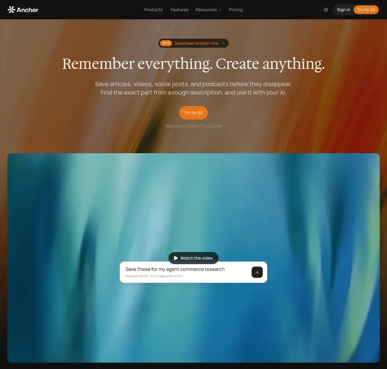
The hero pairs a centered editorial headline and short explanation with two calls to action, then gives the product a large rounded visual that occupies most of the viewport.
Prompt preview
## Reference images

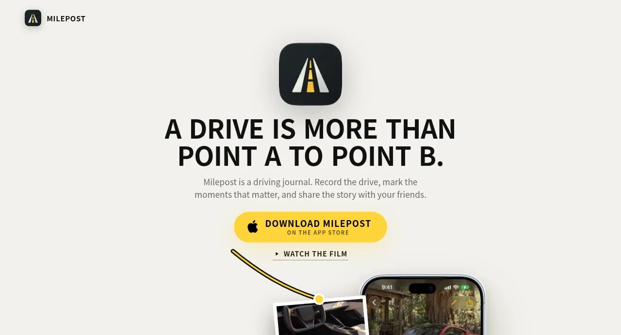
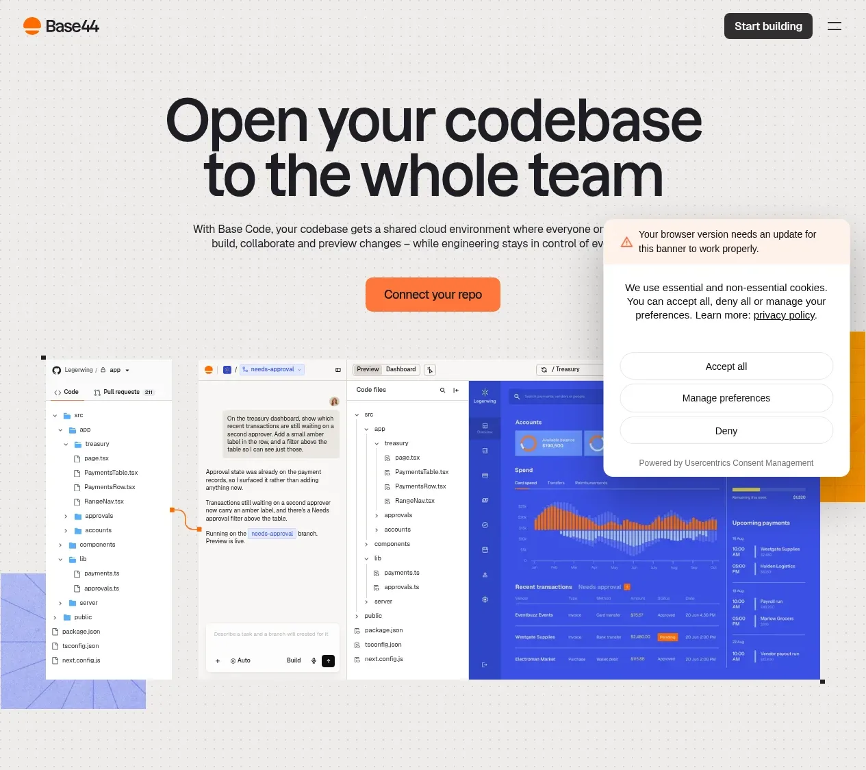
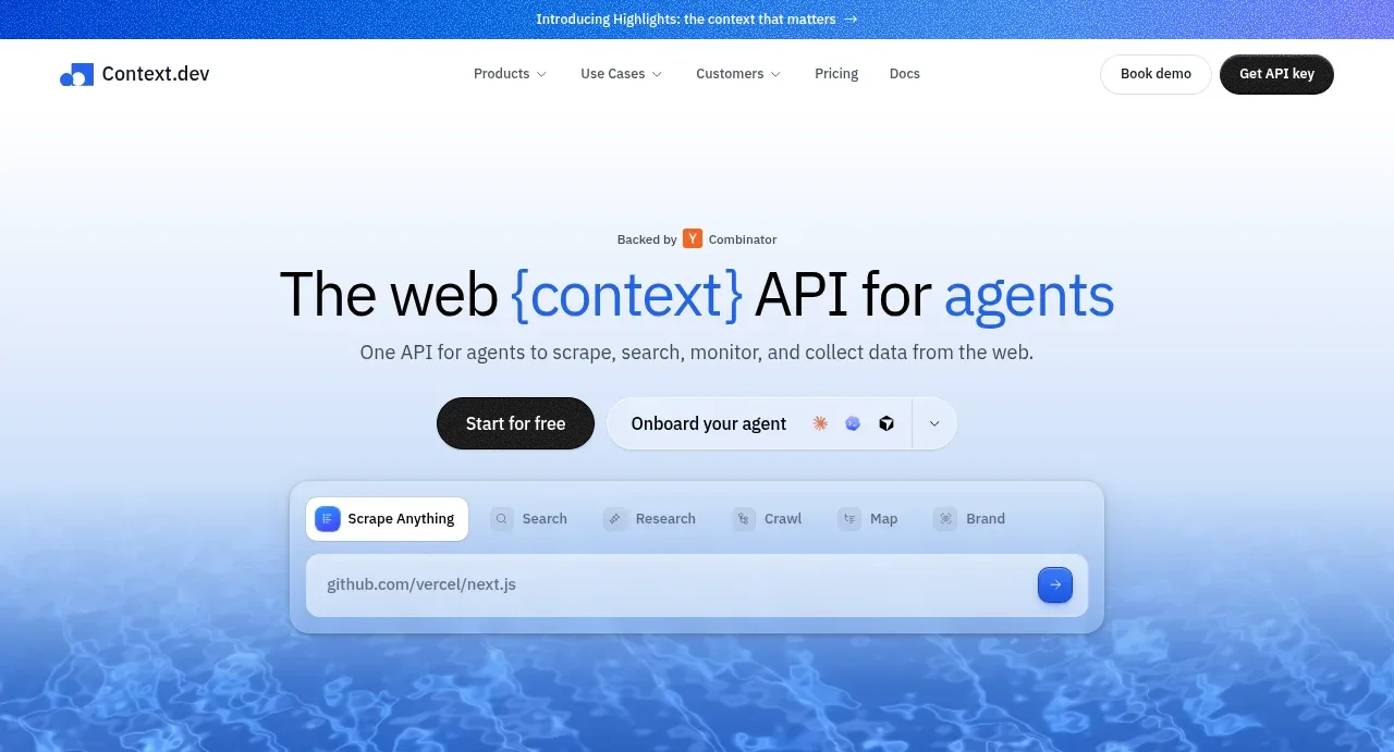
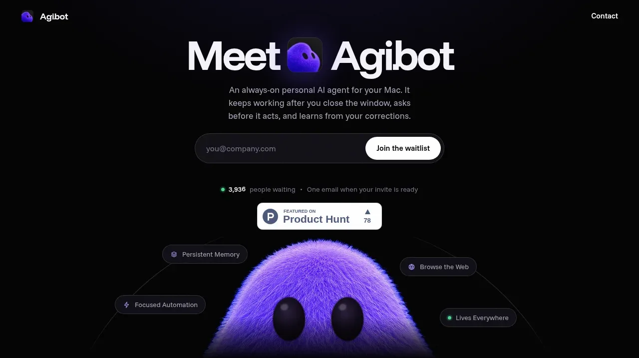
Study these alongside the description below: hierarchy, rhythm, spacing, colour. Build for the product you are asked about, using this design language.

- Component: https://kage-design-assets.t3.tigrisfiles.io/components/ancher-2-0/49a60068-1f5d-45e9-9623-df337c2895cf-1791871457-1.webp
- Full page it was cut from: https://kage-design-assets.t3.tigrisfiles.io/screenshots/ancher-2-0/49a60068-1f5d-45e9-9623-df337c2895cf-1791871353691-full.webp
- Component on Kage: https://kage.design/component/ancher-2-0-hero

## Before you start
Ask what the user's product and brand are, including the desired emotional tone and primary conversion goal. Apply these rules to create an original hero for that product.

Create a full-width hero directly beneath the navigation. Use a soft, abstract, full-bleed blurred gradient background with dark translucent overlay, centered content, a tiny announcement pill, a large high-contrast serif headline, concise supporting copy, and one warm pill CTA. Place a large rounded demo/video panel below the copy with an unobtrusive play control and a small floating input or product-state card. Use an editorial serif around 38–50px with tight line-height, sans-serif body text at 13–15px, and restrained vertical spacing: roughly 28px announcement-to-heading, 14px heading-to-copy, 24px copy-to-action. Use near-black (#111111), ivory text (#f1eee7), muted gray (#aaa49c), orange (#f08a24), and cool cyan/blue visual accents. Radius 10–14px; keep the visual edge-to-edge within a 12px mobile gutter. Make the CTA and video control keyboard accessible.

Never: use logos, product names, copy, illustrations, or imagery from the reference.