kage
kage
context.dev
Design analysis
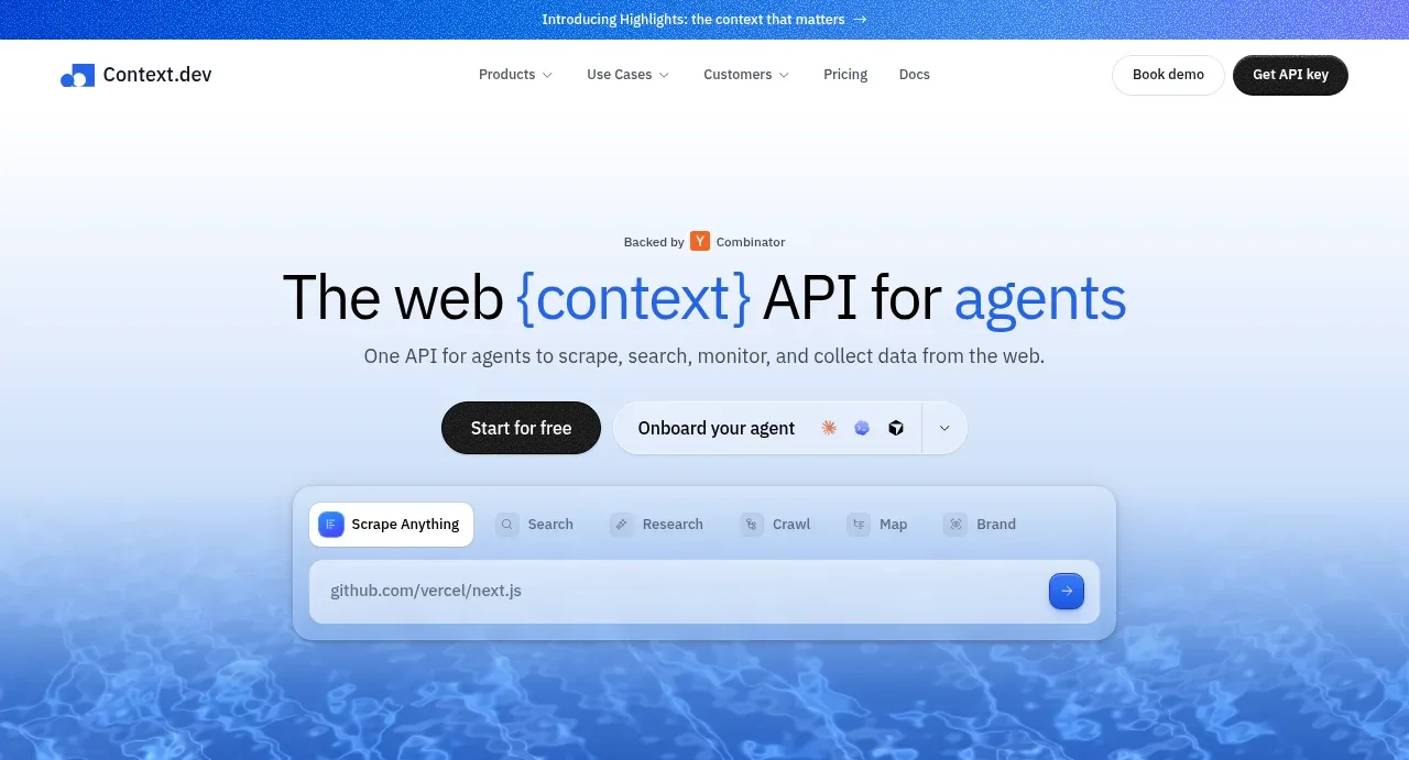
A centered product promise, supporting line, dual actions, and a floating browser-like API demo sit over a blue watery gradient visual.
Prompt preview
## Reference images

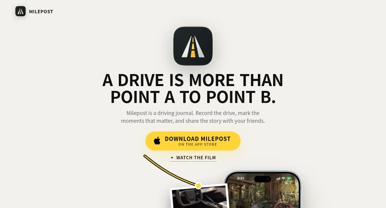
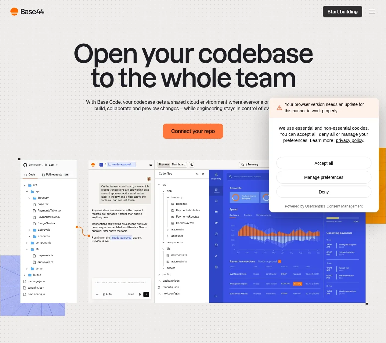
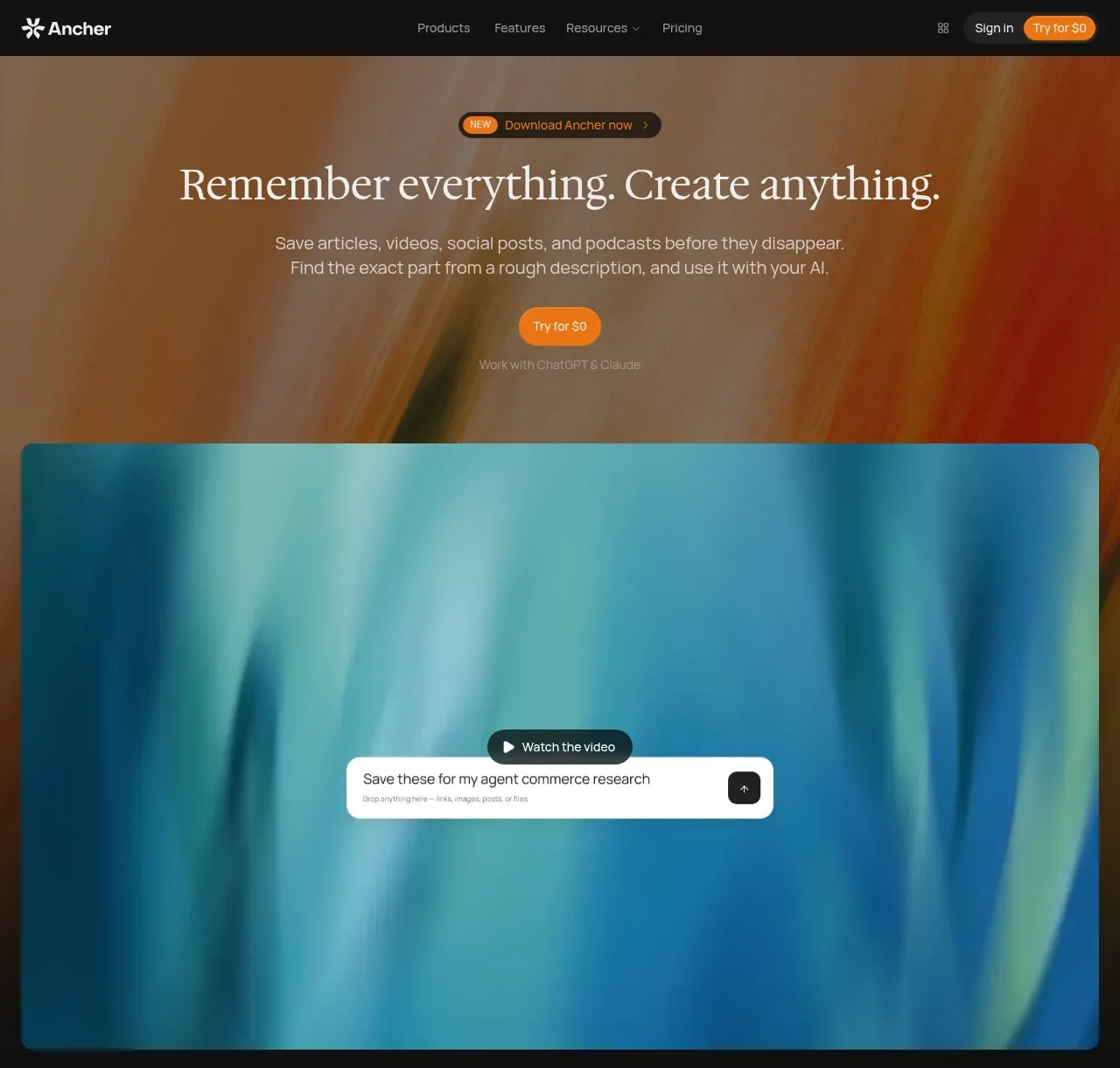
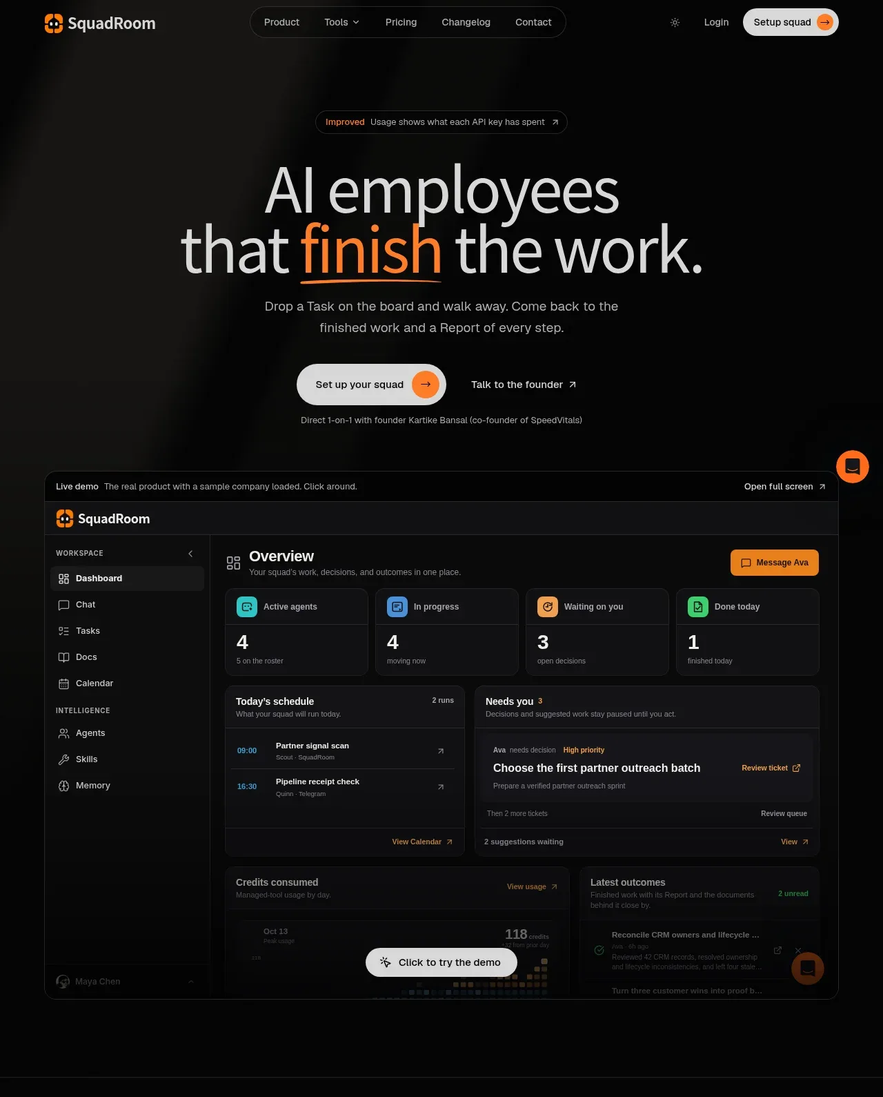
Study these alongside the description below: hierarchy, rhythm, spacing, colour. Build for the product you are asked about, using this design language.

- Component: https://kage-design-assets.t3.tigrisfiles.io/components/scrape-anything-by-context-dev/b0e64468-3924-45db-a4d8-d7cbe8044a77-1791871392-1.webp
- Full page it was cut from: https://kage-design-assets.t3.tigrisfiles.io/screenshots/scrape-anything-by-context-dev/b0e64468-3924-45db-a4d8-d7cbe8044a77-1791871314047-full.webp
- Component on Kage: https://kage.design/component/scrape-anything-by-context-hero

## Before you start
Ask what the user's product, audience, and brand are, then adapt this structure to their offering.

Create a centered hero directly below the navigation. Use a tiny credibility eyebrow, a large two-line headline with one blue-highlighted phrase, concise supporting copy, and two horizontally aligned calls to action. Place a compact product/demo panel below the actions, with tab-like controls, a URL or input field, and a small circular submit control. Let the lower half fade into an abstract blue atmospheric background, while keeping text highly legible. Use near-black #101318, accent blue around #2F6DCE, cool white #F8FAFD, pale blue surfaces, soft 1px borders, 14–18px panel radii, and restrained shadows. Aim for a 64–80px desktop headline, 28–40px mobile headline, generous vertical padding, and a clear visual hierarchy. Buttons should have a dark filled primary treatment and a light secondary treatment; demo tabs and input should support hover and focus states.

Never: use logos, product names, copy, illustrations, or imagery from the reference.