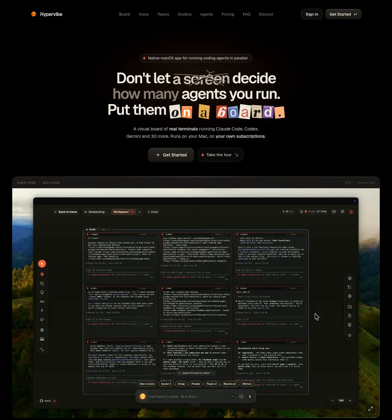
kage
kage
squadroom.app
Design analysis
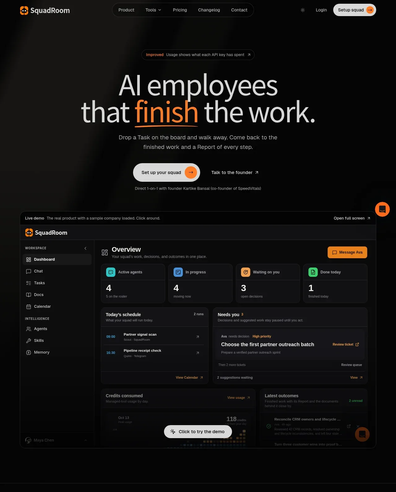
The hero pairs a large two-line value proposition and dual CTAs with a large embedded product demo, making the product promise tangible without relying on decorative imagery.
Prompt preview
## Reference images

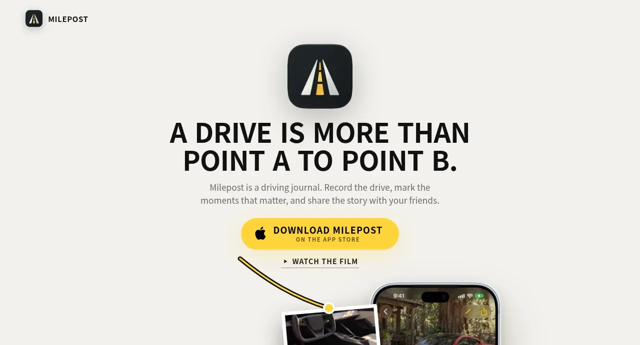
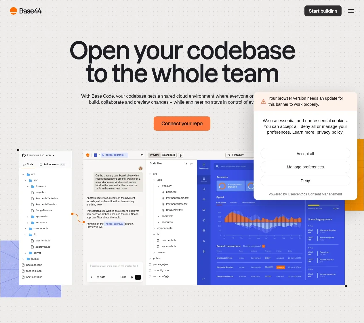
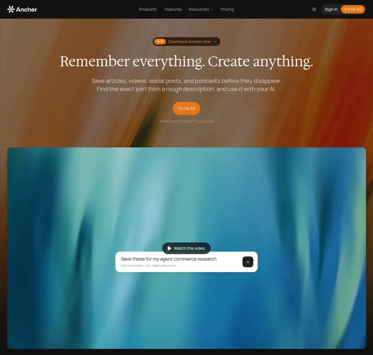
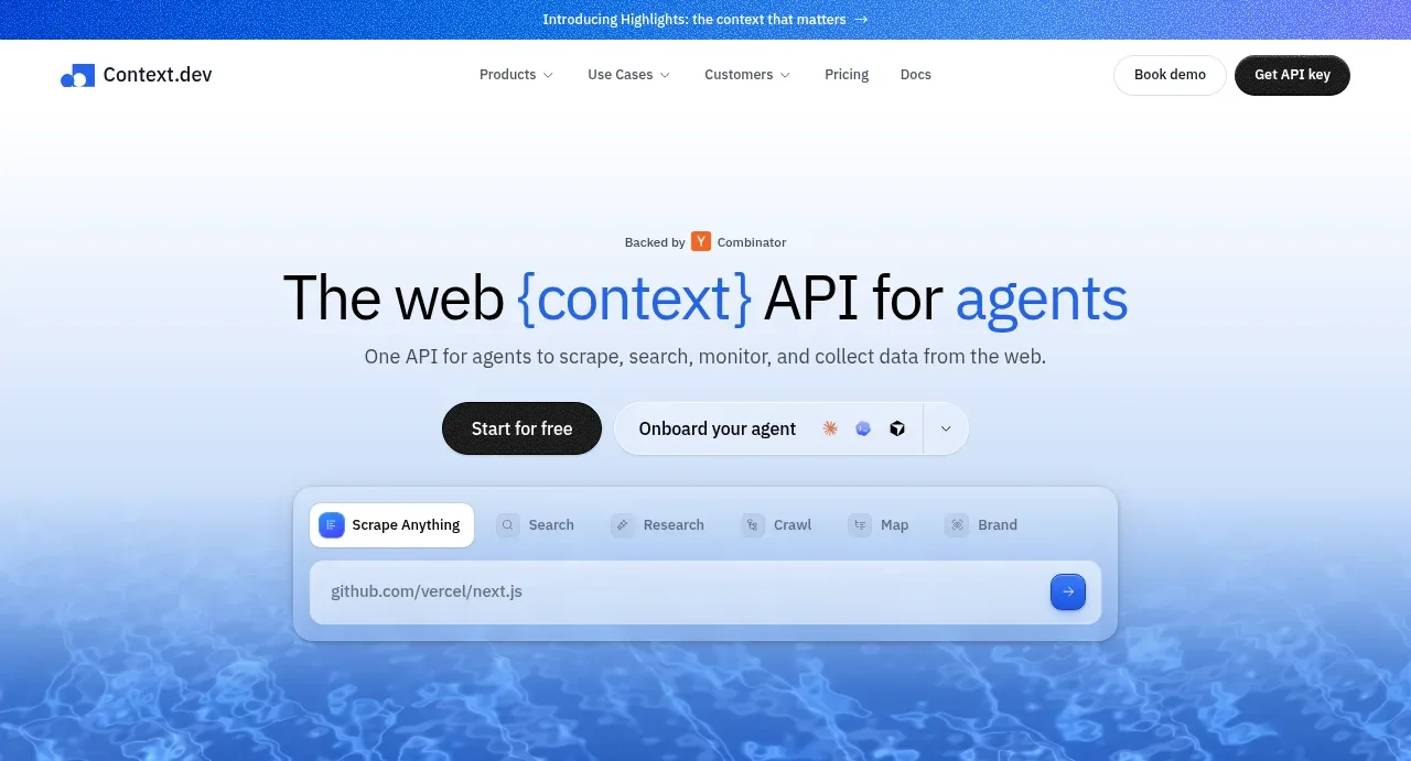
Study these alongside the description below: hierarchy, rhythm, spacing, colour. Build for the product you are asked about, using this design language.

- Component: https://kage-design-assets.t3.tigrisfiles.io/components/squadroom/d449f1a3-a1d7-46c0-a9d5-0020447fa3ed-1791871290-1.webp
- Full page it was cut from: https://kage-design-assets.t3.tigrisfiles.io/screenshots/squadroom/d449f1a3-a1d7-46c0-a9d5-0020447fa3ed-1791871247696-full.webp
- Component on Kage: https://kage.design/component/squadroom-hero

## Before you start
Ask what the user's product does, who the target customer is, and what proof or action should lead the page. Apply these principles to that product and brand.

Create a dark, high-contrast SaaS hero that runs from beneath the navigation through its first product demonstration. Center a small eyebrow badge above an oversized two-line headline, with one emphasized word in a warm orange gradient or underline. Use a near-black canvas (#070707) with extremely subtle radial lighting, white-gray headline text (#e7e7e4), muted supporting copy (#999994), and orange accents (#ff7624). Set the headline around 56–68px on desktop with tight line-height and a responsive 38–46px mobile size. Place a filled rounded primary CTA beside a quiet text-link CTA, then a tiny reassurance line beneath.

Below the copy, include a wide framed application preview: a small demo label strip, dark sidebar, dashboard cards, schedule/list content, and a floating “try demo” button. The preview should feel like a believable product UI built from semantic cards, not an image; use #101010 panels, #242424 borders, 10–14px radii, and restrained cyan, blue, green, and orange status colors. Add a small floating chat/help bubble at the edge. Keep the composition centered in a max-width of roughly 750px with ample vertical whitespace and a clear visual hierarchy.

Never: use logos, product names, copy, illustrations, or imagery from the reference.