kage
kage
base44.com
Design analysis
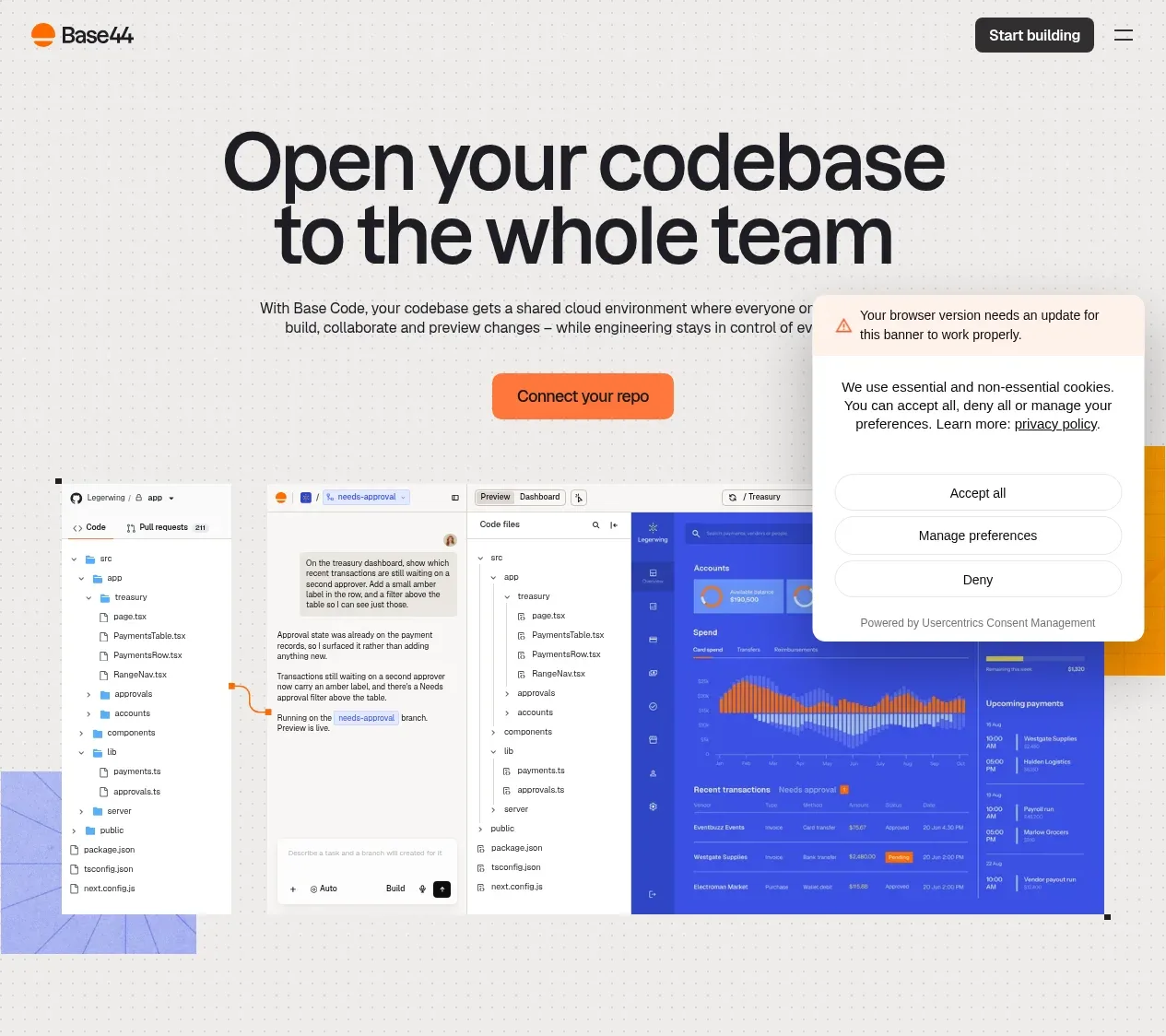
An oversized two-line headline, concise explanatory copy, bright repository connection CTA, and a large product workspace visual establish the product promise immediately.
Prompt preview
## Reference images

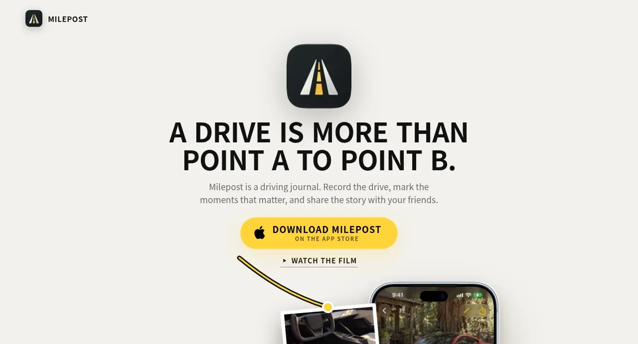
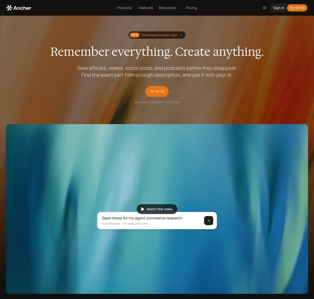
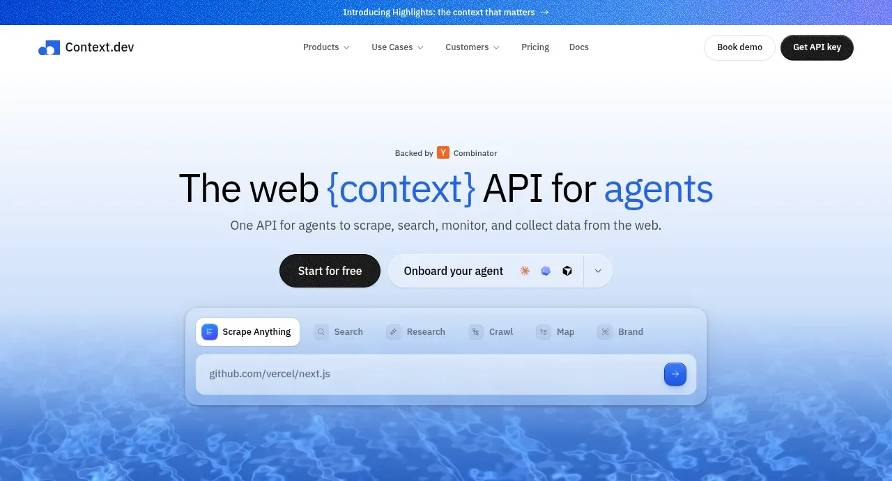
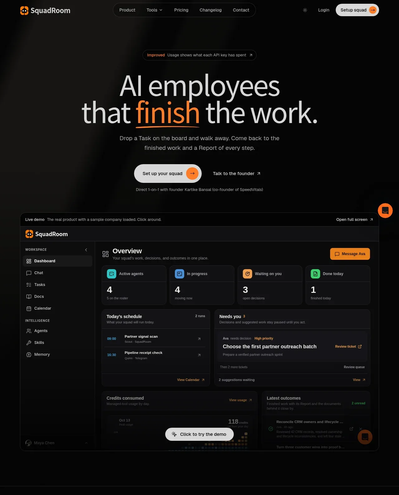
Study these alongside the description below: hierarchy, rhythm, spacing, colour. Build for the product you are asked about, using this design language.

- Component: https://kage-design-assets.t3.tigrisfiles.io/components/base-code/bec5af88-964e-4f0a-90b9-76aa2444b6f5-1791871470-1.webp
- Full page it was cut from: https://kage-design-assets.t3.tigrisfiles.io/screenshots/base-code/bec5af88-964e-4f0a-90b9-76aa2444b6f5-1791871315791-full.webp
- Component on Kage: https://kage.design/component/base-code-hero

## Before you start
Ask what the user's product is, who it serves, and what its brand personality is. Apply these principles to that product and invent appropriate content.

Create a high-impact hero directly below the navigation. Center an oversized, tightly tracked headline over two lines, followed by one short paragraph and one vivid primary CTA. Place a wide product UI or workflow preview beneath the CTA so the promise is demonstrated, not merely stated. Use a pale warm background with a subtle technical dot grid, near-black typography around `#111114`, and an energetic orange CTA around `#ff6b32`; keep the visual edge-to-edge enough to feel substantial while retaining consistent side margins. Use very large responsive type, tight line-height, restrained copy width, and generous vertical breathing room. The CTA should have a rounded rectangle, clear hover state, and accessible focus ring; the product preview may slightly overlap its surrounding space but must not obscure the message.

Never use logos, product names, copy, illustrations, or imagery from the reference.