kage
kage
busabase.com
Design analysis
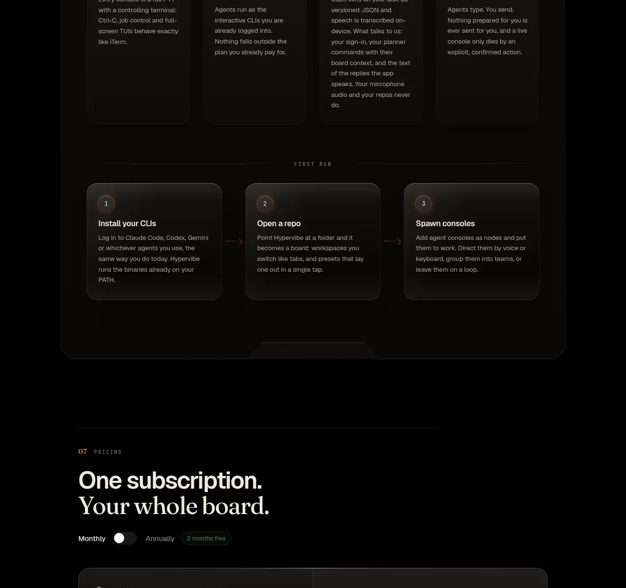
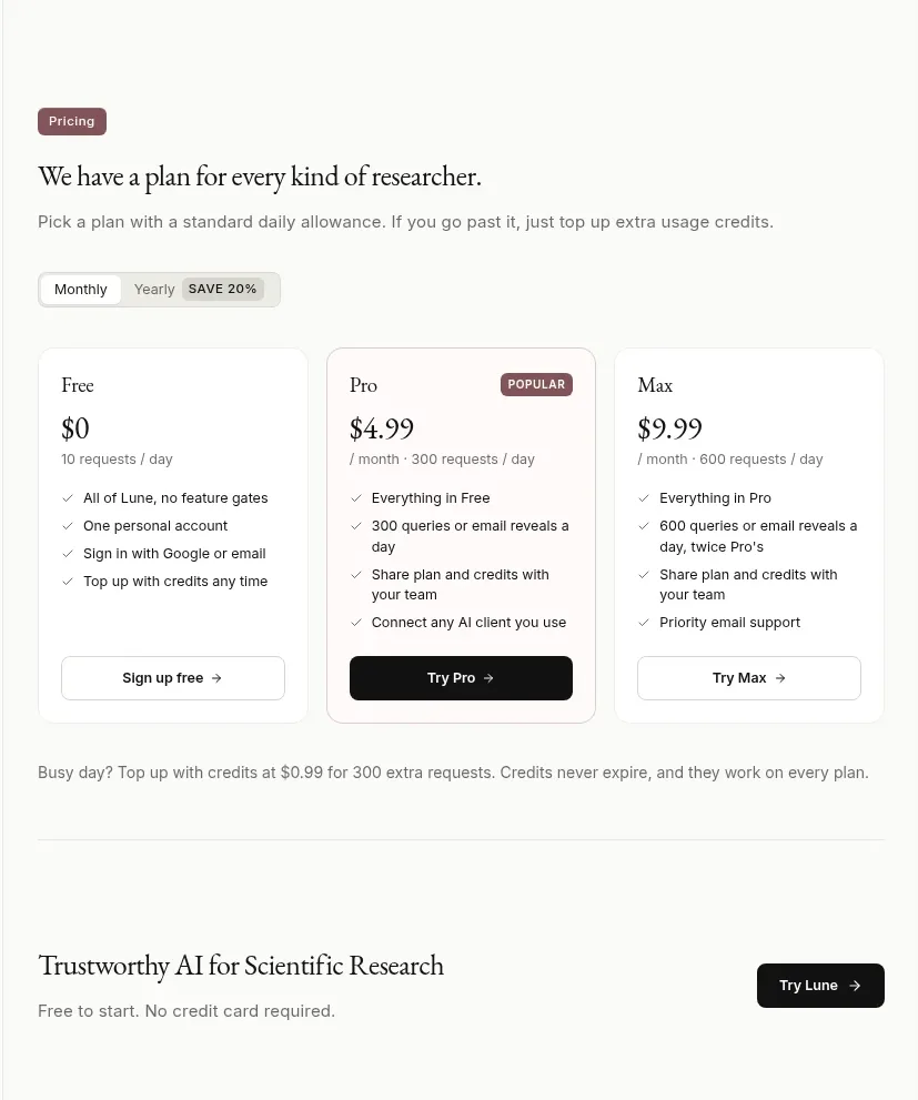
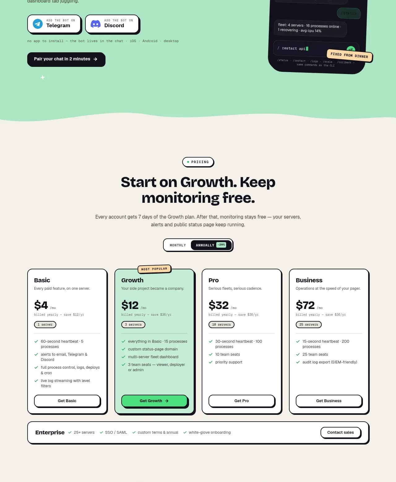
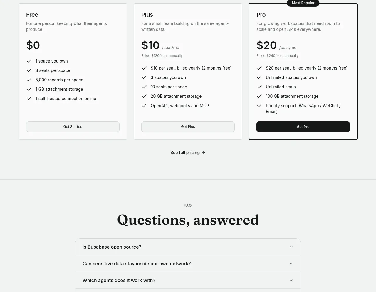
The pricing section uses three side-by-side plan cards with clear prices, feature checklists, and full-width buttons. One plan receives a high-contrast border and small popularity badge to guide attention without hiding alternatives.
Prompt preview
## Reference images

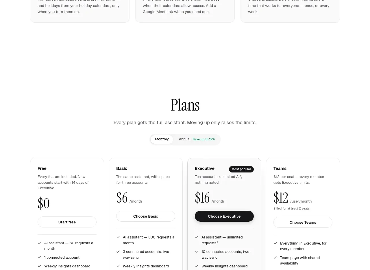
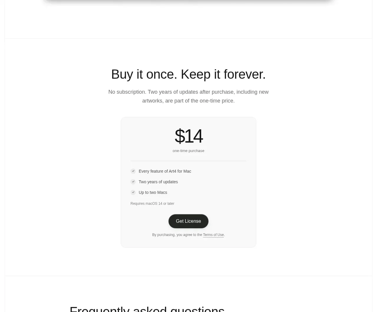
Study these alongside the description below: hierarchy, rhythm, spacing, colour. Build for the product you are asked about, using this design language.

- Component: https://kage-design-assets.t3.tigrisfiles.io/components/busabase/7d05ddcb-d0f9-4d81-8382-8bbb1120492e-1791612079-7.webp
- Full page it was cut from: https://kage-design-assets.t3.tigrisfiles.io/screenshots/busabase/7d05ddcb-d0f9-4d81-8382-8bbb1120492e-1791612035007-full.webp
- Component on Kage: https://kage.design/component/busabase-pricing-table

## Before you start
Ask what the user's plans, billing model, target customer segments, and primary conversion action are. Apply the principles below while using the user's actual product and brand system.

Build a three-tier pricing section with a centered serif heading, supporting line, and optional billing switch. Use equal-width cards with plan name, audience description, prominent price, billing note, checkmarked feature list, and full-width CTA. Visually emphasize one recommended plan with a darker 2px border and a compact badge that slightly overlaps the top edge; keep the other plans neutral and equally credible. Use #f3f5f4 background, #ffffff cards, #d9dedb borders, 8–10px radius, 24px padding, black #151716 primary button, muted #747a77 secondary text, and generous vertical spacing. Include a small link to detailed pricing below. Make feature lists align as much as possible, support monthly/yearly switching, and stack cards on mobile.

Never: use logos, product names, copy, illustrations, or imagery from the reference.