kage
kage
arcjet.com
Design analysis
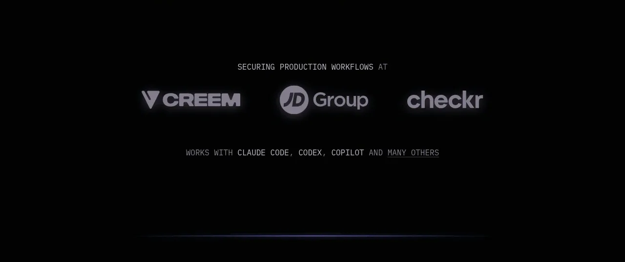
A quiet proof band places a short contextual label above a small row of customer marks, making credibility visible without interrupting the narrative.
Prompt preview
## Reference images

Study these alongside the description below: hierarchy, rhythm, spacing, colour. Build for the product you are asked about, using this design language.

- Component: https://kage-design-assets.t3.tigrisfiles.io/components/arcjet/88e490fa-ec93-4198-849b-d528e634d4ff-1790057131-2.webp
- Full page it was cut from: https://kage-design-assets.t3.tigrisfiles.io/screenshots/arcjet/88e490fa-ec93-4198-849b-d528e634d4ff-1790056993895-full.webp
- Component on Kage: https://kage.design/component/arcjet-logo-cloud

## Before you start
Ask what the user's product is, which customer or ecosystem signals are credible, and what brand system to use. Then build an original proof band from the rules below.

Build a compact dark logo-cloud section with a centered small uppercase label, one row of three to six monochrome customer or ecosystem wordmarks, and an optional second line explaining compatibility. Use a 160–240px vertical band, a narrow max-width, generous top and bottom padding, and evenly distributed marks with reduced opacity so the content feels editorial rather than promotional. Background should remain near-black `#050607`; labels use `#77757b`; marks use gray-white `#a9a7aa` with subtle blur or opacity variation. Use a thin divider or faint radial glow only if needed. On small screens allow wrapping or horizontal scrolling without clipping. Never: use logos, product names, copy, illustrations or imagery from the reference.