 kage
kage
arcjet.com
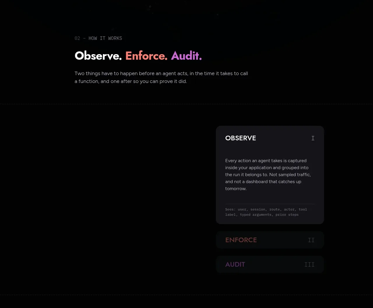
Design analysis
The section frames a three-part operating model and uses a compact tab-like stack to focus attention on one stage at a time.
Prompt preview
## Reference images

Study these alongside the description below: hierarchy, rhythm, spacing, colour. Build for the product you are asked about, using this design language.

- Component: https://kage-design-assets.t3.tigrisfiles.io/components/arcjet/88e490fa-ec93-4198-849b-d528e634d4ff-1790057132-5.webp
- Full page it was cut from: https://kage-design-assets.t3.tigrisfiles.io/screenshots/arcjet/88e490fa-ec93-4198-849b-d528e634d4ff-1790056993895-full.webp
- Component on Kage: https://kage.design/component/arcjet-tabs

## Before you start
Ask what stages or modes make up the user's product workflow and which stage should be emphasized by default. Then implement an original interactive section using the following rules.

Build a dark workflow section with a small numbered eyebrow, an editorial heading containing one or two accent-colored words, a short explanatory paragraph, and a three-item tab or accordion control. The active item should expand into a detailed panel while inactive items remain compact. Use a wide centered layout with copy on the left and the control panel on the right on desktop; stack them on mobile. Background `#050607`; panel `#17171b`; active border or glow in violet `#8275e8`; secondary accent coral `#df5965`; text `#f2efec`; body `#929098`. Use 10px radius, smooth 180–240ms transitions, clear focus rings, and `aria-selected` or accordion semantics. Never: use logos, product names, copy, illustrations or imagery from the reference.
More components

 Language selection cloud
Speechka · Tabs & steps
Language selection cloud
Speechka · Tabs & steps
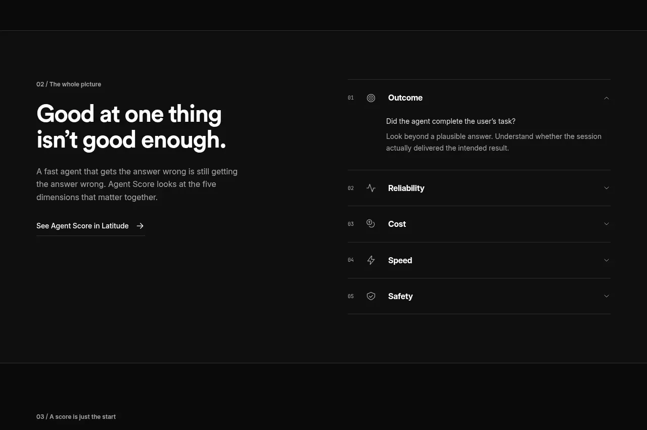
 Five-dimension score breakdown
AgentScore · Tabs & steps
Five-dimension score breakdown
AgentScore · Tabs & steps
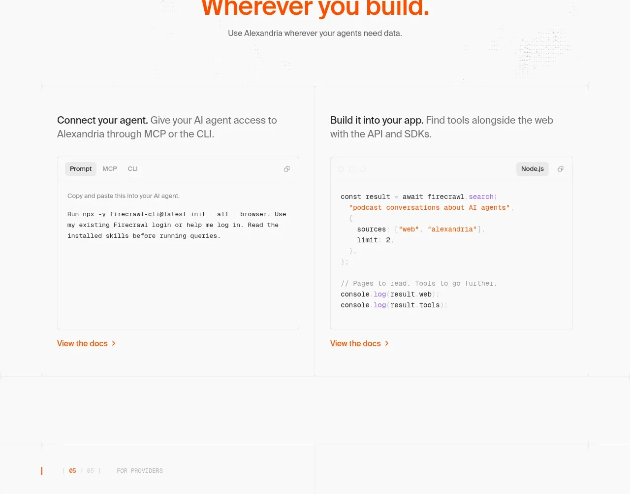
 Build and integration options
Alexandria by Firecrawl · Tabs & steps
Build and integration options
Alexandria by Firecrawl · Tabs & steps
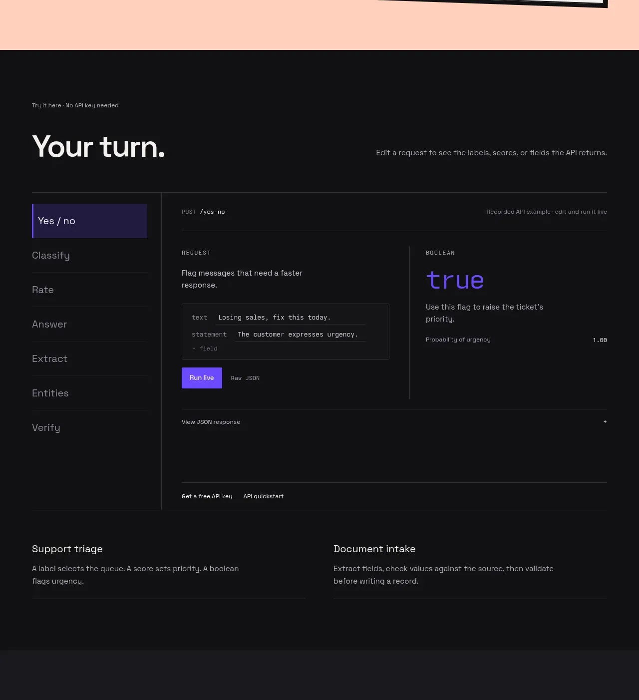
 Interactive API playground
Milliseconds.ai · Tabs & steps
Interactive API playground
Milliseconds.ai · Tabs & steps
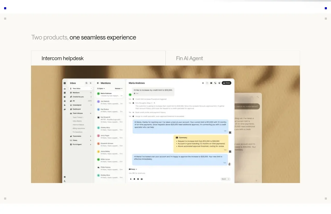
 Product overview showcase
intercom.com · Tabs & steps
Product overview showcase
intercom.com · Tabs & steps
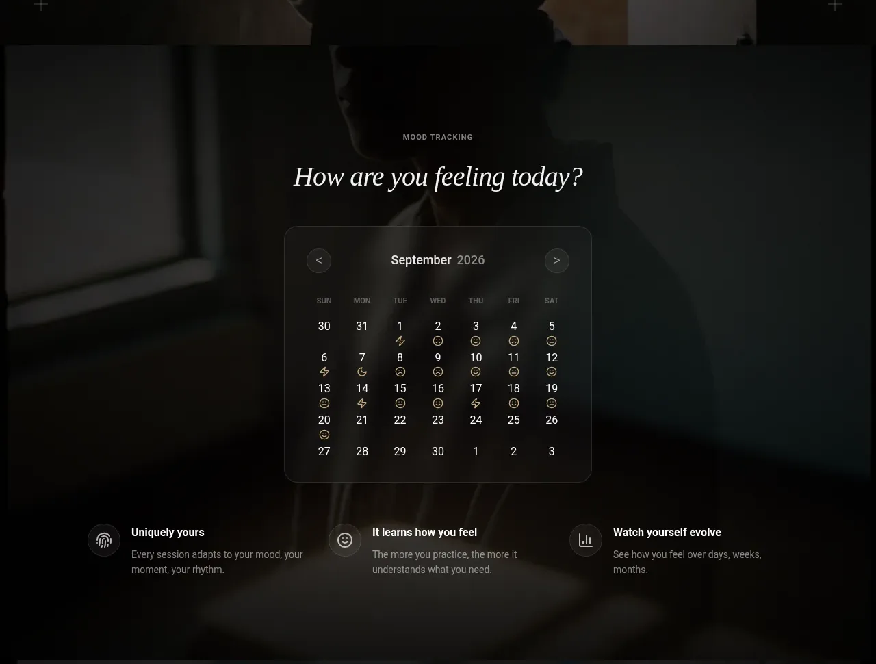
 Mood tracking calendar
Lull · Tabs & steps
Mood tracking calendar
Lull · Tabs & steps