kage
kage
arsaze.com

Design analysis
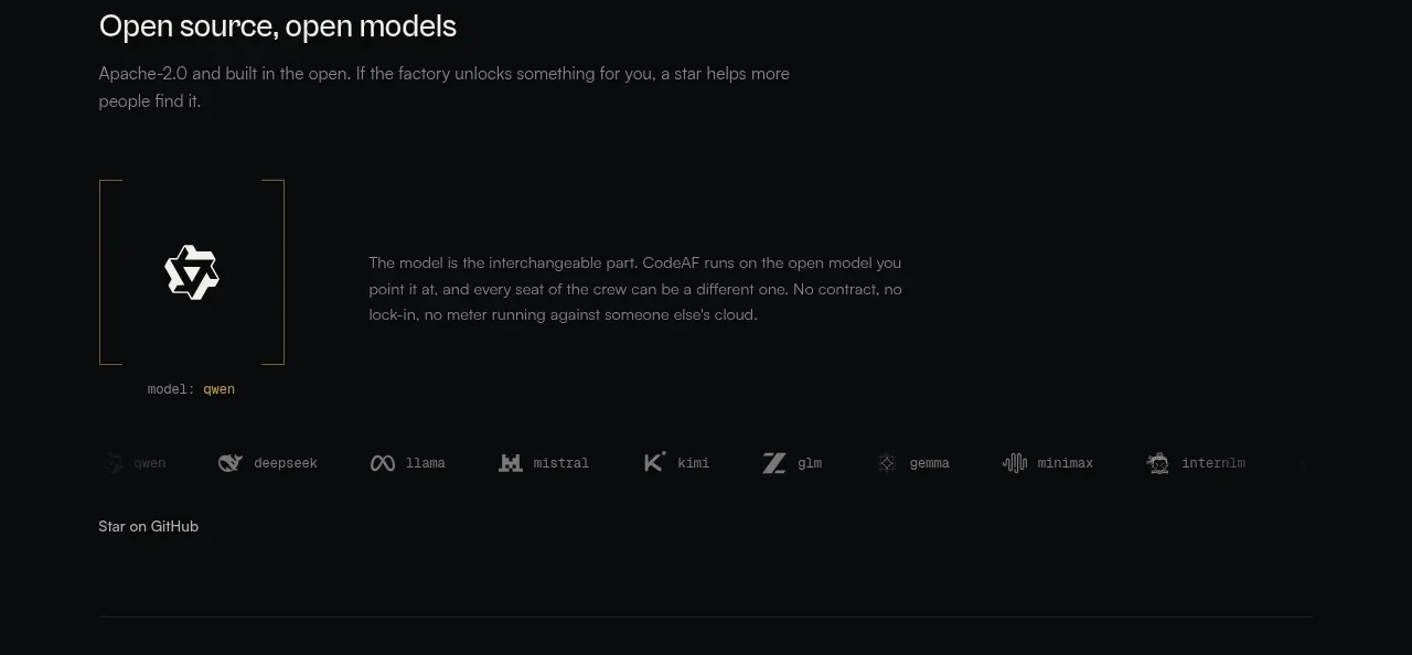
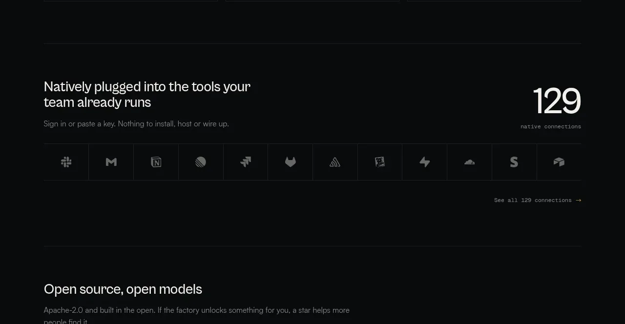
A small uppercase caption and a single row of muted partner/tool names communicate compatibility without interrupting the dark visual rhythm.
Prompt preview
## Reference images

Study these alongside the description below: hierarchy, rhythm, spacing, colour. Build for the product you are asked about, using this design language.

- Component: https://kage-design-assets.t3.tigrisfiles.io/components/arsaze/e4f15c51-7821-4e39-ba4c-e316208d7c18-1790748084-2.webp
- Full page it was cut from: https://kage-design-assets.t3.tigrisfiles.io/screenshots/arsaze/e4f15c51-7821-4e39-ba4c-e316208d7c18-1790748036683-full.webp
- Component on Kage: https://kage.design/component/arsaze-logo-cloud

## Before you start
Ask which tools, ecosystems, or integrations are genuinely relevant to the user's product and brand. Then apply these principles with only appropriate, truthful items.

Build a low-height compatibility strip on #050505. Center a tiny uppercase caption in widely tracked muted gray (#6f6a72), followed by a horizontally distributed row of monochrome integration names or abstract text placeholders in soft gray (#8a868d). Keep contrast intentionally subdued, use equal-width flex cells, and let the row wrap or horizontally scroll on mobile. Add a slight opacity increase on hover, while preserving an editorial, quiet tone.

Never: use logos, product names, copy, illustrations, or imagery from the reference.