 kage
kage
articos.com
Design analysis
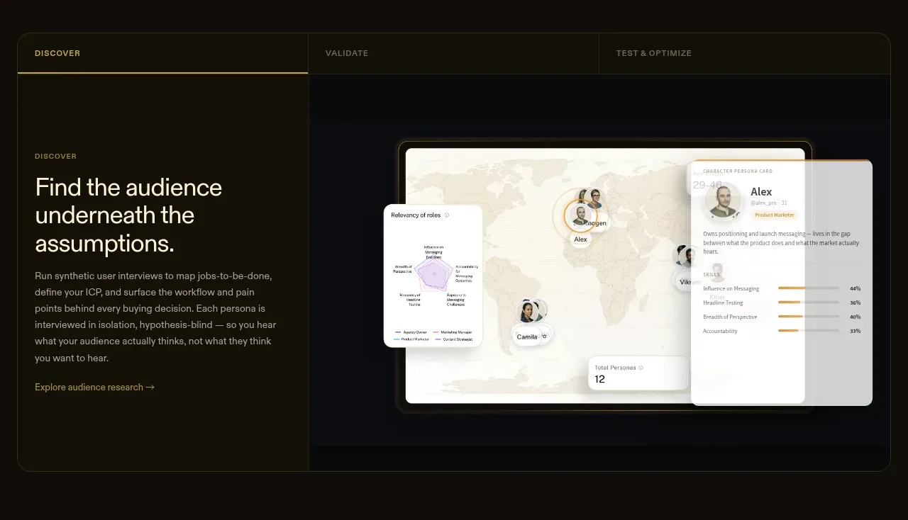
A framed showcase uses tabs to switch between workflow stages, with explanatory copy on the left and a large product-style visual on the right.
Prompt preview
## Reference images

Study these alongside the description below: hierarchy, rhythm, spacing, colour. Build for the product you are asked about, using this design language.

- Component: https://kage-design-assets.t3.tigrisfiles.io/components/articos-mcp/b74b5a52-121a-40b3-9410-436e13736de5-1791957711-4.webp
- Full page it was cut from: https://kage-design-assets.t3.tigrisfiles.io/screenshots/articos-mcp/b74b5a52-121a-40b3-9410-436e13736de5-1791957659853-full.webp
- Component on Kage: https://kage.design/component/articos-mcp-tabs

## Before you start
Ask what workflow stages the user's product has and which visual artifact best demonstrates each stage. Use the interaction model below for that product.

Build a wide, dark tabbed showcase with a thin border around `#39351f`, a subtle translucent panel background around `#12130f`, and restrained gold accents around `#c4a843`.

- Put three or four stage tabs in a full-width row at the top, each with a compact uppercase label and an active underline or gold border.
- Below, use a two-column layout: a left panel with an eyebrow, 26–34px heading, concise description, and small secondary link; a right panel containing a calm product mockup or data visualization.
- Use a 10–14px corner radius on the outer frame and 0–1px internal dividers.
- Keep the active state obvious through colour and border, not heavy fills.
- Add keyboard-accessible tab behavior, animated but quick panel transitions, and responsive stacking on mobile.
- Keep the visual subordinate to the explanatory message and use believable generic data.

Never use logos, product names, copy, illustrations, or imagery from the reference.
More components
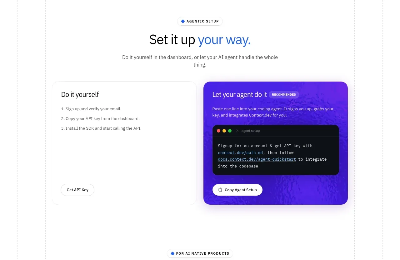
 Self-serve versus assisted setup
Scrape Anything by Context.dev · Tabs & steps
Self-serve versus assisted setup
Scrape Anything by Context.dev · Tabs & steps
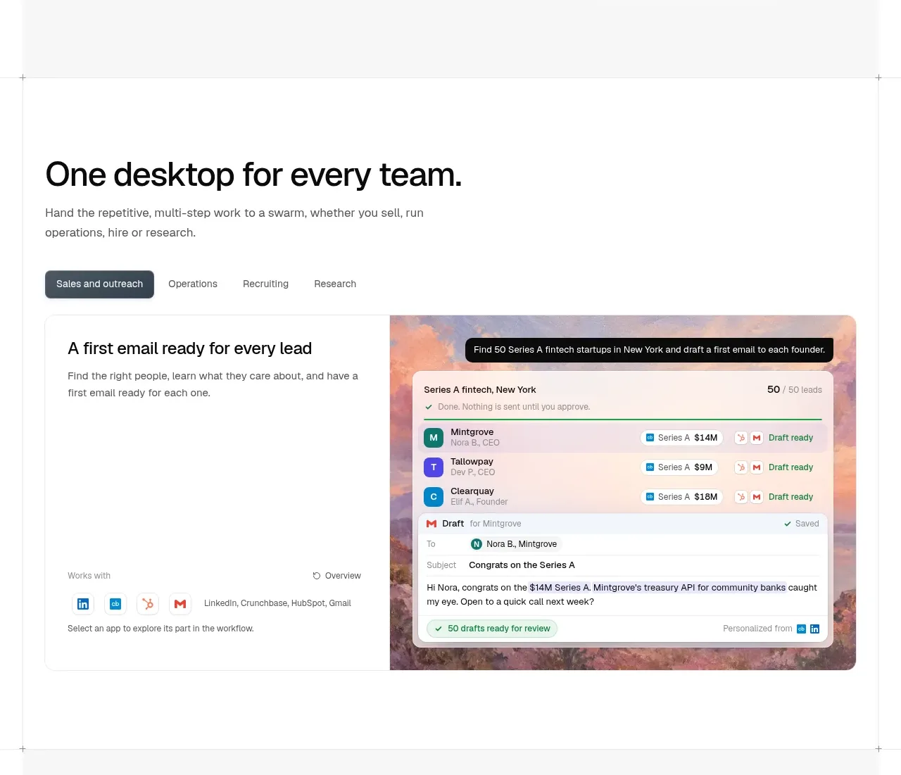
 Team workflow tabs
OpenSwarm · Tabs & steps
Team workflow tabs
OpenSwarm · Tabs & steps
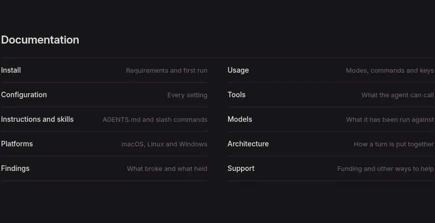
 Documentation link directory
Reika · Tabs & steps
Documentation link directory
Reika · Tabs & steps
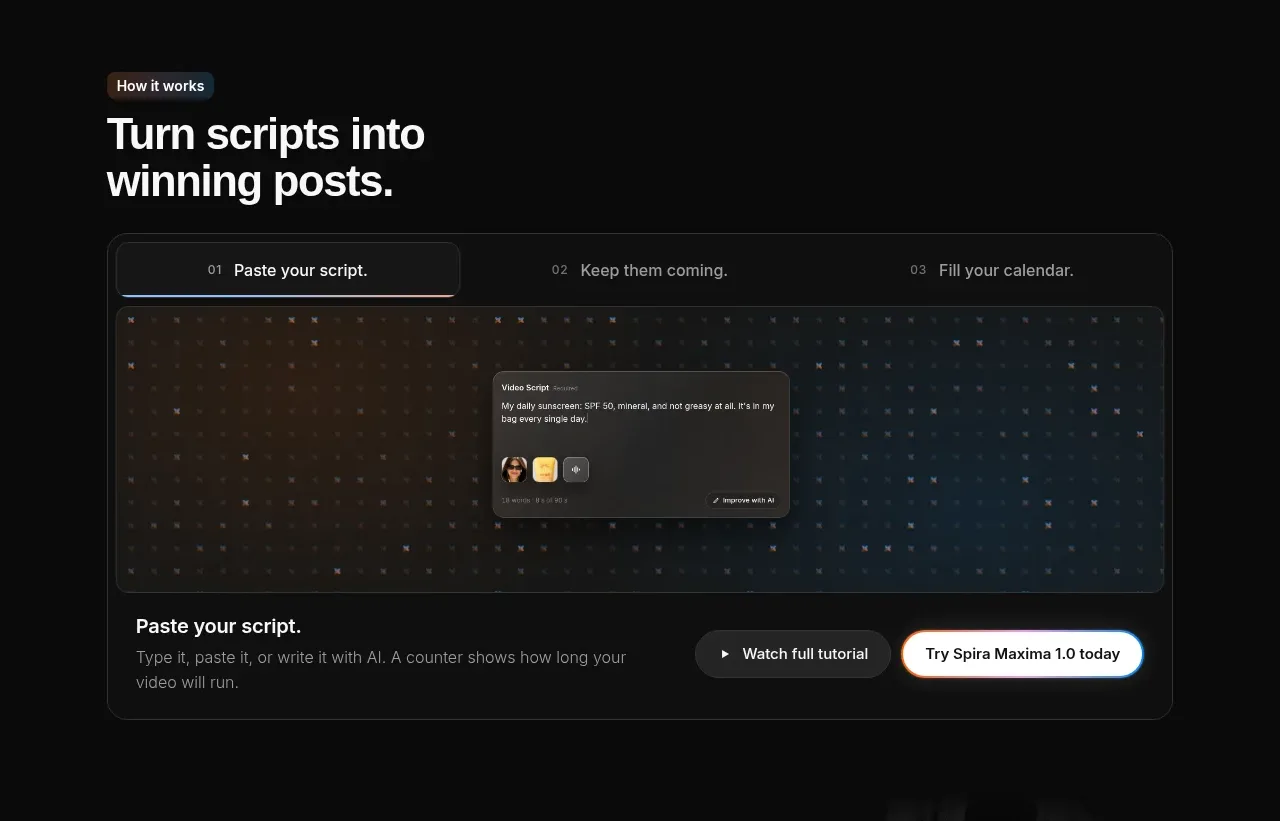
 Script-to-output workflow tabs
Spira Maxima · Tabs & steps
Script-to-output workflow tabs
Spira Maxima · Tabs & steps
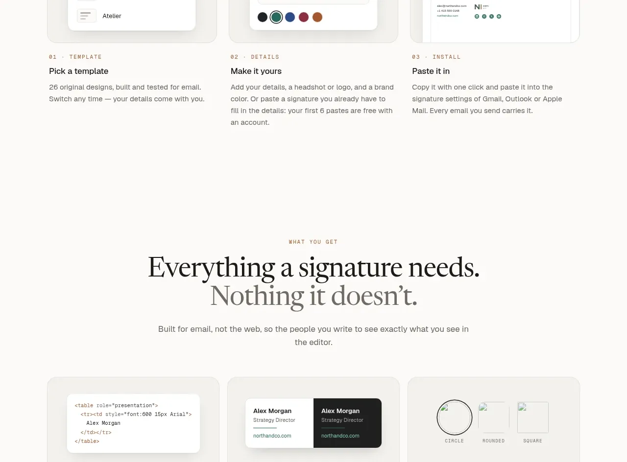
 Inbox preview tabs
esigna · Tabs & steps
Inbox preview tabs
esigna · Tabs & steps
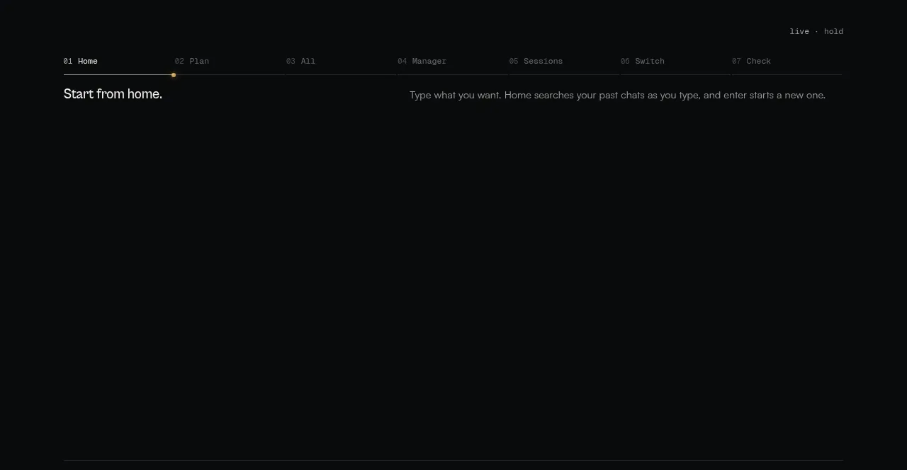
 Workflow stages explainer
CodeAF · Tabs & steps
Workflow stages explainer
CodeAF · Tabs & steps