kage
kage
spira.ai
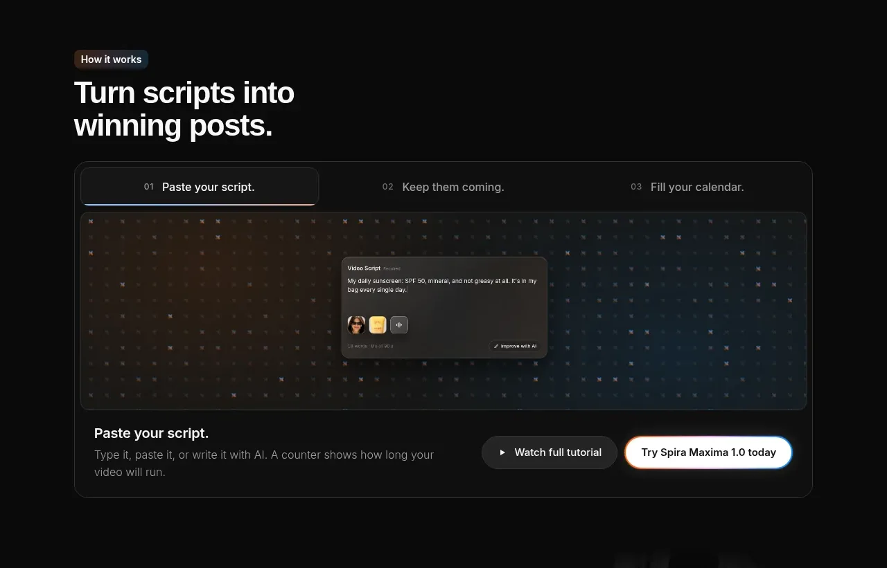
Design analysis
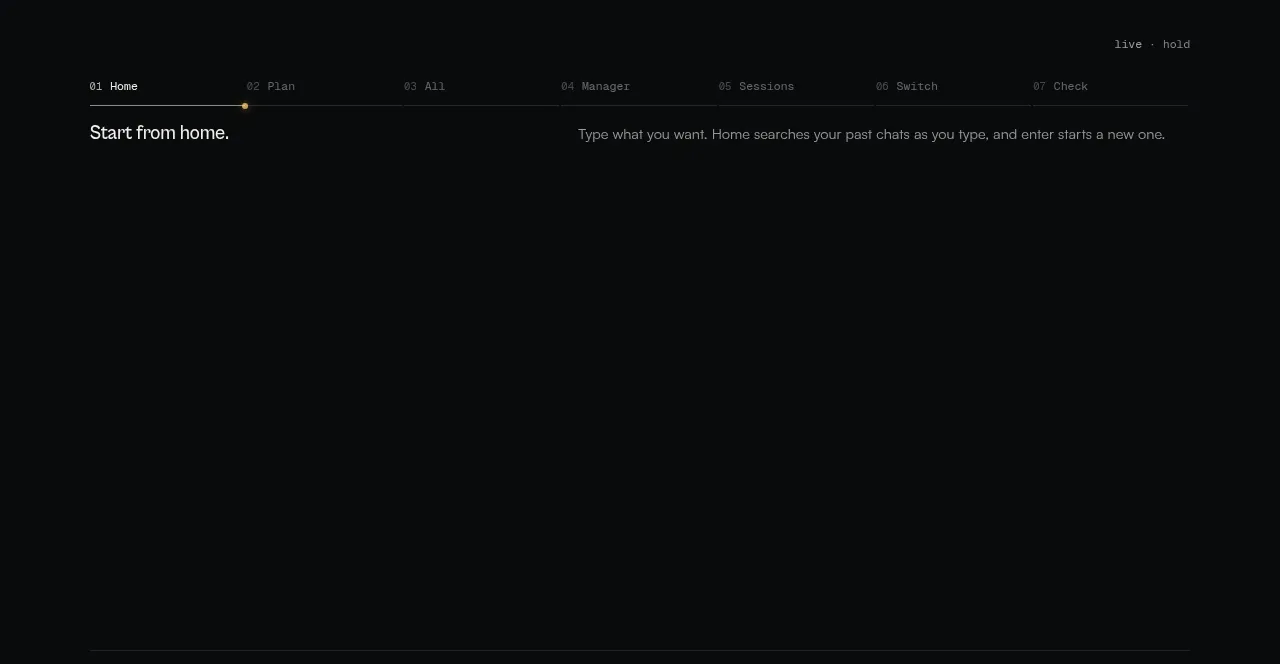
The section explains a workflow through three numbered tabs and a large interactive preview. The active tab is distinguished by a brighter border and the content panel combines media with explanatory copy and CTAs.
Prompt preview
## Reference images

Study these alongside the description below: hierarchy, rhythm, spacing, colour. Build for the product you are asked about, using this design language.

- Component: https://kage-design-assets.t3.tigrisfiles.io/components/spira-maxima/726c84dd-363c-4980-b0d9-b04757b4422a-1791266564-3.webp
- Full page it was cut from: https://kage-design-assets.t3.tigrisfiles.io/screenshots/spira-maxima/726c84dd-363c-4980-b0d9-b04757b4422a-1791266451959-full.webp
- Component on Kage: https://kage.design/component/spira-maxima-tabs

## Before you start
Ask what the user's product workflow steps are and which step should be active initially, then apply these principles to that product.

Create a dark workflow section with a left-aligned eyebrow and a strong two-line heading. Below, place a bordered rounded panel containing a horizontal three-step tab strip. Number each tab, use small uppercase or compact UI labels, and make the active tab visibly brighter with a thin accent border and soft glow. Under the tabs, show a wide demo viewport with a dark textured background and a centered interface mockup; below it place a short explanation on the left and secondary/primary actions on the right. Use #111212 panels, #252628 borders, 16px radius, 16–24px internal padding, white active text, and #8d8f94 inactive text. Tabs must be keyboard accessible and update the preview content.

Never: use logos, product names, copy, illustrations, or imagery from the reference.