kage
kage
agentfield.ai
Design analysis
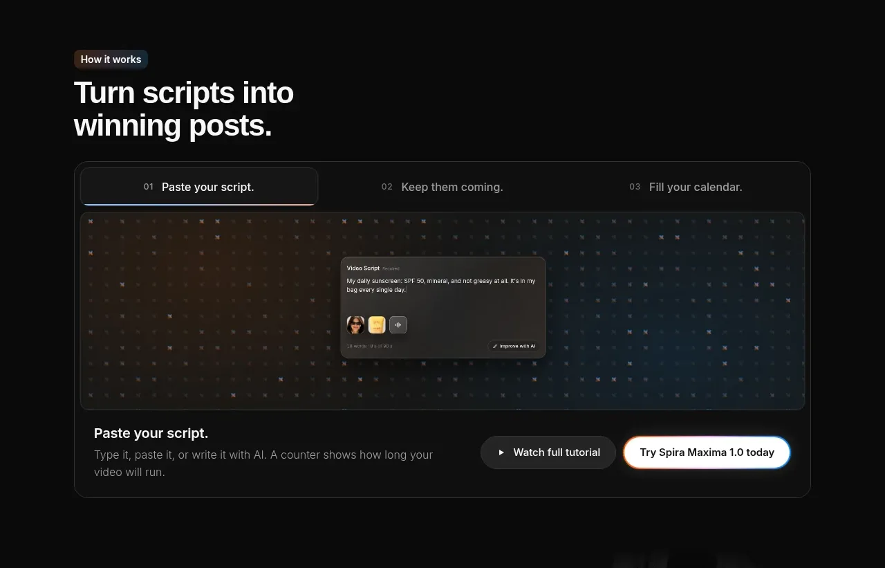
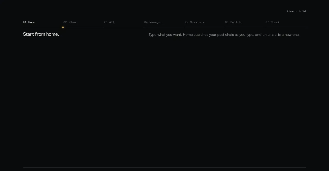
A thin numbered stage navigator introduces a product workflow, with a selected first stage and a short explanatory sentence beneath it; the large empty area preserves a deliberate product-demo canvas.
Prompt preview
## Reference images

Study these alongside the description below: hierarchy, rhythm, spacing, colour. Build for the product you are asked about, using this design language.

- Component: https://kage-design-assets.t3.tigrisfiles.io/components/codeaf/74fffb9e-aea6-4193-af2d-c8a5b19c270c-1791007528-2.webp
- Full page it was cut from: https://kage-design-assets.t3.tigrisfiles.io/screenshots/codeaf/74fffb9e-aea6-4193-af2d-c8a5b19c270c-1791007420738-full.webp
- Component on Kage: https://kage.design/component/codeaf-tabs

## Before you start
Ask what workflow your user's product guides people through and what the meaningful stages are. Adapt this interaction to that workflow and brand.

Build a dark product-tour section with a horizontal numbered tab rail near the top and a selected first tab indicated by a fine line plus a tiny warm accent marker. Below the rail, show the active stage title on the left and one concise explanation on the right. Reserve a large, quiet visual canvas beneath the copy for a future animation, screenshot, or live demo; it should feel intentional, not like an accidental blank space.

Design language: #08090a background, #1b1d1e separators, muted labels #666b6c, active text #d6d9d6, and accent #c29b48. Use monospaced 10–11px stage labels, a 14px stage heading, and 12px supporting copy. Keep the tab rail evenly distributed, use 24–32px vertical spacing, and animate active-tab changes with a restrained fade or horizontal line movement. Make tabs keyboard accessible and horizontally scrollable on small screens.

Never: use logos, product names, copy, illustrations, or imagery from the reference.